Blog

  • Why Your D2C Skincare Brand Isn’t Converting And How to Fix It. 

    Why Your D2C Skincare Brand Isn’t Converting And How to Fix It. 

    Your formulation is excellent. Your ingredients are sourced. Your founder story is real. So why is your D2C skincare brand not converting the way it should?

    In most cases, the product is not the problem. The brand is. When a customer cannot smell, touch, or try your serum before she spends five hundred to five thousand rupees on it, the brand has to do the work the product cannot do until after the sale. And most D2C skincare founders in India are underinvesting in exactly that.

    This guide breaks down the five brand signals your customer is reading before she clicks buy and what you can do to make sure each one works in your favour. Want us to audit your brand? Talk to the Richest Branding team.

    The Real Reason D2C Skincare Brands Lose Sales Before the First Purchase

    India’s D2C beauty and personal care market is estimated at $4.09 billion in 2025, growing at a projected 36.4% CAGR through 2032. The opportunity is enormous. So is the competition. At 11 PM on a phone screen, your customer is choosing between twelve serums that all claim to brighten, hydrate, or repair. She cannot try any of them. What she is actually doing is evaluating trust.

    Trust is not a feeling that arrives fully formed. It is assembled from dozens of brand signals some visible, some almost invisible that your customer processes in under eight seconds. The quality of your photography. The confidence of your typography. Whether your founder seems like a real person with real expertise. Whether your packaging looks like it belongs next to the brands she already buys.

    Get those signals right and she converts. Get them wrong and she moves on, often without being able to explain exactly why.

    Signal 1: Your Product Photography Is Either Building Trust or Destroying It

    In physical retail, your customer picks the bottle up. In D2C, the photograph IS the bottle. It has to communicate weight, texture, material quality, and brand personality simultaneously, in a thumbnail.

    A skincare brand with genuinely premium packaging and standard photography is invisible in the D2C channel. The customer sees the image and makes a price-tier judgment in under a second. If the photograph does not communicate premium, the formulation does not get the chance to.

    What great D2C skincare photography actually does:

    • Shows how the product will feel to hold light catching the glass, texture visible through the dropper.
    • Keeps label typography crisp and legible at thumbnail size.
    • Communicates a consistent mood that matches the rest of the brand identity.
    • Makes the product look worth what you are charging for it.

    This is not a small detail. It is the first and loudest trust signal in your most important selling environment.

    Signal 2: Your Brand Packaging Design Sends a Message Before She Reads a Word

    Packaging is not just a container. For a D2C skincare brand, it is the first physical interaction your customer has with your brand and if the unboxing moment does not match the expectation set online, that gap is trust-destroying.

    The D2C skincare brands that build genuine brand equity understand that packaging operates on two levels.

    • First, the brand communication level: what does the label, the typography, the material, and the colour palette say about who this brand is and who it is for?
    • Second, the unboxing level: when the parcel arrives, does the experience surprise her with quality and intention?

    Why the unboxing moment is your highest-leverage brand investment:

    When the unboxing is genuinely memorable, she photographs it. She shares it. She tells her friend. That organic recommendation is worth more than any paid media spend. The brands that understand this design the unboxing moment as deliberately as they design the product label the outer box, the way the product sits inside, the tissue, the card. Every element is a brand decision.

    At Richest Branding, we design D2C skincare packaging with the unboxing brief at the centre, not as an afterthought.

    Signal 3: Ingredient Transparency Is Now a Trust Baseline, Not a Differentiator

    The modern skincare consumer knows her actives. She knows the difference between niacinamide and kojic acid. She knows what percentage of retinol is considered effective. She knows that fragrance-free and unscented are not the same thing.

    A brand that communicates ingredient information with the same depth the customer is bringing to her research builds instant credibility. One that buries ingredients in small print on the back label signals that there is something to hide even when there is not.

    What ingredient transparency looks like as a brand pillar:

    • Hero active front and centre on the packaging not hidden in the INCI list.
    • Percentage callouts on the label where relevant.
    • Full formulation rationale on the product page, not just a benefits summary.
    • The founder explaining the ingredient logic on Instagram or YouTube

    Each of these signals communicates the same thing: this brand has nothing to hide and everything to be proud of. That is the foundation of D2C skincare brand trust. Minimalist built a brand worth ₹2,955 crore acquired by HUL in early 2025 on exactly this principle.

    Want to make ingredient transparency a core part of your brand identity? Visit our services for your packaging and brand strategy.

    Signal 4: The Founder Story Is Not a Nice-to-Have – It’s the Reason She Chooses You Over the Shelf

    The skincare consumer who shops D2C is specifically looking for something the supermarket shelf cannot give her: a brand she can believe in. She wants to know who made this, why they made it, and what they were trying to solve before they realised it was a problem for everyone like her.

    A founder story that is honest and specific builds more trust than any clinical claim on the label. It does not need to be dramatic. It needs to be real.

    The Bengaluru software engineer who developed a turmeric and niacinamide formulation for her own hyperpigmentation. The Ayurvedic practitioner from Kerala who refined an herbal formulation over twenty years before sharing it. The mother who could not find a fragrance-free moisturiser gentle enough for her daughter’s eczema made one herself.

    These are not marketing stories. They are the reason someone trusts a brand they have never touched and the reason they come back.

    How to build the founder story into your brand identity:

    • Give it a dedicated section on your website not a footer bio, a real narrative.
    • Let it inform the tone of every piece of brand communication.
    • Make it consistent across Instagram, email, packaging inserts, and the website.
    • Be specific. Vague claims about “passion for skincare” convert no one. Specific details the problem, the journey, the moment of breakthrough do.

    Signal 5: Brand Consistency Is the One Thing Most D2C Skincare Brands Get Wrong

    You can get every other signal right and still lose the trust calculation if your brand is inconsistent across touchpoints.

    A beautifully packaged product whose Instagram looks like it was designed by a different team creates a gap. The customer notices she may not be able to articulate it, but she senses that something is off. And a brand that is not in full control of its own identity is harder to trust with what goes on your skin.

    Every touchpoint in your D2C customer journey is a brand moment: the product label, the packaging, the website, the Instagram feed, the email confirmation, the shipping box. Inconsistency anywhere in that chain erodes the trust that the brand has been carefully building everywhere else.

    The consistency checklist for D2C skincare brands:

    • Typography and colour palette applied uniformly across print and digital.
    • Photography style and art direction consistent across product and lifestyle imagery.
    • Tone of voice identical whether you are writing a product description, a shipping notification, or an Instagram caption.
    • Packaging design language visible and recognisable on the website and in feed content.

    Build the brand fully. Not just the bottle.

    How Richest Branding Approaches D2C Skincare Brand Trust

    At Richest Branding, we work with skincare founders across Bengaluru, Mumbai, Pune, Delhi, Dubai, and Singapore who have extraordinary formulations and ask us the same question: why are people not converting?

    Almost always, the answer lives in the brand experience not the product chemistry.

    We design D2C skincare brands with trust as the primary brief. That means photography direction, packaging design, founder story articulation, ingredient communication architecture, and brand consistency across every touchpoint. Not just a logo and a label.

    Because when your customer cannot touch the product before she buys it, the brand does all the work. It has to be built to do exactly that.

    What to Do Next If Your D2C Skincare Brand Isn’t Converting

    The five trust signals above photography, packaging, ingredient transparency, founder story, and brand consistency are not independent. They work together as a system. A gap in any one of them weakens the others.

    If your formulation is strong but your conversion rate is not, the single most effective thing you can do is audit your brand experience against each of these signals. Be honest about where the gaps are. Then close them deliberately, not incrementally.

    The brands that win in India’s D2C skincare market in 2025 and beyond are not the ones with the best ingredients. They are the ones with the strongest, most consistent brand trust signal at every point in the customer journey.

    Ready to build a D2C skincare brand that earns trust before the first purchase? Talk to Richest Branding.

    Frequently Asked Questions

    1. How do D2C skincare brands build trust without physical retail?

    • Through brand identity design, product photography, ingredient transparency, founder storytelling, and unboxing experience each of which replaces the trust signals that physical retail provides through touch and trial.

    2. What is the most important trust signal for a D2C skincare brand?

    • Consistency. A brand that looks and communicates identically across packaging, Instagram, website, and email is the brand that feels in control and therefore safe to buy from.

    3. Why is ingredient transparency important for skincare brands in India?

    • The modern Indian skincare consumer is formulation-literate. She knows her actives. Brands that communicate ingredient rationale clearly signal competence and honesty both of which build purchasing confidence.

    4. How does packaging design affect D2C skincare conversion rates?

    • Packaging is the product in a D2C context. Poor packaging signals poor product, regardless of the formulation inside. Packaging that matches the premium positioning of the brand and delivers a memorable unboxing moment builds the post-purchase confidence that drives reviews and referrals.
  • When Your Spice Brand Outgrows Its Packaging: The Complete Rebranding Playbook for Indian Masala Businesses

    When Your Spice Brand Outgrows Its Packaging: The Complete Rebranding Playbook for Indian Masala Businesses

    There is a moment every successful spice business reaches. The product quality has been refined over years, sometimes over generations. The customer base is loyal and growing. Distribution has expanded from local markets to regional modern trade. Perhaps export enquiries have begun arriving from Dubai or the UK.

    And then the business owner looks at the packaging the same packaging that has been in use for a decade or more and sees the gap. The packaging that made sense when the brand was selling at a local mandi no longer communicates what the brand has become. It no longer represents the quality of what is inside. It no longer signals the price point the business wants to command. And it most certainly will not open the doors of Lulu Hypermarket in Dubai or Waitrose in the UK.

    This is the rebranding moment. And how the business navigates it determines whether the next decade of growth is built on a brand foundation strong enough to support it.

    The Fear That Holds Most Spice Brands Back from Rebranding

    The most common reason spice businesses delay rebranding sometimes for far too long is the fear of losing existing customers. The reasoning is understandable: loyal customers recognise the current packaging. If the packaging changes too dramatically, they may not find the brand on the shelf. The business that has been built over years could be disrupted.

    This fear is real but it is also, in most cases, overestimated. Consumer research across FMCG rebranding consistently shows that loyal customers adapt to packaging changes far more readily than brand owners expect particularly when the change is executed with continuity principles: retaining the brand name in the same prominent position, maintaining the core colour signals that category shoppers use for navigation, and communicating the change through a brief transition period.

    The greater risk, in most cases, is not the short term disruption of rebranding. It is the long term cost of not rebranding the premium pricing that cannot be commanded, the modern trade listings that cannot be secured, the export markets that cannot be entered, and the brand equity that cannot be built on a visual foundation that communicates yesterday’s version of the business.

    The Four Triggers That Tell You It Is Time to Rebrand

    Trigger One: Modern Trade Ambition

    If your spice brand is seeking listings in organised retail D Mart, Reliance Smart, Star Bazaar, Big Bazaar, or any major regional supermarket chain your packaging will be evaluated against the visual standard set by the brands already on those shelves. Category buyers in organised retail make listing decisions partly on the visual quality of the packaging. Packaging that looks like it belongs in a street market will not win a premium aisle slot in a modern supermarket.

    Trigger Two: Export Market Entry

    The decision to enter the UAE, UK, Australian, or Singapore market makes rebranding essentially non negotiable. These markets have visual packaging standards that are set by the international brands competing for the same shelf positions. An Indian spice brand entering these markets with packaging designed for the domestic general trade market will not pass the first evaluation by a retail buyer in those markets.

    Export rebranding is not about abandoning Indian identity. The most successful Indian spice brands in the Gulf and UK markets lead with Indian heritage but they express it in a visual language that international consumers find both recognisable and aspirational.

    Trigger Three: Premium SKU Launch

    When a spice business wants to launch a premium product line single origin spices, reserve blends, chef grade masalas at two or three times the standard price point the existing packaging system cannot carry the new positioning. Premium products require premium packaging. Launching a premium product in standard packaging creates a price to pack mismatch that the consumer resolves by downgrading their perception of the product.

    Trigger Four: Generational Transition

    When the second or third generation of a family spice business takes over, rebranding is often both a business decision and a cultural one. The new generation wants to honour what their parents or grandparents built while positioning the brand for the next chapter of growth. A well executed generational rebranding preserves the equity of the founding story while expressing a new visual ambition for the next decade.

    The Rebranding Process: What to Protect and What to Evolve

    A successful spice brand rebranding is not a blank sheet of paper exercise. It is a precision balance between protecting the elements that carry existing consumer recognition the brand name, the dominant colour family, the overall category positioning and evolving the elements that are limiting growth.

    • Protect: the brand name in its familiar form this is the primary recognition anchor for existing customers
    • Protect: the dominant colour signals used by category shoppers to navigate the range sudden colour change loses shelf navigation
    • Evolve: the overall visual quality and finish materials, photography, typography system, hierarchy and layout
    • Evolve: the back panel from a compliance exercise to a brand storytelling opportunity provenance, recipe, heritage
    • Add: a coherent range architecture if one does not currently exist visual family logic across all SKUs

    The spice businesses that have most successfully made this transition both in India and internationally share one approach: they did not design a new pack. They built a brand system. The difference is the difference between a cosmetic change and a strategic transformation.

    Your masala has been perfecting its formula for years. The brand deserves to be as refined as the recipe.

      Ready to build a brand that commands your market? 

      Visit richestbranding.com  |  info@richestbranding.com

  • Sustainable vs. Premium: Can Your Packaging Be Both?

    Sustainable vs. Premium: Can Your Packaging Be Both?

    Most brands believe they have to choose. Go sustainable and risk looking budget. Go premium and carry the guilt of excess. That is a false choice, and the brands winning right now have already figured that out.

    Eco-luxury packaging design is the answer. It is where considered materials meet exceptional craftsmanship, where environmental responsibility becomes a brand advantage rather than a compromise. If your packaging can be both beautiful and responsible, it says something powerful about who you are as a brand.

    At Richest Branding, we build packaging strategies that hold both values without letting either one down. Here is how it works.

    Want packaging that reflects your brand values beautifully? Explore our Packaging Design services.

    Why Eco-Luxury Packaging Design Is the Smartest Brand Move Right Now

    The modern premium buyer has changed. They are informed, value-driven, and pay close attention to how a brand behaves, not just how it looks. A stunning package that arrives in excessive plastic no longer signals luxury. It signals a brand that has stopped paying attention.

    Sustainable premium packaging for brands is growing because the market is demanding it. According to Nielsen, 73 percent of global consumers say they would definitely or probably change their consumption habits to reduce environmental impact. Premium buyers, in particular, are making purchasing decisions based on brand values alongside product quality.

    What today’s premium customer actually wants

    • Beautiful packaging that feels intentional and considered
    • Materials that reflect care for both the product and the planet
    • A brand story they can feel proud to share
    • An unboxing experience that does not create waste guilt

    Eco-luxury packaging design meets every single one of these expectations. It does not ask customers to sacrifice the premium experience. It elevates it.

    The Biggest Myth About Sustainable Packaging

    Here is the belief that holds most brands back: sustainable means simple, and simple means cheap.

    This is completely wrong. Luxury packaging that is eco-friendly is defined by the quality of its thinking, not the cost of its material. Recycled kraft board with a beautifully embossed logo feels more considered than a glossy generic box. Seed paper inserts feel more memorable than plastic fillers. Soy-based inks on uncoated stock feel warmer and more artisan than digital print on synthetic laminate.

    The shift from conventional to sustainable packaging is a creative opportunity. The brands that see it as a constraint are the ones that never explore far enough.

    How to Make Sustainable Packaging Feel Premium

    Sustainable packaging design strategy is built on the same foundations as luxury packaging, with material intelligence added at every layer.

    Choose materials that have inherent character

    FSC-certified boards, recycled glass, bamboo, sugarcane pulp, and seed paper all carry texture, warmth, and story. These materials do not need to be disguised. They are elevated by an honest, confident design that lets their quality speak.

    Let the finish do the work

    Debossing, blind embossing, and letterpress printing on uncoated sustainable stocks create depth and tactility that feel deeply premium. Foiling with recycled metallic finishes adds richness without compromise. The result is packaging that earns its shelf space and its price point.

    Design with restraint

    As we explored in The Science of Luxury Packaging Design, white space is confidence. This principle is even more powerful in eco-luxury packaging design. Minimal design on a beautiful natural stock communicates clarity, intention, and premium positioning all at once.

    Tell the story simply

    One line. One symbol. One clear sustainability commitment on the packaging. Customers reward honesty and punish complexity. A recycled symbol and a single sentence about your material choice is enough. It builds trust without turning the package into a manifesto.

    Curious how we bring this to life for real brands? See our packaging projects.

    What Eco-Luxury Packaging Design Does for Your Brand Commercially

    Premium sustainable brand packaging is a commercial strategy, not a values exercise.

    It commands a higher price point. Consumers consistently pay more for products that reflect their values. When your packaging communicates both quality and responsibility, the perceived value of your product rises on both dimensions.

    It builds deeper loyalty. A customer who feels aligned with your brand values does not just repurchase. They advocate. They share. They bring others. That is the kind of loyalty that advertising budgets cannot manufacture.

    It earns press and organic visibility. Sustainable luxury packaging attracts editorial attention, social sharing, and influencer content organically. Brands with beautiful, responsible packaging get written about because they have a story worth telling.

    The Richest Branding Approach to Eco-Luxury Packaging

    At Richest Branding, we approach sustainable packaging the same way we approach every brand challenge: strategy first, aesthetics second. We ask what the brand stands for, who is buying it, and what experience they deserve at the moment they hold it.

    From there, every material choice, every finish decision, and every structural detail is made with both premium positioning and environmental consideration in mind. The two are never in conflict when the thinking is right.

    Our work with beauty, wellness, and lifestyle brands proves consistently that the most memorable packaging is often the most considered, and considered always includes how it lands in the world beyond the customer’s hands.

    Let us build eco-luxury packaging that your brand and your customers will be proud of. Start a project.

    Conclusion

    Sustainable and premium are not opposites. They are the same thing when your brand has the clarity and craft to bring them together. Eco-luxury packaging design is how you tell your customer that you care about quality, about them, and about something bigger than the transaction.

    The brands that will define the next decade of premium markets are the ones building this kind of intentional packaging today. The question is whether yours will be one of them.

    What would it mean for your brand if your packaging told both stories at once? That conversation is worth having. Richest Branding is ready when you are.

  • The Gift of Brand: How Premium Festive Packaging Turns an Ordinary Product Into an Extraordinary Experience

    The Gift of Brand: How Premium Festive Packaging Turns an Ordinary Product Into an Extraordinary Experience

    The Indian festive calendar is one of the most commercially significant in any consumer market globally. Diwali alone generates billions of rupees in gift giving across corporate, retail, and personal categories. Add Eid, Raksha Bandhan, Christmas, New Year, and the wedding season and the festive gifting opportunity extends across nearly eight months of the year.

    In this environment, packaging does something it rarely does in everyday FMCG retail: it becomes the primary product. When a consumer selects a Diwali gift for a colleague, a client, or a family member, they are not only selecting what is inside the box. They are selecting the experience of giving and the experience of receiving. The packaging is the gift before the gift is the gift.

    Brands that understand this dynamic invest in festive packaging as a strategic priority not as a cosmetic upgrade to regular packaging. And the return on that investment, measured in brand equity, premium price realisation, and relationship deepening, is among the highest available in any single marketing initiative.

    Why Festive Packaging Is Your Highest Leverage Brand Moment

    In everyday retail, your packaging competes against dozens of competing products on a crowded shelf. In the gifting context, the dynamic is fundamentally different. The gifter is not comparing your product to a competitor’s product they are comparing the experience your packaging creates with the experience a competing gift creates.

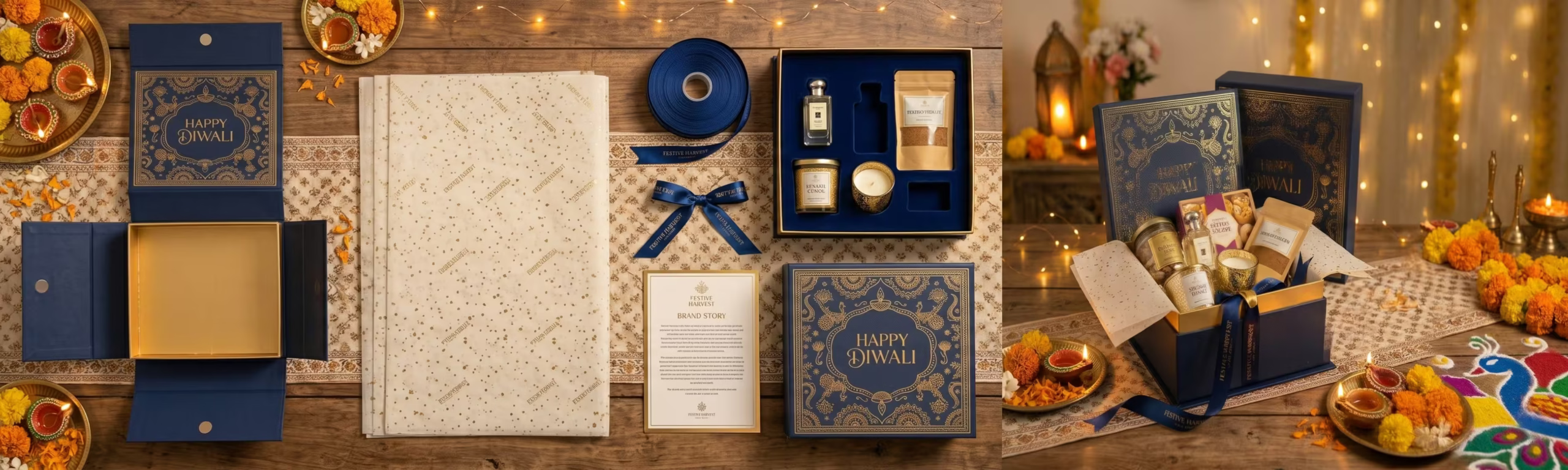
    A premium gift hamper is evaluated holistically: the quality of the outer box, the arrangement of the products inside, the tissue or padding material used, the presence of a branded note card, the ribbon or closure mechanism, the overall weight and feel of the package. The consumer’s decision and critically, the recipient’s experience is shaped by all of these elements together.

    This means that a brand which invests in premium festive packaging is not simply upgrading a box. It is upgrading the entire brand relationship that both the gifter and the recipient will carry forward from that single experience.

    The Architecture of Premium Festive Packaging

    The Outer Box: Structure and Surface

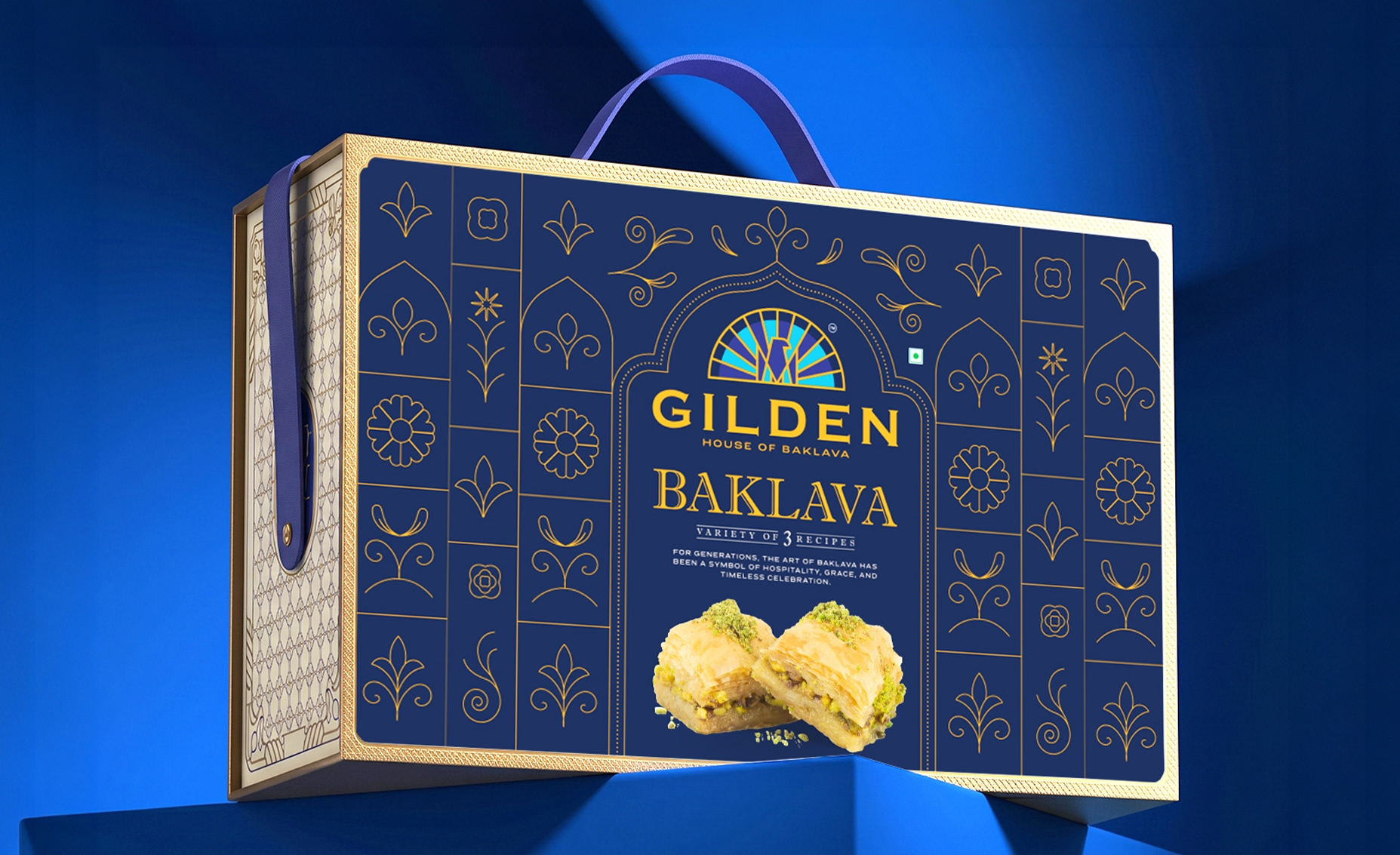
    Premium festive packaging begins with the outer box. The distinction between a premium box and a standard gift box is felt before it is seen. The board weight the thickness and rigidity of the box structure communicates quality the moment the recipient lifts it. A box that feels substantial communicates a gift that is substantial.

    On the surface, the design and finish of the outer box must communicate the brand and the occasion simultaneously. Foil blocking in gold or silver on a deep coloured base communicates festive luxury without resorting to generic festive clichés. Embossed brand marks communicate pride and permanence. Spot UV on selected design elements — a motif, a pattern, a brand symbol communicates craft attention that the recipient notices and remembers.

    The Interior: The Reveal Experience

    The moment the outer box is opened is the highest value brand experience in the entire gifting interaction. The interior reveal the arrangement of the products, the quality of the tissue or inner material, the scent if any, the visual composition seen on opening creates the emotional peak of the gift receiving experience.

    Brands that design the interior reveal with the same care they bring to the exterior surface create gift recipients who talk about the packaging as enthusiastically as the products inside. This word of mouth and the social media content it generates is the highest credibility marketing available.

    The Brand Story Card

    Every premium festive gift package should include a brand story card. Not a product list. Not a price guide. A story about the brand, the ingredients, the craft, the occasion, or a personal message from the brand to the recipient.

    The brand story card is the only element in the festive package that communicates through words rather than visuals. It is the moment the brand speaks directly to the recipient as an individual. Brands that use this opportunity well with warm, genuine, well written language that adds meaning to the gift build a relationship with the recipient that extends beyond the occasion.

    Corporate Gift Packaging: The B2B Premium Opportunity

    Corporate gifting in India is a multi thousand crore annual market and it is growing at pace alongside India’s corporate sector. The corporate gift buyer a procurement manager, a business owner, a marketing head is making a purchase decision that reflects on their organisation’s values and relationships.

    A corporate gift in premium branded packaging communicates: we value this relationship, we invest in quality, and we understand that how we give says something about who we are. A corporate gift in generic packaging communicates none of these things.

    • Minimum order quantity flexibility premium corporate gift packaging that can be ordered in practical quantities for corporate gifting budgets
    • Brand customisation options the outer box adapted with the gifting company’s brand rather than the product brand for corporate relationship gifting
    • Category range skincare sets, nutraceutical wellness hampers, premium snack collections, fragrance gifts all suited to different corporate gifting occasions and relationships
    • Sustainability credentials recycled board, natural fill materials, and minimal plastic increasingly important to corporate buyers with ESG commitments
    • Digital gifting integration QR codes in the package linking to personalised digital messages or brand content

    The Export Gifting Market: UAE and Singapore

    The Indian diaspora gifting market in Dubai, Abu Dhabi, and Singapore represents a premium gifting opportunity that most Indian brands are not currently addressing with purpose. Indians living abroad send and receive gifts for every major Indian festival and they do so in a retail environment where premium packaging is the baseline expectation, not the exception.

    Indian brands that develop export gifting formats compact, premium, airline friendly, internationally compliant and make them available through platforms that serve the diaspora market are accessing a gifting revenue stream that their domestic competitors are not reaching.

    The Indian festive season is not a calendar event. It is a brand building opportunity. The brands that invest in packaging as the primary product during this season build consumer relationships that sustain sales through every season of the year that follows.

      Ready to build a brand that commands your market? 

      Visit richestbranding.com  |  info@richestbranding.com

  • Bottling Desire: How Indian Perfume and Attar Brands Build Packaging That Commands Luxury Pricing

    Bottling Desire: How Indian Perfume and Attar Brands Build Packaging That Commands Luxury Pricing

    Of all the product categories in the world, fragrance is the one where the packaging most profoundly shapes the experience of the product itself. You cannot smell a perfume in a store before you open the bottle. You cannot trial it before you purchase. What you purchase, in the first instance, is entirely the brand promise and that promise is communicated almost entirely through the packaging.

    India has one of the world’s most extraordinary fragrance heritage traditions. The attar makers of Kannauj have been distilling pure botanical fragrances for over five centuries. Hyderabad’s oud and rose traditions carry the weight of Mughal courts. Lucknow’s ittar culture is woven into the cultural fabric of an entire civilisation. These are not niche craft traditions they are some of the most refined and respected fragrance lineages on the planet.

    And yet Indian perfume and attar brands are capturing only a fraction of the premium value that this heritage deserves particularly in the Gulf markets where oud, rose, and oriental fragrances command some of the highest price points in global perfumery. The product is exceptional. The packaging is too often the gap between what the brand is worth and what the consumer will pay.

    Why Fragrance Packaging Is More Than Packaging

    In the fragrance category, the bottle, the cap, the outer box, and the carry bag together constitute the product experience not merely the product container. The consumer does not separate the fragrance from its vessel. The weight of the bottle, the precision of the cap mechanism, the texture of the outer box, the way the ribbon is tied these are the experience of owning and using the fragrance.

    A luxury fragrance sold in a cheap bottle communicates a contradiction that the consumer resolves by downgrading their perception of the fragrance itself. The most exquisite oud in the world, presented in a basic glass vial with a printed sticker label, will be valued at the price point the packaging suggests not the price point the oud deserves.

    This is the single most important insight in fragrance brand building: the packaging does not support the fragrance. The packaging IS the fragrance, to the consumer who has not yet smelled it and to the consumer who gifts it, displays it, and describes it to others.

    The Design Language of Luxury Fragrance Packaging

    The Bottle as Sculpture

    In luxury fragrance, the bottle is not a container. It is a sculpture that the consumer displays. The shape of the bottle communicates the personality of the fragrance before the cap is removed. Geometric precision communicates modern luxury. Organic curves communicate sensuality and warmth. Angular drama communicates intensity and power.

    Indian attar and perfume brands entering the premium segment must approach bottle design with the same creative ambition that European fragrance houses bring to their iconic flacons. The bottle must be something the consumer wants to keep on display on a dressing table, a shelf, a desk. Because the displayed bottle is the most sustained brand impression a fragrance makes.

    Materials That Communicate Worth

    The material choices in luxury fragrance packaging communicate price point more directly than almost any other category. Heavy crystal glass signals absolute premium  weight itself is a luxury signal in fragrance. Frosted glass communicates refinement and restraint. Clear glass with metallic internal details communicates modern luxury.

    For caps and closures, the precision of the fit and the material of the cap are critical luxury signals. A magnetic closure that seats with a satisfying click communicates engineering quality. A heavy metal cap with a branded embossment communicates permanence and craft. A cap that wobbles or sits imprecisely communicates exactly the opposite regardless of how beautiful the bottle beneath it is.

    The Outer Box as the First Impression

    In fragrance, the outer box is the first physical experience of the brand. It is what the consumer sees in the store before the bottle is revealed. It is what the gift recipient holds before unwrapping. It is the first chapter of the brand story.

    Luxury fragrance outer boxes must communicate: the brand identity through consistent visual language, the character of the fragrance through colour and texture, and the quality of the brand through material and finish. The weight of the board, the precision of the scoring, the quality of the print, the choice of surface finish soft touch, foil blocking, embossing, spot UV all communicate quality before the box is opened.

    The Attar Presentation System

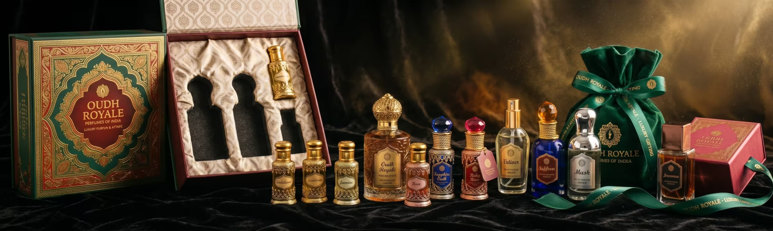
    Traditional Indian ittardans the small decorative bottles used to store and apply attar are among the most beautiful objects in Indian craft tradition. The finest ittardans, made in Firozabad and Moradabad, are genuine works of art.

    For Indian attar brands targeting the Gulf market, where oud and oriental fragrance culture is the dominant perfumery tradition, the presentation of attar in high quality ittardans packaged in a gift set with a branded wooden or velvet lined box positions the product in the luxury gifting category where the highest prices and the most emotionally valuable consumer relationships are built.

    The Gulf Market Opportunity for Indian Fragrance Brands

    The UAE, Saudi Arabia, and wider GCC markets represent the single highest value opportunity for Indian fragrance brands. The Gulf fragrance market is one of the most developed and sophisticated in the world. Consumers in Dubai and Riyadh spend more per capita on fragrance than consumers in almost any other market globally.

    And the fragrance preferences of Gulf consumers deep oud, rose and oud combinations, amber, musk, incense based orientals align perfectly with India’s native fragrance heritage. The Indian attar tradition and the Gulf fragrance culture are not just compatible they share centuries of common history through the spice and fragrance trade routes.

    • Arabic brand name integration in packaging design the brand must feel native to the Gulf market, not imported into it
    • Oud and rose positioned as luxury hero ingredients not as generic descriptors but as provenance stories with specific origins
    • Gift packaging formats sized and designed for the Gulf gifting culture generous, impressive, and appropriate for significant occasions
    • Halal certification prominently displayed essential for the Saudi market and reassuring across the GCC
    • Refillable bottle formats growing strongly in the Gulf premium segment as sustainability intersects with luxury

    India’s fragrance heritage has produced some of the most compelling and distinctive olfactory experiences in the world. The brands that package this heritage at the standard the Gulf and UK luxury fragrance market demands will find that the premium pricing available to them is extraordinary.

    The scent is already world class. The packaging just needs to say so.

      Ready to build a brand that commands your market? 

      Visit richestbranding.com  |  info@richestbranding.com

  • From Feed to Shelf: How Indian Consumer Brands Build Social Media Strategies That Drive Real Purchase Decisions

    From Feed to Shelf: How Indian Consumer Brands Build Social Media Strategies That Drive Real Purchase Decisions

    Social media has fundamentally changed how Indian consumers discover, evaluate, and develop loyalty to consumer brands. The purchase journey that once ran from television advertising to retail shelf now includes Instagram feeds, YouTube reviews, WhatsApp recommendations, and LinkedIn thought leadership sometimes all before the consumer ever sees the physical product.

    For FMCG, skincare, nutraceutical, and beverage brands, this shift creates both an extraordinary opportunity and a common trap. The opportunity: a brand with a compelling social media presence can build consumer awareness and purchase intent at a fraction of the cost of traditional advertising. The trap: most Indian consumer brands are active on social media without being strategic on social media creating content that generates likes without generating revenue.

    At Richest Branding, we work with consumer brands across India and international markets to build social media strategies that are connected to the physical brand system the packaging, the print materials, the retail presence rather than existing as a separate activity managed by a separate team with a separate brief.

    Why Social Media Strategy Must Begin with Brand Strategy

    The most common social media mistake Indian consumer brands make is starting with content before starting with brand. They hire a social media agency or an in house content creator, give them the product and a content calendar, and hope that posting consistently will build brand equity.

    It rarely does. Because content without brand strategy produces content that is visually inconsistent, tonally inconsistent, and audience inconsistent. The consumer sees posts that look different week to week, sound different month to month, and seem aimed at different people across different posts. The result is a feed that demonstrates activity but communicates no coherent brand identity.

    Social media brand strategy begins where all brand strategy begins: with a clear articulation of who the brand is, who it is for, what it stands for, and what it will consistently say and show. This is not a content calendar. It is a brand framework. And without it, no content calendar will build the brand equity that drives purchase.

    Richest Branding builds social media strategies as an extension of the packaging and brand system not as a separate activity. The visual language, the communication voice, and the content values that govern the packaging design are the same ones that govern the social media content. This integration is what creates the brand consistency that consumers recognise, trust, and buy from.

    The Content Architecture That Converts

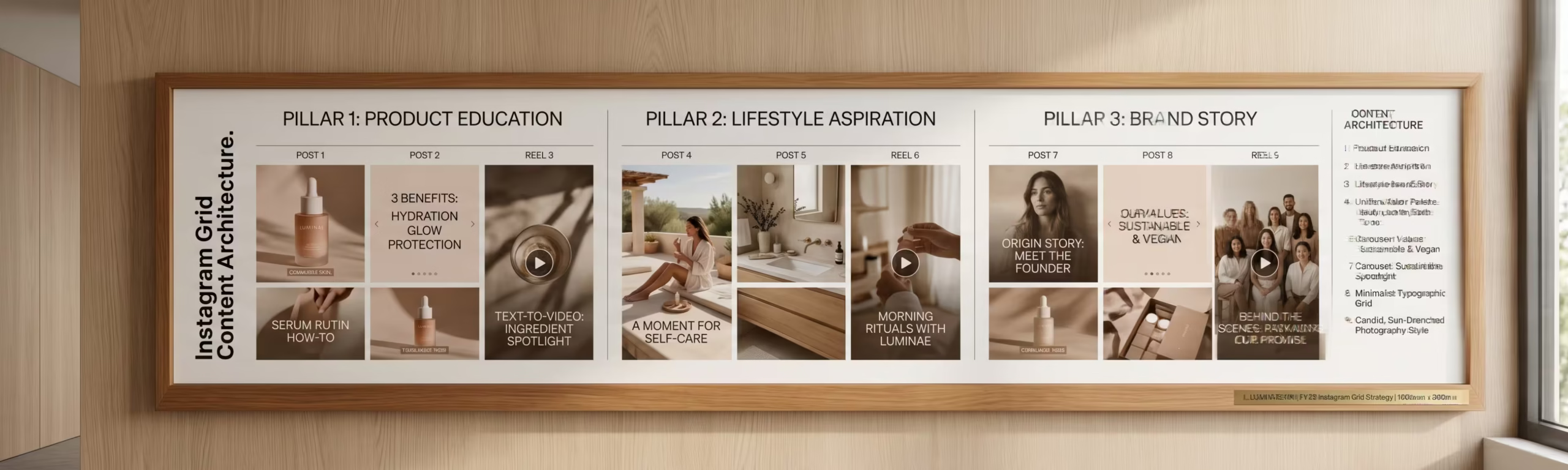
    Content Pillar 1: Product and Packaging as Content

    For consumer brands with premium packaging, the product itself is the most powerful content asset. A skincare serum in a beautifully designed frosted glass bottle, photographed on marble with botanical elements, generates more organic engagement than a generic lifestyle post. A spice brand’s packaging, styled in a kitchen context with the finished dish, communicates appetite appeal and brand aesthetic simultaneously.

    The connection between packaging quality and social media content quality is direct: brands that invest in premium packaging design have a content advantage on social media that brands with generic packaging cannot close with production budget alone. This is one of the most practical arguments for packaging investment that Richest Branding makes to every client the packaging pays for itself in the content it generates.

    Content Pillar 2: Brand Story and Founder Voice

    The most trusted content on any social media platform is authentic human voice. For consumer brands, this typically means the founder’s voice the person behind the product, the reason the brand exists, the values that inform every decision from ingredient sourcing to packaging design to customer service.

    Indian consumers particularly in the premium segments that skincare, nutraceutical, and artisan food brands target respond strongly to founder authenticity. They want to know who made this, why they made it, and whether the values behind the brand are genuine. Founder content does not need to be polished to the standard of product photography. It needs to be honest.

    Content Pillar 3: Education and Category Authority

    Consumer brands that educate their audience build a relationship that goes beyond the product transaction. A skincare brand that teaches its audience about specific actives, about skin type compatibility, about layering serums correctly is building the kind of category authority that drives purchase consideration beyond impulse.

    An Indian spice brand that teaches its audience about the specific region its turmeric comes from, about the difference between curcumin concentrations, about the traditional culinary applications of a specific blend is building brand trust through knowledge that no advertising claim can replicate.

    Content Pillar 4: Community and Social Proof

    User generated content consumer photographs of the product, reviews shared publicly, reposts of mentions is the highest credibility content a consumer brand can have. It is not created by the brand. It is earned by the product experience and the packaging quality that prompted someone to share it.

    Building a social media strategy that actively encourages, celebrates, and amplifies user generated content is one of the most effective and most overlooked community building strategies available to Indian consumer brands. The brands that do this consistently build communities that market for them and that is a commercial asset that compounds over time.

    The Print and Digital Integration: Where Most Brands Miss

    At Richest Branding, we build social media strategies that are integrated with the print materials and physical brand system because this is where the real brand experience lives.

    The brand identity that lives on the packaging also lives on the Instagram feed. The photography style that makes the product beautiful in the retail environment also makes it beautiful on social media. The brand voice that writes the back panel copy also writes the Instagram captions. The colour system that makes the product stand out on a Carrefour shelf also makes the Instagram grid immediately recognisable.

    This integration across physical packaging, print materials, retail presence, and digital social media is what transforms a business with a product into a brand with a community. And a brand with a community is the most durable competitive asset in consumer goods. It cannot be copied by price alone, it cannot be erased by a competitor’s advertising spend, and it compounds in value every year it is consistently built.

      Ready to build a brand that commands your market? 

      Visit richestbranding.com  |  info@richestbranding.com

  • Who Are You Talking To? How Defining Your Target Audience Transforms Your Brand Packaging and Marketing Strategy

    Who Are You Talking To? How Defining Your Target Audience Transforms Your Brand Packaging and Marketing Strategy

    There is a question at the heart of every successful brand that surprisingly few Indian FMCG, skincare, and consumer goods businesses have answered with real precision: who exactly is our product for?

    Not a general description. Not a demographic range. A specific, richly understood human being the person whose problem the product solves, whose aspirations the brand speaks to, whose purchasing behaviour the packaging is designed to trigger.

    When this question is answered with precision, every downstream decision packaging design, price point, retail channel, marketing communication, social media strategy becomes clearer, more coherent, and more effective. When it is not answered, brands make expensive compromises: packaging that tries to speak to everyone and compels no one, pricing that is too high for the mass market and too low for the premium market, marketing that reaches a wide audience without converting any of them.

    The target audience definition workshop is one of the most valuable strategic exercises the Richest Branding team conducts with clients before any design work begins. What we discover in that workshop consistently changes the packaging brief, the marketing strategy, and the brand’s market position in ways that produce measurably better commercial outcomes.

    The Three Dimensions of Target Audience Understanding

    Dimension 1: Demographics Who They Are

    Demographics are the starting point, not the destination. Age, gender, income level, geography, household composition, occupation these facts describe the audience but do not explain why they buy. A 28 year old working woman in Bengaluru with a household income above 12 lakhs per annum is a demographic description. It tells you which shelf height to target in modern trade and which social media platform to advertise on. It does not tell you why she will choose your skincare brand over the five adjacent options.

    Dimension 2: Psychographics What They Value

    Psychographics are where brand strategy becomes genuinely powerful. The values, aspirations, anxieties, and self image of your target consumer determine which brand messages resonate and which are ignored. The same demographic woman in Bengaluru may be driven primarily by efficacy and clinical proof or by natural and sustainable ingredients or by the social status of carrying a premium brand or by the recommendation of a community she trusts.

    Each of these psychographic profiles demands a different brand identity, a different packaging design, a different marketing message, and often a different price point. Treating them as interchangeable because they share the same demographic is the root cause of most brand underperformance in Indian consumer goods.

    Dimension 3: Behavioural Insights How They Buy

    Where does this consumer discover new brands? What role does packaging play in her purchase decision at the shelf versus on a mobile screen? How important is brand reputation versus product reviews? Does she buy on impulse or after deliberate consideration? Does she buy for herself or as gifts? Is she price sensitive or value sensitive and what is the difference in her mind?

    The answers to these questions are the practical design inputs that determine packaging hierarchy, marketing channel priority, retail strategy, and pricing architecture. Without them, brand strategy is built on assumption. With them, it is built on evidence.

    The Market Positioning Map: Finding the Space Your Brand Can Own

    Once the target audience is defined with precision, market positioning becomes a structured exercise rather than a creative one. The positioning map places all the existing brands in the category against two key axes chosen based on what the target audience most values and identifies the spaces that are unoccupied or underserved.

    In the Indian skincare market, the two axes might be ‘clinical efficacy vs natural and holistic’ and ‘mass accessible vs premium luxury’. In the Indian spice market, the axes might be ‘traditional and heritage’ vs ‘modern and global’ and ‘commodity pricing’ vs ‘premium provenance’. In the Indian nutraceutical market, the axes might be ‘pharmaceutical grade formulation’ vs ‘natural supplement’ and ‘condition specific targeting’ vs ‘general wellness’.

    Every category has its own map. And every map has positions that are overcrowded where ten brands are fighting for the same consumer with the same message and positions that are underserved, where a brand with the right product, the right packaging, and the right marketing could build a durable market position with significantly less competitive pressure.

    How Market Positioning Directly Determines Packaging Design

    • A brand positioned as clinical premium uses white, clean packaging with pharmaceutical typography and ingredient transparency the design communicates precision
    • A brand positioned as natural and artisan uses kraft materials, hand lettered typography, and botanical imager the design communicates authenticity
    • A brand positioned as luxury accessible uses high quality materials at surprising price points, with restrained sophisticated design the packaging communicates premium without intimidation
    • A brand positioned as performance and results uses bold graphic design, strong claims hierarchy, and evidence forward communication the design communicates efficacy
    • A brand positioned as heritage and tradition uses rich colours, cultural motifs executed with modern refinement, and founder and provenance storytelling the design communicates trust built over time

    At Richest Branding, the connection between market positioning and packaging design is not a creative choice it is a strategic translation. Our team works through the positioning framework with every client and then designs packaging that expresses that positioning with precision. The result is packaging that speaks directly to the right consumer, differentiates clearly from the right competitors, and communicates exactly the value the brand is claiming.

    Brands that skip this work that start with design before completing the positioning produce packaging that looks good but does not sell. Brands that do this work first produce packaging that wins the shelf, earns consumer trust, and builds the kind of brand equity that compounds over years.

      Ready to build a brand that commands your market? 

      Visit richestbranding.com  |  info@richestbranding.com

  • Study the Shelf Before You Design the Pack: How Competitive Shelf Analysis Builds FMCG Brands That Win

    Study the Shelf Before You Design the Pack: How Competitive Shelf Analysis Builds FMCG Brands That Win

    The most common and most expensive mistake in FMCG packaging design is designing in isolation sitting in a studio, looking at moodboards and competitor references on a screen, and producing a design that looks good as an isolated object. Then watching that same design disappear into the competitive noise of the actual retail shelf it was built to stand out from.

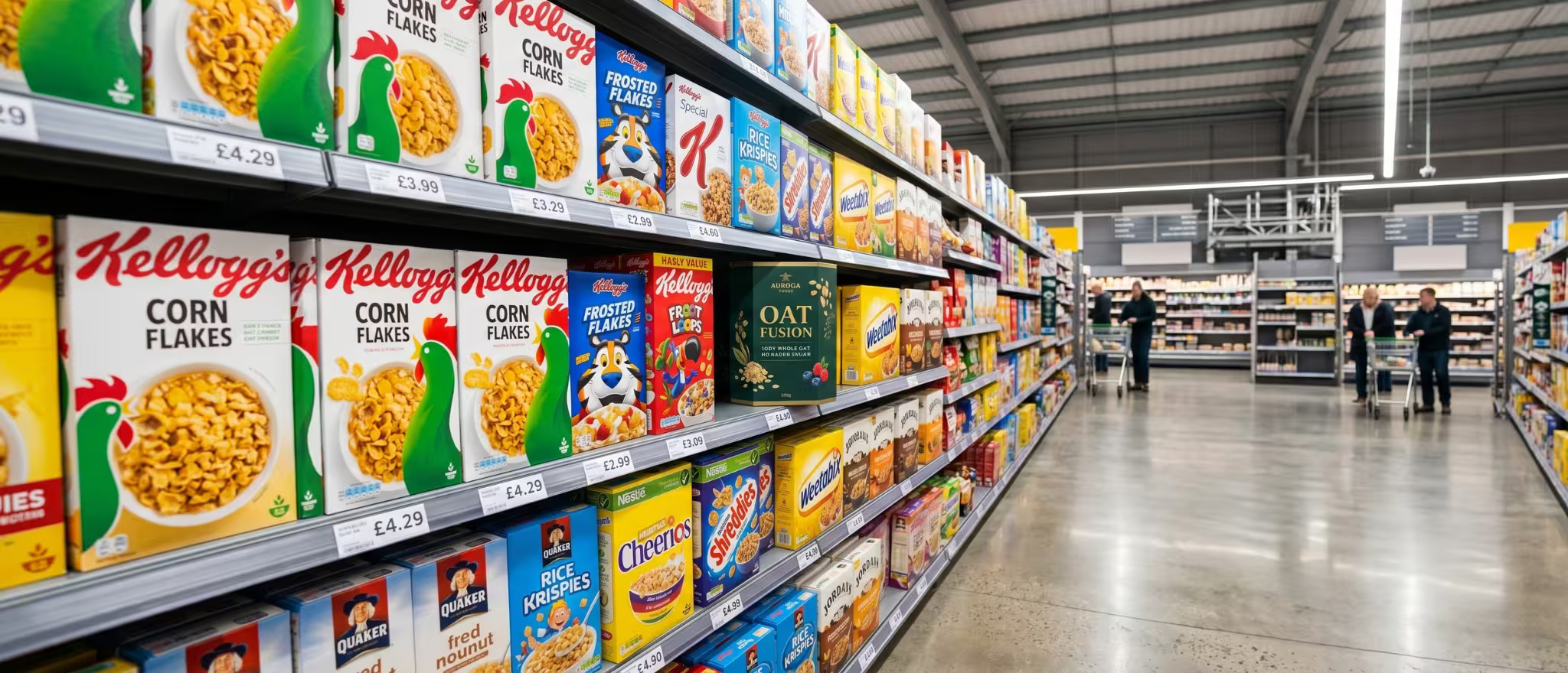
    Great FMCG packaging is not designed in isolation. It is designed in context. And the most important context is the shelf the precise retail environment where the product will compete for attention against every other product in the category, simultaneously, under real lighting conditions, for a real consumer with three seconds of attention and twenty other things on their shopping list.

    At Richest Branding, shelf competitor analysis is a foundational step in every packaging design engagement. Before a single design element is created, our team studies the shelf. Not the internet. The actual shelf in modern trade, in general trade, in the export retail environments the brand is targeting. What we find in that study shapes every design decision that follows.

    What a Shelf Competitor Analysis Actually Reveals

    The Colour Map of the Category

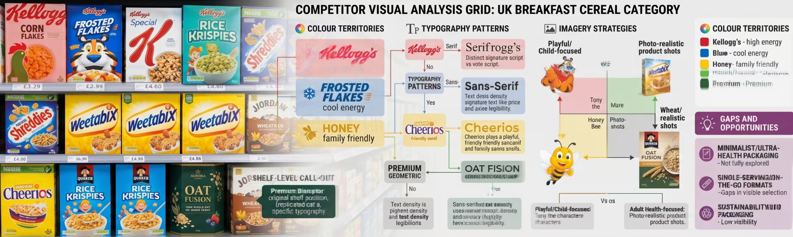
    Every FMCG category has a colour map a pattern of which colours are being used by which competitors, which colours have become so associated with specific brands that using them would create confusion, and which colour territories are genuinely unowned.

    In the spice category, for example, the dominant colours across Indian brands tend toward reds, golds, and ochres communicating warmth, heat, and traditional quality. A new spice brand that enters the category with a deep teal or slate grey packaging may be taking a significant risk breaking category code too dramatically or may be making a brilliant strategic move to own a premium, differentiated position that none of the existing brands occupy.

    The shelf competitor colour map tells you which choice is which. Without it, you are guessing.

    The Typography Voice of the Category

    What typefaces are the existing brands in the category using? Are they heavy and traditional, suggesting heritage and trust? Light and modern, suggesting premium and sophistication? Script and handwritten, suggesting artisan craft and authenticity? The typography voice of the category is a set of consumer expectations implicit rules about what this category looks like that a new or rebranding brand must consciously decide to follow, partially follow, or deliberately break.

    At Richest Branding, this analysis informs one of our core strategic recommendations: whether a brand should seek to earn credibility by partially respecting category conventions while introducing differentiation, or whether the category conventions themselves are so uniform that a deliberate break from them is the most powerful positioning available.

    The Imagery Language of the Category

    What imagery is being used by existing competitors? Product photography, ingredient photography, lifestyle imagery, illustration, abstract graphic design the imagery language of a category communicates what kind of brand the consumer expects to encounter here. A category dominated by ingredient close up photography can be powerfully disrupted by a brand that uses lifestyle photography. A category of lifestyle brands can be disrupted by a brand that leads with ingredient provenance.

    The Four Competitive Positioning Options on the Shelf

    Option 1: Category Leader Positioning

    Some brands choose to communicate through their packaging that they are the category leader dominant, established, trusted. This positioning uses the most credible visual language in the category: the strongest colours, the most confident typography, the most premium materials. It works best for brands that genuinely have the market position to support this claim either through history, through distribution scale, or through product quality that is provably superior.

    Option 2: Premium Challenger Positioning

    The most common high value positioning for new FMCG and skincare brands is the premium challenger a brand that enters an established category and signals, through every packaging decision, that it is the premium alternative to the existing options. This positioning typically requires breaking the category’s visual conventions rather than following them, using better materials and finishes than the established brands, and communicating a brand story that the mass market brands cannot claim.

    Option 3: Niche Specialist Positioning

    Some brands win by owning a specific, deeply understood segment of the category rather than competing across the full shelf. A spice brand that owns the single origin premium segment. A snack brand that owns the high protein fitness segment. A skincare brand that owns the Ayurvedic clinical active segment. Niche specialist positioning on shelf is communicated through precision and focus a packaging design that speaks with great clarity to a specific consumer rather than vague appeal to everyone.

    Option 4: Disruptor Positioning

    Occasionally, a brand has the product, the story, and the brand team to enter a category and break the visual conventions entirely. The disruptor uses packaging design to signal: this is not another version of what you already know. This is something new. This positioning carries the highest risk and the highest reward and requires the deepest understanding of the shelf it is disrupting.

    How Richest Branding Applies Shelf Analysis to Design

    Our team at Richest Branding brings practical retail experience across Indian modern trade, general trade, and international export markets. We have studied shelves in Ahmedabad, Mumbai, Bengaluru, Dubai, and Singapore. We understand the specific visual environments our clients’ products will compete in not as a theoretical framework, but as a practical design input that shapes every packaging decision.

    When we present a packaging design to a client, we present it in context: shown on a simulated shelf alongside the actual competitor packaging we studied. We are not showing you a beautiful object. We are showing you a competitive weapon designed to win a specific battle on a specific shelf, against specific opponents, for a specific consumer.

    That is the difference between packaging design and packaging strategy. And it is the difference Richest Branding brings to every engagement.

      Ready to build a brand that commands your market? 

      Visit richestbranding.com  |  info@richestbranding.com

  • Built for the World: How Indian Brands Design Export Quality Packaging That Earns International Shelf Space

    Built for the World: How Indian Brands Design Export Quality Packaging That Earns International Shelf Space

    Every year, Indian brands with genuinely exceptional products spices, skincare, nutraceuticals, beverages, snacks attempt to enter international retail markets in the UAE, Saudi Arabia, Singapore, Australia, the UK, and Germany. A fraction succeed. The majority do not.

    The product is rarely the problem. India produces food, skincare, and consumer goods at a quality standard that compares favourably with the best in the world. The problem almost universally in the failed export attempts we have audited at Richest Branding is the packaging.

    Export quality packaging is not simply packaging that meets international regulatory requirements. It is packaging that meets the visual, material, and brand communication standards of the international retail environment it is entering. These are two very different things. And confusing them is the most expensive mistake an Indian brand can make in its export journey.

    What International Retail Buyers Actually Evaluate

    When a category buyer at Carrefour UAE, Lulu Hypermarket, Cold Storage Singapore, Woolworths Australia, Sainsbury’s UK, or a Whole Foods regional buyer in the USA reviews a product submission from an Indian brand, they are making a holistic evaluation that goes far beyond regulatory compliance.

    They are asking: does this brand look like it belongs on a shelf next to the brands our customers already trust? Is the packaging quality consistent with the price point being proposed? Is the brand identity strong enough to build consumer recognition over multiple purchase cycles? Are the regulatory requirements for our specific market met completely and correctly?

    The Indian brands that earn these placements consistently do one thing differently from the brands that do not: they design for the specific market from the start, not after the domestic design is finalised.

    At Richest Branding, our export packaging work begins with market research into the specific retail environment the brand is targeting. We study the shelf: who are the brands already there, what are the design conventions of the category in that market, and what would make our client’s product both compliant and distinctive in that specific retail context.

    The International Packaging Standards Every Indian Export Brand Must Meet

    UAE and Saudi Arabia

    The Gulf retail market is one of the most accessible and highest value export destinations for Indian brands. The Indian diaspora is enormous. The demand for Indian food, spices, and beauty products is sustained and growing. But the regulatory and visual requirements are specific.

    • Arabic language: all key information product name, ingredient list, nutritional information, usage instructions — must be in Arabic, designed as part of the label, not added as a sticker
    • Halal certification: prominently displayed with the certifying body identified not a generic Halal text statement
    • SFDA registration for Saudi Arabia: required before the product can be listed in modern trade
    • Country of origin: clearly stated Made in India is a positive differentiator in Gulf markets, not something to minimise
    • Net weight in metric units with both English and Arabic labelling

    Singapore and Australia

    Singapore and Australian retail buyers have among the most rigorous packaging standard expectations of any export market for Indian brands. Both markets have large Indian diaspora communities but also mainstream retail buyers evaluating Indian products alongside Korean, Japanese, and European equivalents.

    • Singapore AVA compliance: all food and cosmetic products require specific labelling format, ingredient declaration, and shelf life communication
    • Australia FSANZ and TGA: strict nutritional labelling formats, allergen declaration requirements, and for nutraceuticals, therapeutic goods registration where applicable
    • English must be the primary label language in both markets translations are secondary
    • Photography and imagery standards: no misleading serving size or results imagery
    • Barcode format: GS1 compliant barcodes are mandatory for modern trade listing in both markets

    UK, Germany, and the European Union

    The UK and EU markets represent the most sophisticated and brand conscious consumer environments for Indian export products. The premium and speciality food, beauty, and wellness segments in these markets are actively seeking authentic, provenance led Indian products but the packaging standard required is exceptionally high.

    • UK labelling: post Brexit UK specific regulations for allergen labelling, nutrition declaration, and country of origin apply separately from EU rules
    • EU General Food Law and Cosmetics Regulation: comprehensive requirements for both food and cosmetic categories
    • Language requirements: primary language of the destination country required on front of pack in the EU
    • Sustainability credentials: recyclability and environmental labelling is increasingly mandatory and always a consumer expectation in these markets

    The Shelf Competitor Design Study: How Richest Branding Builds Export Winning Packaging

    One of the most valuable services Richest Branding provides to brands preparing for international market entry is a shelf competitor design study. Before any export packaging design work begins, our team conducts a structured analysis of the target market’s retail shelf.

    We identify the existing brands in the category, analyse their packaging design language, understand the visual conventions that communicate trust and quality in that specific market, identify the gaps the positions on the shelf that are not yet owned and design our client’s packaging to occupy a distinctive and defensible position in that specific competitive context.

    This is not a theoretical exercise. It is a practical, market specific design process that produces packaging designed to win on a specific shelf, against specific competitors, for a specific consumer. The difference between this approach and designing export packaging based on the domestic design alone is the difference between packaging that earns shelf placement and packaging that is politely declined.

    International Market Positioning Begins at the Packaging Brief

    Market positioning the specific place a brand occupies in the consumer’s mind relative to the competitors available to them is communicated most powerfully through packaging. In an international retail context where the consumer has no pre existing relationship with an Indian brand, the packaging is the entire brand communication.

    The Indian skincare brand that enters the Singapore market must be positioned clearly premium Ayurvedic, clinical efficacy, natural and sustainable, accessible and everyday before the packaging design begins. The positioning determines every design decision. Without it, the packaging is a guess. With it, the packaging is a strategy.

    At Richest Branding, we have helped brands across FMCG, skincare, nutraceuticals, spices, and beverages build international market positions that began at the packaging brief and were validated by the international retail placements that followed. The practical knowledge our team has built across these markets is the foundation that every export packaging engagement is built on.

      Ready to build a brand that commands your market? 

      Visit richestbranding.com  |  info@richestbranding.com

  • Your Packaging Is Your Most Powerful Marketing Tool: How Smart FMCG and Skincare Brands Sell Without Spending on Ads

    Your Packaging Is Your Most Powerful Marketing Tool: How Smart FMCG and Skincare Brands Sell Without Spending on Ads

    Most Indian FMCG and skincare brands think of marketing as the money they spend on digital advertising, influencer campaigns, and trade promotions. Packaging is treated as a separate, operational matter something the production team manages after the marketing strategy is set.

    This thinking costs businesses more than any advertising budget they will ever set. Because the most powerful marketing touchpoint in the entire consumer journey is not the Instagram ad. It is not the influencer review. It is not the in store activation. It is the moment the consumer stands in front of your product on a shelf or receives it at their door and decides whether it is worth their money and their trust.

    That moment is entirely owned by the packaging. And at Richest Branding, we have spent years working with FMCG, skincare, nutraceutical, and beverage brands across India and international markets to prove one thing consistently: when the packaging is treated as the primary marketing strategy, not a production afterthought, the commercial results follow.

    The Marketing Mathematics of Packaging

    Consider the economics. A digital advertising campaign reaches a defined audience for a defined period at a defined cost per impression. When the budget ends, the impressions end. The marketing stops.

    A packaging design, once created, works without pause. It appears in every store the product reaches. It sits on the consumer’s kitchen shelf, bathroom cabinet, or dining table for weeks or months a constant brand presence in the spaces most personal to the consumer. It travels in shopping bags, gets photographed for social media, gets recommended to friends. It generates word of mouth, user generated content, and repeat purchase without a single additional rupee of media spend.

    This is not a diminishment of digital marketing it is a recognition of packaging’s disproportionate marketing value. The brands that understand both, and build both to the same standard, build brand equity at a pace that neither alone achieves.

    At Richest Branding, we work with our clients to develop packaging that functions as a complete marketing communication not just a container. Our team brings together brand strategy, design, and print material expertise to ensure that every pack works as hard as the best advertising campaign your brand has ever run.

    The Five Ways Packaging Functions as Marketing

    1. Packaging as the First Advertisement

    Before a consumer sees your digital ad, reads your brand story, or hears a recommendation from a friend they will likely encounter your product on a shelf or in a search result thumbnail. In that moment, the packaging is performing the complete job of a well crafted advertisement: it must capture attention, communicate the product promise, differentiate from competition, and generate a desire to own.

    The difference between an advertisement and packaging is that the packaging must do all of this within 2 to 3 seconds, at physical scale, in a context surrounded by competitor products. The discipline required is greater and the reward for getting it right is a marketing touchpoint that repeats itself millions of times without additional spend.

    2. Packaging as Social Content

    In the age of Instagram and YouTube unboxing, premium packaging generates organic social content that money cannot buy. When a consumer receives a beautifully packaged skincare order, they photograph it. When a nutraceutical brand arrives in packaging that feels genuinely premium, they share it. When a spice brand’s packaging sits beautifully on a kitchen shelf, it appears in home interior content.

    Every piece of user generated content featuring your packaging is a trust signal that reaches the creator’s audience with a credibility that paid advertising cannot replicate. Designing packaging with social shareability as a deliberate objective asking at every stage whether a consumer would choose to photograph this is one of the highest return decisions a brand can make in its packaging brief.

    3. Packaging as Brand Relationship

    The consumer who buys your product for the first time is evaluating the packaging experience alongside the product experience. If the packaging delivers a moment of pleasure through material quality, through an unexpected design detail, through a back panel that makes them smile or learn something that packaging is building an emotional relationship with the brand.

    Repeat purchase in FMCG and skincare is built more on brand feeling than on product superiority alone. Consumers repurchase brands they feel good about. Packaging is the most consistent carrier of that feeling.

    4. Packaging as Print Marketing Material

    At Richest Branding, we understand that packaging design does not exist in isolation it is one component of a complete print and brand communications system. The same brand identity that governs the packaging design must govern the product catalogue, the sales brochure, the exhibition stand, the point of sale display, and the retailer sell sheet.

    When these materials work as a unified system when the retailer’s buyer receives a sell sheet that looks as premium as the product packaging it is selling the brand communicates a level of professionalism and commitment that competitors without integrated print communications cannot match. This is practical, real world brand strategy, not theory.

    5. Packaging as Market Positioning Statement

    Every packaging design decision material choice, colour palette, typography, format, finish is a market positioning statement. It tells the retailer, the distributor, the consumer, and the competitor exactly which market segment the brand is claiming.

    The packaging that communicates premium commands premium shelf placement and justifies premium pricing. The packaging that communicates mass market is negotiated on price alone. The choice between these outcomes is made at the packaging design brief, not at the negotiating table.

    How Richest Branding Builds Packaging That Markets

    Our approach at Richest Branding is built on practical experience across FMCG, skincare, nutraceuticals, beverages, spices, and premium consumer goods. We do not deliver packaging design in isolation we deliver packaging design as part of an integrated brand and marketing system.

    • Brand strategy workshop before any design work understanding the target consumer, the competitive landscape, and the market position the brand is claiming
    • Packaging design developed simultaneously with print marketing materials catalogue, sell sheet, exhibition collateral, retail display so all elements speak the same visual language
    • Export packaging designed for specific international markets from day one UAE, Saudi Arabia, Singapore, Australia, UK with regulatory requirements built in, not retrofitted
    • Social media content guidance built around the packaging design knowing which elements photograph best and how to build an Instagram strategy around the packaging asset
    • Print production oversight our team works directly with print vendors to ensure that what was designed is what gets printed, at the quality the brand was built to communicate

    The brands that build the most durable market positions in competitive FMCG and skincare are not always the ones with the biggest advertising budgets. They are the ones that treat every packaging touchpoint as a marketing opportunity and execute it with the consistency and quality that turns a product into a brand consumers trust.

      Ready to build a brand that commands your market? 

      Visit richestbranding.com  |  info@richestbranding.com