Blog

  • Built for the World: How Indian Brands Design Export Quality Packaging That Earns International Shelf Space

    Built for the World: How Indian Brands Design Export Quality Packaging That Earns International Shelf Space

    Every year, Indian brands with genuinely exceptional products spices, skincare, nutraceuticals, beverages, snacks attempt to enter international retail markets in the UAE, Saudi Arabia, Singapore, Australia, the UK, and Germany. A fraction succeed. The majority do not.

    The product is rarely the problem. India produces food, skincare, and consumer goods at a quality standard that compares favourably with the best in the world. The problem almost universally in the failed export attempts we have audited at Richest Branding is the packaging.

    Export quality packaging is not simply packaging that meets international regulatory requirements. It is packaging that meets the visual, material, and brand communication standards of the international retail environment it is entering. These are two very different things. And confusing them is the most expensive mistake an Indian brand can make in its export journey.

    What International Retail Buyers Actually Evaluate

    When a category buyer at Carrefour UAE, Lulu Hypermarket, Cold Storage Singapore, Woolworths Australia, Sainsbury’s UK, or a Whole Foods regional buyer in the USA reviews a product submission from an Indian brand, they are making a holistic evaluation that goes far beyond regulatory compliance.

    They are asking: does this brand look like it belongs on a shelf next to the brands our customers already trust? Is the packaging quality consistent with the price point being proposed? Is the brand identity strong enough to build consumer recognition over multiple purchase cycles? Are the regulatory requirements for our specific market met completely and correctly?

    The Indian brands that earn these placements consistently do one thing differently from the brands that do not: they design for the specific market from the start, not after the domestic design is finalised.

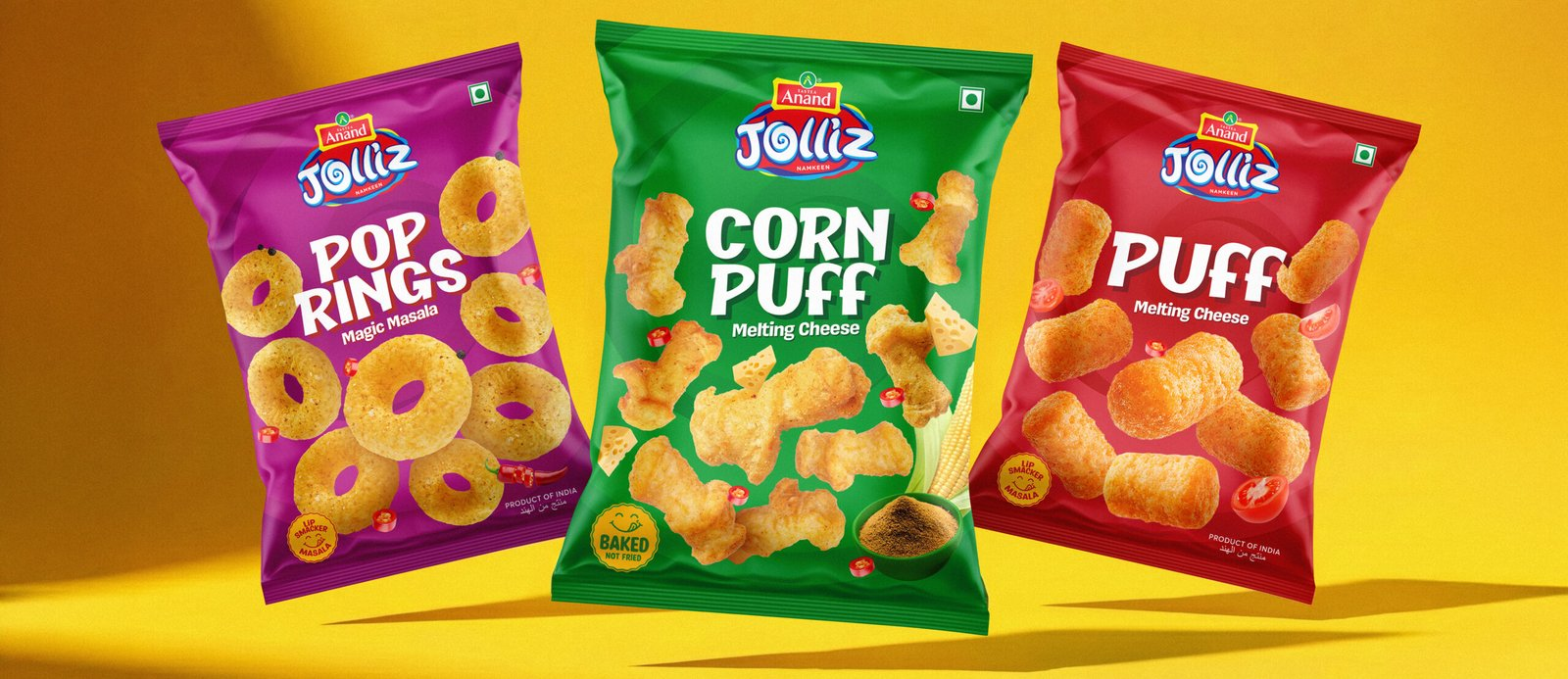
    At Richest Branding, our export packaging work begins with market research into the specific retail environment the brand is targeting. We study the shelf: who are the brands already there, what are the design conventions of the category in that market, and what would make our client’s product both compliant and distinctive in that specific retail context.

    The International Packaging Standards Every Indian Export Brand Must Meet

    UAE and Saudi Arabia

    The Gulf retail market is one of the most accessible and highest value export destinations for Indian brands. The Indian diaspora is enormous. The demand for Indian food, spices, and beauty products is sustained and growing. But the regulatory and visual requirements are specific.

    • Arabic language: all key information product name, ingredient list, nutritional information, usage instructions — must be in Arabic, designed as part of the label, not added as a sticker
    • Halal certification: prominently displayed with the certifying body identified not a generic Halal text statement
    • SFDA registration for Saudi Arabia: required before the product can be listed in modern trade
    • Country of origin: clearly stated Made in India is a positive differentiator in Gulf markets, not something to minimise
    • Net weight in metric units with both English and Arabic labelling

    Singapore and Australia

    Singapore and Australian retail buyers have among the most rigorous packaging standard expectations of any export market for Indian brands. Both markets have large Indian diaspora communities but also mainstream retail buyers evaluating Indian products alongside Korean, Japanese, and European equivalents.

    • Singapore AVA compliance: all food and cosmetic products require specific labelling format, ingredient declaration, and shelf life communication
    • Australia FSANZ and TGA: strict nutritional labelling formats, allergen declaration requirements, and for nutraceuticals, therapeutic goods registration where applicable
    • English must be the primary label language in both markets translations are secondary
    • Photography and imagery standards: no misleading serving size or results imagery
    • Barcode format: GS1 compliant barcodes are mandatory for modern trade listing in both markets

    UK, Germany, and the European Union

    The UK and EU markets represent the most sophisticated and brand conscious consumer environments for Indian export products. The premium and speciality food, beauty, and wellness segments in these markets are actively seeking authentic, provenance led Indian products but the packaging standard required is exceptionally high.

    • UK labelling: post Brexit UK specific regulations for allergen labelling, nutrition declaration, and country of origin apply separately from EU rules
    • EU General Food Law and Cosmetics Regulation: comprehensive requirements for both food and cosmetic categories
    • Language requirements: primary language of the destination country required on front of pack in the EU
    • Sustainability credentials: recyclability and environmental labelling is increasingly mandatory and always a consumer expectation in these markets

    The Shelf Competitor Design Study: How Richest Branding Builds Export Winning Packaging

    One of the most valuable services Richest Branding provides to brands preparing for international market entry is a shelf competitor design study. Before any export packaging design work begins, our team conducts a structured analysis of the target market’s retail shelf.

    We identify the existing brands in the category, analyse their packaging design language, understand the visual conventions that communicate trust and quality in that specific market, identify the gaps the positions on the shelf that are not yet owned and design our client’s packaging to occupy a distinctive and defensible position in that specific competitive context.

    This is not a theoretical exercise. It is a practical, market specific design process that produces packaging designed to win on a specific shelf, against specific competitors, for a specific consumer. The difference between this approach and designing export packaging based on the domestic design alone is the difference between packaging that earns shelf placement and packaging that is politely declined.

    International Market Positioning Begins at the Packaging Brief

    Market positioning the specific place a brand occupies in the consumer’s mind relative to the competitors available to them is communicated most powerfully through packaging. In an international retail context where the consumer has no pre existing relationship with an Indian brand, the packaging is the entire brand communication.

    The Indian skincare brand that enters the Singapore market must be positioned clearly premium Ayurvedic, clinical efficacy, natural and sustainable, accessible and everyday before the packaging design begins. The positioning determines every design decision. Without it, the packaging is a guess. With it, the packaging is a strategy.

    At Richest Branding, we have helped brands across FMCG, skincare, nutraceuticals, spices, and beverages build international market positions that began at the packaging brief and were validated by the international retail placements that followed. The practical knowledge our team has built across these markets is the foundation that every export packaging engagement is built on.

      Ready to build a brand that commands your market? 

      Visit richestbranding.com  |  info@richestbranding.com
  • Your Packaging Is Your Most Powerful Marketing Tool: How Smart FMCG and Skincare Brands Sell Without Spending on Ads

    Your Packaging Is Your Most Powerful Marketing Tool: How Smart FMCG and Skincare Brands Sell Without Spending on Ads

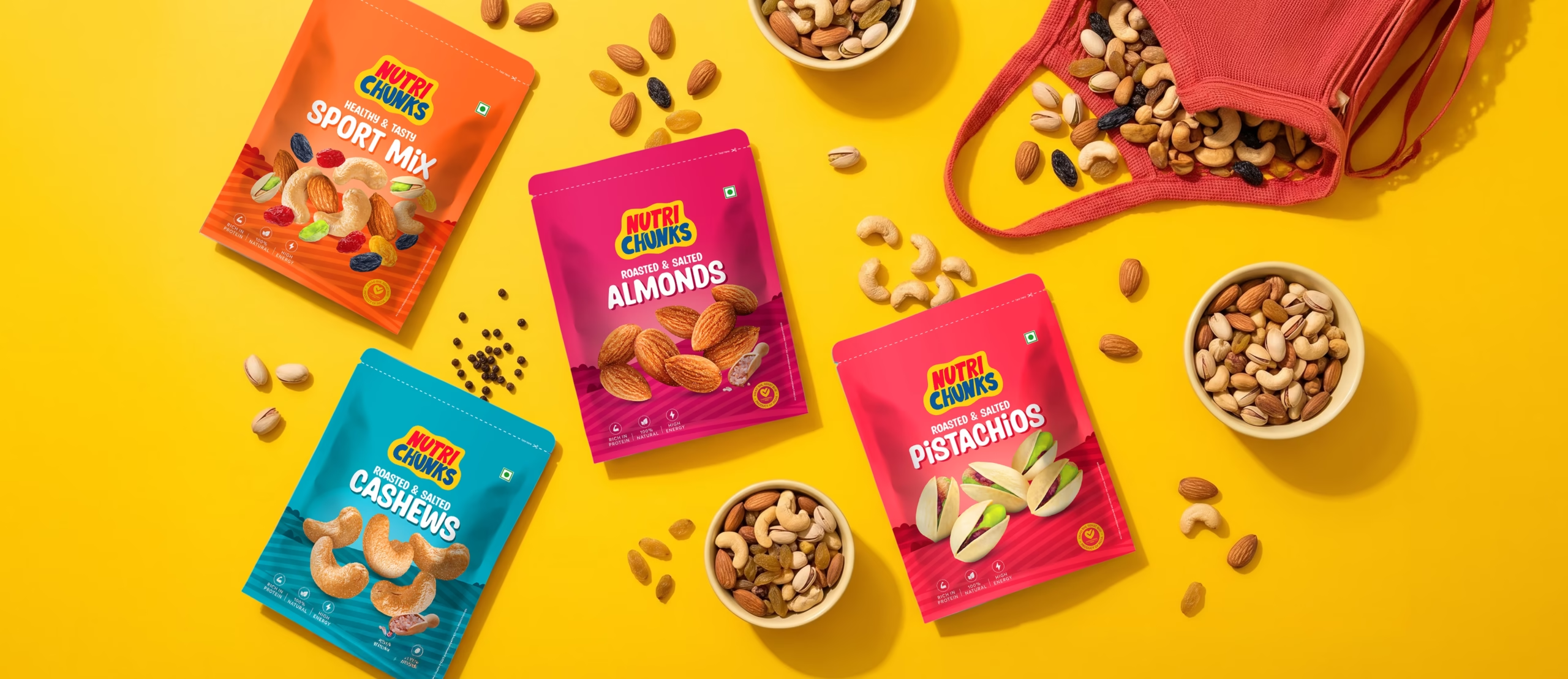
    Most Indian FMCG and skincare brands think of marketing as the money they spend on digital advertising, influencer campaigns, and trade promotions. Packaging is treated as a separate, operational matter something the production team manages after the marketing strategy is set.

    This thinking costs businesses more than any advertising budget they will ever set. Because the most powerful marketing touchpoint in the entire consumer journey is not the Instagram ad. It is not the influencer review. It is not the in store activation. It is the moment the consumer stands in front of your product on a shelf or receives it at their door and decides whether it is worth their money and their trust.

    That moment is entirely owned by the packaging. And at Richest Branding, we have spent years working with FMCG, skincare, nutraceutical, and beverage brands across India and international markets to prove one thing consistently: when the packaging is treated as the primary marketing strategy, not a production afterthought, the commercial results follow.

    The Marketing Mathematics of Packaging

    Consider the economics. A digital advertising campaign reaches a defined audience for a defined period at a defined cost per impression. When the budget ends, the impressions end. The marketing stops.

    A packaging design, once created, works without pause. It appears in every store the product reaches. It sits on the consumer’s kitchen shelf, bathroom cabinet, or dining table for weeks or months a constant brand presence in the spaces most personal to the consumer. It travels in shopping bags, gets photographed for social media, gets recommended to friends. It generates word of mouth, user generated content, and repeat purchase without a single additional rupee of media spend.

    This is not a diminishment of digital marketing it is a recognition of packaging’s disproportionate marketing value. The brands that understand both, and build both to the same standard, build brand equity at a pace that neither alone achieves.

    At Richest Branding, we work with our clients to develop packaging that functions as a complete marketing communication not just a container. Our team brings together brand strategy, design, and print material expertise to ensure that every pack works as hard as the best advertising campaign your brand has ever run.

    The Five Ways Packaging Functions as Marketing

    1. Packaging as the First Advertisement

    Before a consumer sees your digital ad, reads your brand story, or hears a recommendation from a friend they will likely encounter your product on a shelf or in a search result thumbnail. In that moment, the packaging is performing the complete job of a well crafted advertisement: it must capture attention, communicate the product promise, differentiate from competition, and generate a desire to own.

    The difference between an advertisement and packaging is that the packaging must do all of this within 2 to 3 seconds, at physical scale, in a context surrounded by competitor products. The discipline required is greater and the reward for getting it right is a marketing touchpoint that repeats itself millions of times without additional spend.

    2. Packaging as Social Content

    In the age of Instagram and YouTube unboxing, premium packaging generates organic social content that money cannot buy. When a consumer receives a beautifully packaged skincare order, they photograph it. When a nutraceutical brand arrives in packaging that feels genuinely premium, they share it. When a spice brand’s packaging sits beautifully on a kitchen shelf, it appears in home interior content.

    Every piece of user generated content featuring your packaging is a trust signal that reaches the creator’s audience with a credibility that paid advertising cannot replicate. Designing packaging with social shareability as a deliberate objective asking at every stage whether a consumer would choose to photograph this is one of the highest return decisions a brand can make in its packaging brief.

    3. Packaging as Brand Relationship

    The consumer who buys your product for the first time is evaluating the packaging experience alongside the product experience. If the packaging delivers a moment of pleasure through material quality, through an unexpected design detail, through a back panel that makes them smile or learn something that packaging is building an emotional relationship with the brand.

    Repeat purchase in FMCG and skincare is built more on brand feeling than on product superiority alone. Consumers repurchase brands they feel good about. Packaging is the most consistent carrier of that feeling.

    4. Packaging as Print Marketing Material

    At Richest Branding, we understand that packaging design does not exist in isolation it is one component of a complete print and brand communications system. The same brand identity that governs the packaging design must govern the product catalogue, the sales brochure, the exhibition stand, the point of sale display, and the retailer sell sheet.

    When these materials work as a unified system when the retailer’s buyer receives a sell sheet that looks as premium as the product packaging it is selling the brand communicates a level of professionalism and commitment that competitors without integrated print communications cannot match. This is practical, real world brand strategy, not theory.

    5. Packaging as Market Positioning Statement

    Every packaging design decision material choice, colour palette, typography, format, finish is a market positioning statement. It tells the retailer, the distributor, the consumer, and the competitor exactly which market segment the brand is claiming.

    The packaging that communicates premium commands premium shelf placement and justifies premium pricing. The packaging that communicates mass market is negotiated on price alone. The choice between these outcomes is made at the packaging design brief, not at the negotiating table.

    How Richest Branding Builds Packaging That Markets

    Our approach at Richest Branding is built on practical experience across FMCG, skincare, nutraceuticals, beverages, spices, and premium consumer goods. We do not deliver packaging design in isolation we deliver packaging design as part of an integrated brand and marketing system.

    • Brand strategy workshop before any design work understanding the target consumer, the competitive landscape, and the market position the brand is claiming
    • Packaging design developed simultaneously with print marketing materials catalogue, sell sheet, exhibition collateral, retail display so all elements speak the same visual language
    • Export packaging designed for specific international markets from day one UAE, Saudi Arabia, Singapore, Australia, UK with regulatory requirements built in, not retrofitted
    • Social media content guidance built around the packaging design knowing which elements photograph best and how to build an Instagram strategy around the packaging asset
    • Print production oversight our team works directly with print vendors to ensure that what was designed is what gets printed, at the quality the brand was built to communicate

    The brands that build the most durable market positions in competitive FMCG and skincare are not always the ones with the biggest advertising budgets. They are the ones that treat every packaging touchpoint as a marketing opportunity and execute it with the consistency and quality that turns a product into a brand consumers trust.

      Ready to build a brand that commands your market? 

      Visit richestbranding.com  |  info@richestbranding.com

  • Trust in a Bottle: How Nutraceutical and Health Supplement Brands Build Packaging That Converts the Sceptical Consumer

    Trust in a Bottle: How Nutraceutical and Health Supplement Brands Build Packaging That Converts the Sceptical Consumer

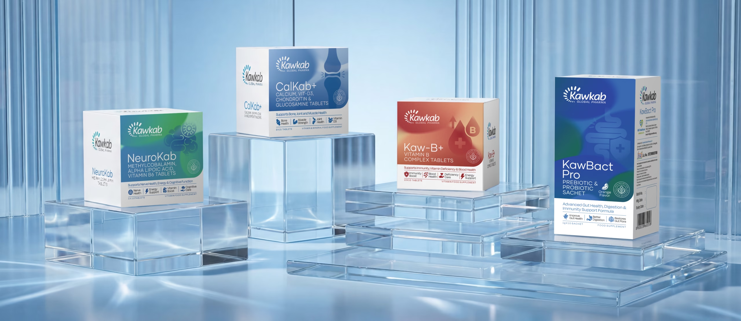
    The nutraceutical and health supplement consumer is the most sceptical consumer in any FMCG category. She has been burned before by products that promised more than they delivered, by brands that used clinical language without clinical credibility, by packaging that communicated premium without the product quality to justify it.

    This scepticism is not a barrier to the category. It is a design brief. The packaging of a nutraceutical or health supplement must accomplish something that packaging in most other categories does not need to do: it must earn trust before it earns desire.

    India’s nutraceutical industry is growing at an extraordinary pace. The COVID era accelerated consumer awareness of preventive health, immunity support, and nutritional supplementation in a way that a decade of conventional health marketing had not achieved. That awareness has created a category where consumer intent to purchase is high and where the brands that communicate credibility most effectively are capturing the most valuable customer relationships.

    Why Trust is the Primary Purchase Driver in Nutraceuticals

    In food and beverage FMCG, appetite appeal and brand familiarity drive purchase. In skincare, sensory experience and ingredient aspiration drive purchase. In nutraceuticals, something different drives purchase: the belief that this product will actually do what it says.

    This belief or its absence is built entirely on brand signals before the first capsule is swallowed. The packaging is the primary trust building mechanism because it is the first thing the consumer evaluates and the last thing they see before they take the product every day.

    A nutraceutical brand whose packaging communicates clinical precision, ingredient transparency, and quality commitment is telling the consumer something very specific: we take the science as seriously as you do. That is the trust signal that converts the sceptical consumer.

    The Design Architecture of a Credible Nutraceutical Brand

    Clinical Credibility Through Visual Language

    The visual language of clinical credibility in nutraceutical packaging is precise: clean white or minimal colour backgrounds that communicate purity and cleanliness. Sans serif typography that communicates precision and modernity. Generous white space that communicates confidence rather than overcrowding every millimetre with claims.

    The temptation in nutraceutical packaging is to fill every available surface with benefit claims, ingredient callouts, and certification badges. The brands that build the highest consumer trust do the opposite they select the three or four most important things to communicate and give them the space to land with authority.

    Ingredient Transparency as Brand Equity

    The nutraceutical consumer in 2025 does not simply want to know that a product contains a certain ingredient. She wants to know the source of the ingredient, the form it is in, and the dosage per serving. Brands that provide this information prominently, clearly, and without the obfuscation of proprietary blends are building a form of brand equity that is very difficult for competitors to replicate.

    Ingredient transparency on pack is no longer a differentiator in the premium nutraceutical segment it is a baseline expectation. Brands that do not provide it are immediately placed in the suspect category by the informed consumer. Brands that go beyond baseline showing certification of the specific ingredient form, QR codes linking to Certificate of Analysis documents, clinical study references are building the deepest possible consumer trust.

    Certification and Compliance as Visual Communication

    In nutraceuticals, certifications are not just compliance requirements they are brand assets that must be designed into the packaging with the same care as any other visual element.

    • FSSAI certification for the Indian market prominently displayed, not buried in small print
    • USFDA compliance for brands targeting the US market the logo mark of this certification carries enormous trust weight with the informed American supplement consumer
    • NSF certification for sport and athletic supplement brands essential for credibility in the fitness and performance segment
    • Organic certification where ingredient sourcing supports it India’s organic agricultural supply chain is genuinely world class
    • Halal and Kosher certifications for brands targeting UAE, Saudi Arabia, and international Jewish markets

    Dosage Communication That Reduces Purchase Anxiety

    One of the most specific design challenges in nutraceutical packaging is dosage communication. The consumer needs to understand exactly what they are buying how many capsules per serving, how many servings per pack, what the total course duration is, and whether the dosage is aligned with clinical recommendations.

    Brands that communicate dosage clearly and simply reduce the purchase anxiety that the sceptical nutraceutical consumer experiences at the shelf. Brands that bury dosage information in small print on the back label or use language that requires a nutritional science degree to interpret increase purchase anxiety. In a category where trust is the purchase driver, increased anxiety directly reduces conversion.

    The Premium Nutraceutical Packaging Formats That Win

    The format selection in nutraceutical packaging communicates positioning before any label is read. HDPE plastic bottles remain the dominant format for mass market supplements functional, durable, and cost effective, but limited in their ability to signal premium. The premium nutraceutical segment has moved toward formats that communicate more deliberate brand investment.

    Dark amber glass bottles with aluminium closures communicate pharmaceutical grade seriousness and ingredient protection. Matte finish HDPE with soft touch coating communicates premium within the plastic format. Kraft paper pouch packaging with a clear window communicates natural and sustainable positioning. Recyclable tin packaging communicates artisan craft and premium gift occasion positioning.

    The Indian Nutraceutical Brand Going Global

    India has a specific and compelling competitive advantage in the global nutraceutical market: the depth and authenticity of its botanical ingredient heritage. Ashwagandha, brahmi, shatavari, triphala, moringa, turmeric these are not ingredients that India discovered in the last decade of wellness trend activity. They are ingredients that India has used, studied, and refined for thousands of years.

    The Indian nutraceutical brand that packages this heritage with clinical precision showing the research, the certifications, the ingredient sourcing story, and the dosage science occupies a positioning that no American, European, or Chinese nutraceutical brand can authentically claim.

    The packaging is the first chapter of that story. It must be written with the same rigour and intention as the formulation itself.

      Ready to build a brand that commands your market? 

      Visit richestbranding.com  |  info@richestbranding.com
  • From Formula to First Impression: How Premium Skincare Packaging Design Builds Brands That Command Global Shelves

    From Formula to First Impression: How Premium Skincare Packaging Design Builds Brands That Command Global Shelves

    In the skincare and beauty category, the packaging is evaluated before the formula ever touches skin. The consumer picks up the bottle, feels its weight, reads the label, and makes a judgement about what is inside based entirely on what she holds in her hand. This judgement happens in under ten seconds and it determines whether the product is purchased, tried, loved, and repurchased or put back on the shelf.

    India’s skincare industry is at a remarkable moment. The country produces world class formulations from Ayurvedic ingredient combinations that carry millennia of refinement to cutting edge cosmeceutical actives manufactured to international pharmaceutical standards. Bengaluru, Mumbai, and Pune have produced some genuinely exceptional skincare brands in the last decade.

    And yet, too many of these brands are still dressed in packaging that does not match the quality of what is inside. The formula is premium. The packaging communicates mid market. The consumer takes the cue from the packaging not from the formulator.

    The Skincare Consumer Decision Journey and Where Packaging Intervenes

    Understanding where packaging intervenes in the skincare purchase decision is essential to understanding why it deserves the investment it requires.

    The decision journey for a premium skincare purchase whether it happens in a Sephora in Dubai, a Nykaa flagship in Bengaluru, or on an e commerce platform from a mobile screen follows a consistent pattern. Discovery through a recommendation, an advertisement, or a social media post. Evaluation of the brand’s visual identity and claims. Physical or digital examination of the packaging. Purchase decision made.

    Packaging intervenes at the evaluation and examination stages simultaneously. It is the bridge between the brand promise communicated in discovery and the product experience that will determine repurchase. If the packaging does not fulfil the promise, the purchase funnel collapses at the most expensive point right before conversion.

    The Design Elements That Define Premium Skincare Packaging

    Material Selection as Brand Language

    In premium skincare, the container is the first quality signal. Glass communicates premium, stability, and efficacy particularly for active ingredient formulations like vitamin C serums, retinol treatments, and AHA exfoliants where the consumer understands that the ingredient is sensitive to air and light. A brand that chooses violet glass, amber glass, or frosted glass communicates formulation seriousness before any ingredient claim is read.

    For skincare brands targeting the premium segment in Dubai, Singapore, or the UK, glass is often not optional it is an expectation. International beauty retail buyers in Sephora, Space NK, and Tangs evaluate packaging material as an immediate proxy for brand positioning. A premium skincare claim in a basic PET plastic bottle creates a credibility gap that no marketing investment can fully bridge.

    Colour and Finish: The Emotional Register of Skincare

    Skincare packaging colour palettes communicate brand personality and product philosophy before a single word is read. White and off white palettes communicate clinical cleanliness and efficacy. Earthy tones terracotta, sage, warm beige communicate natural and botanical positioning. Black and deep charcoal communicate luxury and prestige. Soft pastels communicate gentle, sensitive skin positioning.

    The finish of the packaging amplifies the colour signal. Matte finish communicates premium restraint. High gloss communicates accessibility and vibrancy. Soft touch coating a tactile finish that feels like velvet communicates ultra premium and creates a physical brand experience the moment the consumer picks up the product.

    Typography That Earns Trust

    Skincare packaging typography must navigate a specific tension: the need to communicate brand personality through display typography, and the need to communicate clinical credibility through ingredient and claims typography. These are different registers and they require different typographic voices.

    The brand name and product name benefit from a refined, distinctive typeface that communicates the brand’s aesthetic position. The ingredient names, percentage actives, and usage instructions require clean, legible typography that communicates precision and scientific credibility. The best skincare packaging systems manage both registers within a coherent visual hierarchy.

    The Label as Real Estate

    On a 30ml serum bottle, the label is approximately 4 centimetres by 8 centimetres. In this space, the brand must communicate: the brand identity, the product name, the hero active ingredient and its concentration, the skin concern addressed, any certifications relevant to the target market, and usage instructions. The organisation of this information what is primary, what is secondary, what is tertiary is a discipline as rigorous as any copywriting brief.

    The brands that win premium skincare shelf placement internationally make every millimetre of label real estate work. Nothing is placed by default. Every element has a reason for its position, its size, and its relationship to the elements around it.

    The D2C Skincare Packaging Opportunity in India

    India’s D2C skincare segment is growing at a pace that the organised beauty retail market is only beginning to reflect. Brands built entirely on direct consumer relationships sold through brand websites, Instagram storefronts, and platforms like Nykaa and Purplle have a packaging advantage that traditional retail brands do not: the unboxing experience.

    • The outer shipping box is a brand touchpoint: branded tissue, custom inserts, and a handwritten or printed welcome note convert the delivery moment into a brand experience
    • The product packaging must photograph beautifully for user generated content Instagram posts, YouTube reviews, and reels are the highest credibility marketing a skincare brand receives
    • Sustainable packaging choices glass, recycled materials, refillable formats resonate strongly with India’s premium urban skincare consumer and the international markets the brand aspires to reach
    • Consistent visual identity across the entire product range signals brand maturity and justifies premium pricing across SKUs
    • QR codes on packaging linking to ingredient education content, founder stories, and usage tutorials extend the brand experience beyond the physical product

    Skincare Packaging for the UAE, Singapore, and UK Markets

    Indian skincare brands entering international beauty markets face a specific packaging challenge: the visual standard expected by Dubai’s Sephora buyer, Singapore’s Guardian buyer, and the UK’s Space NK buyer is set by the brands already on those shelves European luxury beauty houses, Korean skincare innovations, and established American prestige brands.

    Indian skincare brands do not need to imitate these brands. They need to meet the same standard of packaging quality and then differentiate through their own authentic story: Ayurvedic provenance, specific Indian botanicals, traditional formulation wisdom expressed in contemporary packaging language.

    The skincare brand that packages its genuine Indian formulation heritage with international grade design quality occupies a positioning that no European, Korean, or American brand can authentically claim. That positioning is both differentiated and premium. It simply requires packaging that is equal to the story it is telling.

      Ready to build a brand that commands your market? 

      Visit richestbranding.com  |  info@richestbranding.com

  • What Makes a Logo Worth Crores: The Strategic Science Behind Brand Marks That Build Market Leading Companies

    What Makes a Logo Worth Crores: The Strategic Science Behind Brand Marks That Build Market Leading Companies

    There is a question every business owner asks when presented with a logo design invoice: why does this cost what it costs? It is a fair question. To the eye, a logo is a simple thing a mark, a name, perhaps a symbol. What could possibly justify the investment?

    The answer is not in the logo itself. It is in what the logo does over the life of the company that commissions it.

    A logo is the most reproduced piece of communication a business will ever create. It appears on every product the company ships, every communication the company sends, every vehicle the company operates, every uniform an employee wears, every exhibition stand, every business card, every invoice, every digital platform. Over the life of a business, a single logo is seen millions of times by thousands of people.

    The question is not what the logo costs to design. The question is what each of those millions of impressions is communicating and whether what they communicate is building the company’s brand equity or quietly undermining it.

    The Five Qualities of a Logo That Builds Brand Equity

    1. Distinctiveness

    A logo that looks like every other logo in its category communicates nothing specific. It is not a brand mark it is a placeholder. The consumer cannot distinguish it, cannot recall it, and cannot feel anything about a company through it.

    Distinctiveness does not mean bizarre or attention seeking. It means owning a visual space that no competitor occupies. The most distinctive logos are often the simplest because simplicity, executed with genuine originality, is the hardest design achievement in brand identity.

    2. Scalability

    A logo must work at every scale at which it will be used from a 16 pixel browser favicon to a 6 metre trade show stand banner. A logo that is beautiful at presentation size but loses its integrity when reproduced small or becomes invisible when enlarged is not a professional brand mark.

    Scalability requires that the logo is designed as a system: a primary full version, a compact version for small applications, a monogram or symbol version for the smallest contexts, and rules for how each version is used.

    3. Legibility Across Media

    A professional logo must work in full colour, in single colour, in black, in white reversed out of a dark background, embossed without any colour, and engraved in single material. A logo that depends on colour to communicate its essential character has a fundamental design weakness because there are contexts where colour cannot be reproduced.

    The embossed lid of a spice tin. The woven patch on a garment. The carved signage above a retail entrance. The stamp on a certificate of authenticity. Each of these applications strips colour from the logo. The mark that survives without colour is the mark with genuine design integrity.

    4. Timelessness

    The logos that build the most brand equity over time are the logos that do not look dated within a decade. They may be refined evolved, modernised in detail but their essential character is permanent.

    The most expensive logo a company can commission is one that needs replacing in five years because it was designed around a trend rather than a brand truth. Every time a logo changes significantly, the accumulated visual recognition equity is partially reset.

    5. Meaning That Earns Discovery

    The best logos reward attention. They communicate something specific about the brand’s values, heritage, or promise but they do so with restraint. The meaning is there for those who look, but the logo does not shout it.

    A family business logo that incorporates a subtle reference to the founding year. A food brand’s mark that contains a hidden reference to the key ingredient. A Gujarat based textile brand whose logo honours a pattern from the regional craft tradition. These are the kind of brand stories that create the conversations that build brand community.

    The Logo Design Process: What It Actually Involves

    Strategy Before Aesthetics

    A professional logo design process begins not with sketches but with questions. Who is this brand for? What does it stand for? What category does it operate in, and what are the visual conventions of that category both to respect and to break? What is the single most important thing this logo must communicate?

    The answers to these questions are the brief from which the visual exploration begins. Without them, the designer is making aesthetic choices in a vacuum. With them, every design decision is purposeful and defensible.

    The Exploration Phase

    A professional logo design process explores a wide range of directions before narrowing. Not two or three options but dozens of sketch level explorations that test different visual strategies for communicating the brand’s essential character. The exploration phase is where originality is found and where the strongest directions are identified for refinement.

    Refinement and Application Testing

    Once the strongest direction is identified, the professional refinement process is rigorous: testing the mark at every scale, in every colour application, on every relevant medium. A logo that has not been tested embossed on packaging, reversed white on the brand’s primary colour, at 16 pixels on a digital screen, and at 6 metres on a printed banner has not been professionally refined.

    What Your Logo Is Costing You If It Is Weak

    • Every premium price point you cannot defend because the logo does not communicate premium
    • Every qualified lead who visits the website and leaves because the brand does not pass the credibility test
    • Every export inquiry that does not convert because the packaging logo does not meet international retail standards
    • Every talented candidate who chooses the competitor whose brand feels more aspirational
    • Every partnership conversation that starts with an apology for the brand rather than pride in it

    A logo is not a cost. It is the visual foundation on which every rupee of brand equity is built. The investment in a great logo is not recovered in the first year it is recovered in every interaction, over every year, for the life of the company.

    Design it once. Design it right. Build on it for decades.

      Ready to build a brand that commands your market? 

      Visit richestbranding.com  |  info@richestbranding.com

  • Pour It Right: How Indian Beverage Brands Build Packaging That Commands Premium and Drives Repeat Purchase

    Pour It Right: How Indian Beverage Brands Build Packaging That Commands Premium and Drives Repeat Purchase

    India’s beverage market is at an extraordinary inflection point. The era of two or three nationally dominant brands owning the entire non alcoholic beverage category is over. Consumer interest in functional beverages, traditional Indian drinks modernised for contemporary consumption, and premium juice and health drink formats is creating category white space at a rate that did not exist five years ago.

    Brands are being built in this white space right now. Some will build genuine market positions and sustained consumer loyalty. Others will launch, achieve a burst of initial distribution, and disappear from shelves within 24 months.

    The difference between these two trajectories is rarely the product. India produces extraordinary beverages from the finest mango pulp to traditional sharbats to modern functional drinks. The difference is almost always the brand and at the most immediate level, the packaging.

    The Beverage Packaging Hierarchy of Jobs

    Unlike many FMCG categories, beverage packaging must perform a wider range of simultaneous jobs. It is a container that must maintain product integrity. It is a communication vehicle at the retail point of purchase. It is a brand expression vehicle in the hand of the consumer on restaurant tables, in offices, in social media photographs. And increasingly, it is a sustainability signal.

    World class beverage packaging design addresses all of these jobs in a coherent and prioritised way, rather than solving for one and ignoring the others.

    The Beverage Format Decision: Before the Design Brief

    Glass vs PET vs Can vs Carton

    The packaging format is the first and most significant brand positioning decision in beverage launch. Each format communicates a price tier and a consumption occasion before the label is read.

    Glass communicates premium without exception it is the format of choice for premium juice brands, craft beverages, and any product that wants to signal quality through container quality. It commands a higher price point, restricts distribution to modern trade and premium outlets, but builds brand perception that no other format achieves.

    PET plastic enables the widest distribution reach and the lowest cost structure, but communicates mass market by default. Premium PET packaging through label quality, structured bottle design, and premium closure can signal a step above mass market, but cannot fully escape the perception ceiling that the material itself imposes.

    Aluminium cans communicate energy, modernity, and ready to consume convenience and in India’s growing energy and functional drinks space, they are the format of choice for the target consumer segment that space is built to reach.

    Label vs Shrink Sleeve vs Direct Print

    Beyond the container, the decoration method paper or film label, shrink sleeve, or direct print is the second format decision with significant brand implications. Shrink sleeves allow 360 degree graphic coverage and work particularly well for premium juice and functional drink formats where vibrant full coverage design communicates premium differentiation. Paper labels on glass bottles communicate artisan and craft positioning.

    The Indian Functional Beverage and Traditional Drink Opportunity

    The category creating the most exciting brand building opportunities in Indian beverages right now is the intersection of traditional Indian beverages and contemporary functional drink positioning. Aam panna as a digestive health drink. Kokum sharbat as a natural cooling and gut health beverage. Thandai as a festive and adaptogenic drink. Nannari as a regional craft beverage with genuine heritage.

    These are not just products — they are brand stories with five hundred years of consumer validation behind them. The brand builder’s job is to translate that heritage into a contemporary beverage brand identity that the modern Indian consumer and the Indian diaspora consumer in Dubai, Oman, and Singapore can choose with pride and confidence.

    • The traditional Indian beverage heritage is the most differentiated story available in the non alcoholic drinks category globally right now
    • Premium positioning requires premium packaging: glass or premium PET, professional label design, clear functional benefit communication
    • Export readiness demands regulatory compliance built into the original design not retrofitted for each market separately
    • Social media shareability is a product brief requirement for premium beverage brands if it does not photograph beautifully, reconsider the packaging
    • The 500ml single serve glass bottle format is the most powerful premium statement available in Indian beverage retail today

    What Makes a Beverage Label Win on the Shelf

    In the beverage aisle, the consumer is making purchase decisions at eye level, at refrigerator door level, and from the overhead angle at the back of a shelf. The label must work in all three contexts.

    The key label design elements that drive beverage purchase: a dominant brand name that is visible from 1.5 metres. A clear flavour or variant communication. An appetite appeal visual the fruit, the ingredient, the finished poured product that triggers immediate desire. And a quality signal material, finish, typography that justifies the price before the price is read.

    India’s beverage category is being reinvented. The brands that build the right packaging foundation now will be the category leaders that the next generation of Indian consumers grows up with.

      Ready to build a brand that commands your market? 

      Visit richestbranding.com  |  info@richestbranding.com

  • Shelf Wars: The Packaging Design Science Behind India’s Fastest Growing Namkeen and Snack Brands

    Shelf Wars: The Packaging Design Science Behind India’s Fastest Growing Namkeen and Snack Brands

    The Indian namkeen and snack market is one of the most brutally competitive FMCG categories in the country. The category is enormous, fragmented, regionally diverse, and driven almost entirely by impulse at the point of purchase.

    No consumer walks into a convenience store having decided in advance which bhujia they will buy. They walk in for a reason unrelated to snacks. They pass the snack rack. Something catches their eye. In under two seconds they have reached for a pack. The decision is made before conscious deliberation begins.

    That two second window is where namkeen and snack brands are won and lost. And it is determined almost entirely by packaging design.

    Why Gujarat’s Namkeen Industry Faces Its Biggest Brand Moment

    Gujarat and specifically Ahmedabad, Rajkot, Bhavnagar, and Surat is home to some of India’s finest namkeen production. The recipes developed over generations, the specific spice profiles, the texture quality these are genuine competitive advantages that no factory in any other state can fully replicate.

    But the category is changing at pace. The entry of nationally distributed organised brands, the growth of D2C snack companies with premium brand identities and direct consumer relationships, and the increasing penetration of modern trade where visual brand identity determines shelf placement have created a competitive environment where craft and recipe alone are no longer sufficient to sustain growth.

    Gujarat’s namkeen brands must now compete on brand identity with the same seriousness with which they have always competed on product quality. The recipe is the foundation. The brand is the structure built on it.

    The Packaging Design Principles That Win the Snack Aisle

    Bold at 2 Metres

    The first test of snack packaging design is visibility at distance. In a general trade kirana store, your product may be displayed on a shelf or in a bin 2 to 3 metres from the consumer. The brand name and the product character must be readable and compelling at that distance.

    This requires high contrast between background and foreground. A dominant brand mark that is bold enough to read as a shape before it is read as text. And an overall colour scheme that creates a stop signal something the eye catches even in peripheral vision.

    Flavour Communication That Triggers Appetite

    The most powerful element in any namkeen or snack pack is the flavour visualisation the photograph or illustration that communicates not what the product is made from, but how it will taste.

    A photograph of actual bhujia or mixture is less powerful than an image that communicates the experience: the crunch, the spice, the richness, the flavour hit. The product visual should trigger a physical response the consumer should almost taste the product before they have picked up the pack.

    Range Architecture: Building a Snack Family

    One of the most common and most expensive mistakes in namkeen brand building is launching multiple flavour variants without a coherent range architecture. The result is multiple packs that look like they come from different companies no visual family relationship, no range recognition.

    A well designed snack range architecture creates a consistent brand block on the shelf: the same brand visual system across all variants, differentiated by colour coding for flavour. The consumer recognises the brand across the range and navigates to their preferred flavour. The brand block is visible even when individual SKUs are not fully stocked.

    The Flavour Callout Hierarchy

    In a category where flavour is the primary purchase driver, the variant callout Aloo Bhujia, Punjabi Mixture, Khatta Meetha, Chilli Lime, Classic Sev must have clear visual hierarchy on the pack. It should be readable at the distance from which the consumer is likely to be browsing.

    The secondary callouts net weight, quantity, price point must be present and compliant without competing with the primary flavour communication. Regulatory information that crowds the flavour story costs the brand appetite appeal.

    Premium Namkeen: The Fastest Growing Segment

    The Indian premium snack market is growing significantly faster than the mass market. Consumers in Mumbai, Bengaluru, Pune, and among the Indian diaspora in Dubai are actively seeking premium namkeen options products at 2 to 3 times the mass market price point, delivered in packaging that communicates quality commensurate with the price.

    • Premium packaging materials: structured pouches with matte finish, resealable zips, premium print quality
    • Brand storytelling on pack: the founding generation, the recipe origin, the regional craft tradition
    • Photography quality: professional appetite photography rather than generic product images
    • Portion formats: premium consumers respond to smaller premium priced single serve formats alongside standard sizes
    • Gift packaging: during Diwali, wedding, and festive seasons, premium namkeen gift sets are among the highest margin products in the category

    The namkeen shelf is one of the most visually competitive environments in Indian retail. Winning it requires packaging that works in two seconds and then builds a brand relationship that brings the consumer back for the next pack.

      Ready to build a brand that commands your market? 

      Visit richestbranding.com  |  info@richestbranding.com

  • Packaging the Worlds Most Powerful Flavours: The Complete Guide to Spice Brand Design That Commands Premium

    Packaging the Worlds Most Powerful Flavours: The Complete Guide to Spice Brand Design That Commands Premium

    India has been the world’s spice capital for five thousand years. The spice routes that rewrote the map of global trade were built around the extraordinary flavours that Indian soil, climate, and agricultural tradition produce.

    That heritage belongs to every Indian spice brand. And yet the majority of Indian spice brands are packaged in a way that communicates local convenience rather than global excellence forfeiting the premium pricing, the export market access, and the brand equity that the product’s actual quality deserves.

    Spice packaging is not simply a container. It is the translation of one of the world’s most powerful culinary legacies into a visual language that the modern consumer in Ahmedabad, Dubai, London, or Singapore can immediately understand, trust, and choose over every competing product on the shelf beside it.

    The Four Consumer Journeys in Spice Retail

    The Traditional Indian Household Buyer

    This buyer purchases on brand familiarity, specific regional flavour authenticity, and value. She has used the same masala brand her mother used and changes only when quality drops or a trusted recommendation arrives. For this buyer, the packaging must signal continuity, authenticity, and quality without intimidating with premium signalling she has not been prepared for.

    The Modern Urban Indian Cook

    This buyer in Mumbai, Bengaluru, or Pune is food curious, Instagram active, and willing to pay significant premium for spice products that look as good in her kitchen as they taste in her food. She buys recipe mixes with clear preparation instructions, single origin spices with provenance stories, and blends with clear usage occasions. Her packaging must be photographable.

    The Indian Diaspora Buyer Abroad

    The Indian diaspora buyer in Dubai, London, or Toronto is making an emotional purchase alongside a practical one. The smell of cardamom, the colour of turmeric, the particular heat profile of a specific Kashmiri chilli blend these are memories made edible. For this buyer, the packaging must signal authentic Indian provenance while meeting the visual quality standard of the international retail environment she shops in.

    The Non Indian International Buyer

    This is the fastest growing and highest value segment in global spice retail. The food curious consumer in Singapore, Germany, or Australia who wants to cook Indian food at home needs education on the pack: what does this spice taste like, what do you cook with it, what does it pair with. The packaging must be beautiful, accessible, and informative without being overwhelming.

    The Anatomy of World Class Spice Packaging

    Colour Language for Spice Categories

    The visual language of spice packaging is one of the most developed and colour coded in all of FMCG. Consumers read category and flavour profile from colour before they read the name. Deep reds for heat and intensity. Warm ochres and turmeric yellows for aromatic blends. Cool greens for fresh herb based masalas. Rich browns for roasted, smoky profiles.

    Owning a distinctive colour within the category distinct enough to stand out, within the range of consumer expectation for the category is the first strategic decision in spice packaging design. The brands that own their colour in the spice aisle are found by recognition, not by search.

    Typography That Communicates Provenance and Premium

    The typographic voice of a spice brand communicates its positioning more precisely than almost any other element. Heavy traditional serifs with ethnic flourishes communicate authentic Indian heritage. Clean modern sans serif typography with accent details communicates contemporary premium. A considered combination of both communicates the most compelling positioning available to Indian spice brands: rooted in authentic tradition, expressed for the modern world.

    On Pack Photography and Illustration

    The visual centrepiece of a spice pack the product photography or illustration that occupies the dominant space on the front label does more work than any other single design element. It must simultaneously communicate the spice’s flavour character, its culinary application, and its quality level.

    The best spice pack photography achieves something specific: it makes the viewer almost smell and taste the product. The colour grading, the composition, the choice of showing the spice in context a sizzling curry, a perfectly spiced dish, a pile of vivid whole spices — all work together to trigger appetite response and purchase desire.

    The Export Ready Pack: What Changes and What Must Not

    When an Indian spice brand prepares for export to the UAE, Saudi Arabia, UK, or Singapore there are regulatory changes required and there are brand changes that should never be made.

    • Required for UAE and Saudi: Arabic language on pack, SFDA or Ministry of Health compliance, Halal certification display
    • Required for UK: allergen labelling per UK food regulations, country of origin prominently displayed, net weight in metric
    • Required for Singapore: AVA compliant labelling, ingredient declarations per Singapore Food Regulations
    • Must NOT change: the core brand identity, the colour system, the logo brand continuity across markets is essential
    • Should add: QR code linking to recipe content in the local language, one of the highest engagement additions to export spice packaging

    The Price Positioning Signal in Spice Packaging

    Spice packaging communicates price point before the consumer reads the price. The material of the container glass vs tin vs plastic pouch vs flexible pack signals a price range. The finish of the label premium paper with soft touch lamination vs standard gloss film signals a price range. The weight and quality of the closure a proper tin lid vs a basic plastic cap signals a price range.

    Indian spice brands that want to move from mass market to premium shelf positioning must change their packaging materials and finishes before they change their price. The packaging must earn the right to the price before the price is announced.

    The world’s most powerful flavours come from India. It is time the packaging communicated that with the authority the product has always deserved.

      Ready to build a brand that commands your market? 

      Visit richestbranding.com  |  info@richestbranding.com

  • The 3 Second Rule: How Strategic FMCG Packaging Design Wins the Shelf Before the Consumer Thinks

    The 3 Second Rule: How Strategic FMCG Packaging Design Wins the Shelf Before the Consumer Thinks

    Three seconds. That is the window your FMCG packaging has to register, communicate, and compel a purchase decision in a modern retail environment. Not three minutes. Not three interactions. Three seconds and in a hypercompetitive aisle, often less.

    Consumer research conducted across modern trade formats in India, the UAE, and Australia consistently shows that the majority of FMCG purchase decisions are made at the shelf. Not at home, not influenced by advertising, not driven by brand loyalty. They are made in the moment, by a consumer whose attention you have borrowed for less time than it takes to read this paragraph.

    This is the commercial reality that every FMCG brand in India must build its packaging strategy around. And it is why packaging design is not a finishing detail in the product launch process it is one of the most commercially critical decisions a brand makes.

    Why Most Indian FMCG Packaging Loses the Shelf Battle

    The most common failure mode in Indian FMCG packaging is not poor design it is design that serves the brand owner’s preferences rather than the consumer’s perception. The brand owner knows exactly what is inside the pack. The consumer does not. The packaging must communicate the product’s nature, quality, and differentiation to someone who is simultaneously processing dozens of competing visual signals.

    When packaging is designed from the inside out starting with what the brand wants to communicate the result is often overcrowded, visually competing with itself, and failing to land a single clear message. When it is designed from the outside in starting with what the consumer needs to see, feel, and understand the result is clean, confident, and effective.

    The Five Design Decisions That Determine Shelf Performance

    1. Colour as the First Signal

    Colour is the fastest communication channel available to packaging design. Before typography is read and before imagery is processed, colour communicates category, quality, and emotional tone. The consumer’s brain categorises premium, value, healthy, indulgent, or natural primarily through colour before any other element is processed.

    The strategic question is not what colour does the brand like but what colour does the category use, what does our target consumer associate with our promise, and how do we stand out from the adjacent products on the shelf without breaking the category code so completely that we become unrecognisable. Colour strategy in FMCG packaging is a precision discipline, not an aesthetic preference.

    2. Typography Hierarchy That Communicates in One Glance

    An FMCG pack must communicate a minimum of three things in the consumer’s three second window: what the product is, who makes it, and why this variant specifically. This requires a rigorous typographic hierarchy the brand name at the dominant size, the product descriptor at the secondary size, and the variant or flavour identifier at the tertiary size.

    The most common typographic error in Indian FMCG packaging is size competition: multiple text elements at similar sizes, creating visual noise instead of visual hierarchy. The consumer’s eye does not know where to land. The three second window closes without a decision made.

    3. Imagery That Makes the Product Desirable

    Food and beverage FMCG packaging lives and dies on appetite appeal the visceral, immediate, almost physical response a consumer has to a product image on pack. A photograph of a perfectly prepared dish. An illustration that communicates freshness, flavour, or warmth. A close up of the ingredient that communicates quality and provenance.

    The investment in professional food photography for FMCG packaging is one of the highest return investments in the entire product launch budget. A pack with weak imagery loses appetite appeal to competitors who invested in professional food photography. The product inside may be identical. The pack tells a different story.

    4. Structure as a Differentiation Tool

    Beyond the printed surface, the physical structure of the packaging the shape, the form factor, the closure mechanism, the material feel communicates quality and differentiation in a way that print alone cannot.

    A spice brand that moves from a flat sachet to a structured stand up pouch with a resealable zip communicates freshness, premium quality, and modern consumer understanding simultaneously. The product is unchanged. The packaging structure has repositioned the brand.

    5. The Back Panel Strategy

    Most FMCG brands treat the back panel as a compliance exercise regulatory information, nutritional data, barcode. The brands that build genuine consumer relationships treat the back panel as a brand storytelling opportunity.

    The ingredient sourcing story. The founding philosophy. A recipe suggestion that demonstrates the brand’s understanding of how the product is actually used. These are the brand equity builders that convert a first purchase into a repeat purchase.

    Modern Trade vs General Trade Packaging

    Indian FMCG brands operating across both modern trade supermarkets, hypermarkets, organised retail — and general trade — kirana stores, local chemists, neighbourhood provision stores face a specific packaging challenge: the same pack must perform in radically different retail environments.

    • Modern trade: bright lighting, organised category blocking, consumer browses independently without shopkeeper influence
    • General trade: lower lighting, cluttered display, shopkeeper recommendation carries significant weight, pack must be legible at 1 to 2 metre distance across a crowded counter
    • E commerce thumbnail: pack must be identifiable and desirable as a small image on a mobile screen
    • Social media shareability: premium packs get photographed and shared by consumers, making packaging organic brand content

    A packaging strategy that optimises for only one of these contexts and ignores the others is leaving distribution reach and brand equity on the table. The best FMCG packaging in India is designed to perform across all four contexts simultaneously.

    Your packaging is your most prolific salesperson. It works every hour of every day, in every store your product reaches. The investment in getting it right is not a cost it is the foundation of your sales infrastructure.

      Ready to build a brand that commands your market? 

      Visit richestbranding.com  |  info@richestbranding.com

  • The Founder Is the Brand: Why India’s Most Successful Business Leaders Build Personal Brands That Drive Company Growth

    The Founder Is the Brand: Why India’s Most Successful Business Leaders Build Personal Brands That Drive Company Growth

    There is a pattern visible across India’s most successful business leaders that is not coincidental. Harsh Mariwala built Marico and built a personal brand around thoughtful entrepreneurship that amplified Marico’s credibility for decades. Falguni Nayar became the human expression of Nykaa’s philosophy before Nykaa became a publicly listed company. Ritesh Agarwal was OYO’s most credible brand ambassador at every stage of its international expansion.

    In each case, the founder’s personal brand and the company brand operated as a mutually reinforcing system. The founder’s visibility increased trust in the company. The company’s success validated the founder’s authority. The combined brand equity was significantly larger than either could have built independently.

    This is not a coincidence or a personality trait. It is a strategy. And it is available to every serious business leader in India today — regardless of the company’s current size.

    Why Personal Brand Building Is Now a Business Imperative

    The founder or senior leader of a business is its most credible brand voice. Consumers trust people more than logos. B2B buyers trust category experts more than company marketing. Investors trust founders more than pitch decks. Talent trusts mission-driven leaders more than job descriptions.

    In a media landscape where every business is competing for attention, the human voice of a credible founder cuts through in a way that brand advertising fundamentally cannot. LinkedIn posts from a genuine category expert generate more qualified business conversations than most companies achieve from their corporate pages with ten times the budget.

    The Four Components of a Powerful Founder Personal Brand

    1. A Clearly Defined Point of View

    The most powerful personal brands are built not on broad expertise but on a specific, distinctive, and consistently expressed point of view about their category.

    A branding strategist who believes that most Indian businesses are radically underinvesting in brand equity relative to their product quality and expresses that belief consistently, specifically, and with evidence builds an audience that comes back because they want that specific perspective. Not because they want generic marketing advice.

    The question every founder must answer before building their personal brand is: what do I believe about my category that most people in it have not yet accepted? That conviction expressed consistently is the foundation of a genuine personal brand.

    2. A Content System, Not a Posting Schedule

    Personal brand building on LinkedIn is not about posting frequency. It is about content architecture the deliberate mix of post types, topics, and narrative arcs that, over months and years, builds a coherent and credible public identity.

    A founder’s content system might include: industry insight posts that establish category authority, personal journey posts that build relatability and trust, client and team celebration posts that demonstrate values in action, and long-form articles that demonstrate depth of thinking. Each type serves a different function in building the complete personal brand.

    3. Visual Identity for the Individual

    Just as companies have visual brand identities, serious personal brands require a coherent visual system: a consistent photography style for profile and content images, a colour palette that appears consistently across digital touchpoints, typography that communicates the individual’s professional positioning.

    This is not vanity. A founder’s LinkedIn profile photograph, the visual quality of their post graphics, and the consistency of their digital presence communicate their standards of thinking as clearly as their words do.

    4. The Speaking and Media Strategy

    The most powerful personal brand accelerators are external validation: speaking at industry events, being quoted in publications, appearing on podcasts with relevant audiences, being recognised in awards programmes. Each external validation compounds the personal brand’s authority in a way that self-generated content alone cannot.

    A deliberate media and speaking strategy identifying the publications, events, and platforms where the target audience pays attention, and systematically building presence in those environments can accelerate a personal brand’s reach and credibility significantly faster than organic content growth alone.

    The Business Case: What a Strong Founder Personal Brand Generates

    • Inbound business conversations clients who have already decided they want to work with you before the first meeting
    • Investor credibility a publicly visible thought leader is a significantly less risky bet than an unknown founder with equivalent metrics
    • Talent attraction mission driven candidates choose organisations whose leaders they respect and follow
    • Partnership and collaboration opportunities credible founders attract credible partners
    • Premium pricing power clients pay more to work with a recognised category expert than an unknown specialist

    The Gujarat and Maharashtra Business Leader Opportunity

    India’s business media is disproportionately focused on a narrow set of voices from Mumbai, Bengaluru, and Delhi. The extraordinary entrepreneurial intelligence concentrated in Ahmedabad, Surat, Baroda, Pune, Nagpur, and Nashik is dramatically underrepresented in national and international business conversations.

    This is not a reflection of the quality of thinking. It is a reflection of the absence of personal brand investment. The business leaders who close this gap in the next three years will find that it is not crowded. The opportunity for a genuinely insightful Ahmedabad-based entrepreneur to become a recognised national voice in their category is larger today than it has ever been.

    The company brand is what the market knows about your business. The founder brand is why the market trusts it. Both are required. Neither is sufficient alone.

      Ready to build a brand that commands your market? 

      Visit richestbranding.com  |  info@richestbranding.com