Blog

  • The NRI Buyer Is Worth 10x: How Real Estate Developers Build Brands That Win in Dubai

    The NRI Buyer Is Worth 10x: How Real Estate Developers Build Brands That Win in Dubai

    The NRI Buyer Is Not Just a Sales Segment They Are a Brand Opportunity

    Non Resident Indians in the Gulf represent one of the most significant and consistent buyer pools for Indian real estate. In Dubai alone, the Indian expatriate community numbering in the hundreds of thousands, many earning in dirhams at salary levels far above Indian domestic benchmarks invests billions of rupees annually in Indian property.

    These buyers are not just high value individually. They are high-influence collectively. An NRI buyer who has a great purchase experience with a Mumbai or Ahmedabad developer goes back to their community their colleagues at the oil company, their neighbours in the Jumeirah apartment complex, their WhatsApp groups of fellow Gujaratis or Maharashtrians and becomes a brand ambassador. A bad experience does the same, with amplified damage.

    Building a real estate brand that wins with this segment is therefore not just a sales and marketing challenge. It is a brand-building challenge of the highest order.
    1. What the Dubai NRI Thinks of When They Think of Indian Real Estate

    Before building a brand that speaks to the Dubai NRI, it is essential to understand what this buyer already thinks. They have formed their perception of Indian real estate developers from years of accumulated signals friends’ experiences, news stories, RERA era regulatory changes, developer marketing they have received, and their own previous purchase experiences, positive or negative.

    The Dubai NRI’s top concerns about Indian real estate brands:

    • Delivery credibility will the project actually be delivered on time and to specification
    • Financial transparency are the payment structure, charges, and commitments genuinely clear
    • Developer reputation what do other NRIs say about this developer, privately and publicly
    • After-sales service what happens after money is paid, during construction, and at possession
    • Brand quality does this developer look like someone who manages quality seriously

    Every single one of these concerns is addressed, at least in part, by brand quality. A developer whose brand communicates professionalism, transparency, and quality signals addresses the trust deficit before the first conversation.

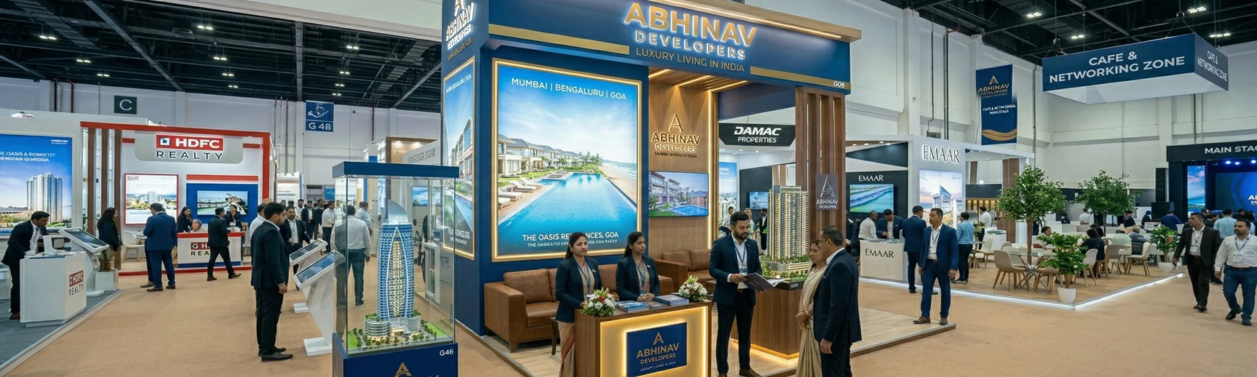
    2. Presence at Gulf Property Exhibitions: Brand, Not Just Booth

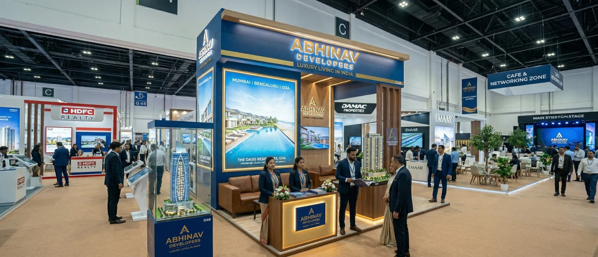
    The Gulf property exhibition circuit Cityscape, Index, and the numerous community events in Dubai, Abu Dhabi, and Muscat is a critical channel for Indian real estate developers targeting NRI buyers. But simply attending these exhibitions is not enough. The brand experience at the exhibition is everything.

    Many Indian developers show up to Dubai property exhibitions with what can only be described as inadequate brand presentation generic banners, low quality printed brochures, and exhibition booths that communicate neither premium quality nor developer credibility. They are competing at these events against UAE developers who invest heavily in brand experience, and losing the comparison before a word is spoken.

    The developers who win at Gulf exhibitions are the ones who arrive as a premium brand. Their booth design communicates quality. Their printed materials are indistinguishable from the finest international real estate marketing materials. Their digital presentations are polished and aspirational. Every visual element says: this is a developer you can trust with your investment.

    3. The Digital Brand Journey for NRI Buyers

    Before an NRI buyer ever walks into an exhibition booth or attends a developer’s event in Dubai, they have almost certainly done extensive digital research. Their brand encounter begins online with a Google search, a LinkedIn search, or a link shared in a WhatsApp group.

    The developer’s website is the single most important brand touchpoint in the NRI buyer journey. An NRI buyer evaluating a project from Dubai is reading the website with the same critical eye they apply to the international brands around them. A slow-loading website with generic stock photography, inconsistent typography, and poor mobile experience does not just fail it actively destroys trust.

    The NRI-optimised real estate website must deliver:

    • Premium visual design that communicates developer quality within the first five seconds
    • Project visualisations of international quality renders, walkthroughs, or actual photography
    • Transparent project information specifications, pricing, payment plans, RERA details
    • Credibility signals completed projects, awards, client testimonials from real buyers
    • Easy international enquiry pathways WhatsApp, email, and callback scheduling for Gulf time zones
    4. Brochure Design for the NRI Market: The Material Matters

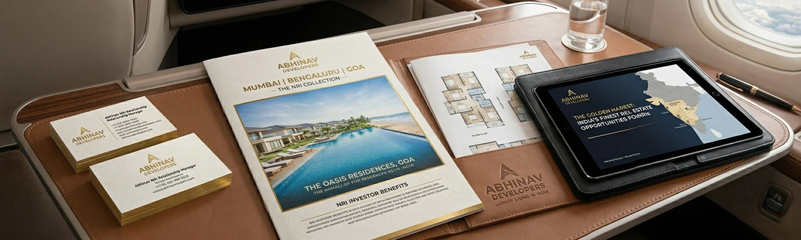
    In real estate marketing for NRI buyers, the quality of printed collateral carries extraordinary weight. An NRI who receives a premium printed project brochure heavy stock, exceptional printing, professional photography, refined typography handles it differently from a standard-quality brochure. It goes on the coffee table. It gets shown to the spouse. It is kept, not discarded.

    This physical quality signal is a direct proxy for the quality the buyer expects from the construction. If the developer cannot invest in producing an exceptional brochure, what does that signal about their investment in the building itself? The logical connection is unfair but real, and it drives purchasing decisions.

    5. Building a Developer Brand That Transcends Individual Projects

    The most successful Indian real estate developers who have cracked the NRI market in Dubai have done so by building strong developer brands not just strong project brands. When the developer’s name alone is sufficient to generate trust and interest, the cost of selling each new project drops dramatically and the premium achievable on each unit increases.

    This is the long game of real estate branding, and it is the one that pays the highest returns. At Richest Branding, we work with developers at every stage of this journey from the first professional brand identity to the mature developer brand that commands respect across three continents.


    Ready to Build a Brand That Builds Empires?

    Strategy • Design • Impact

    richestbranding.com  |  info@richestbranding.com

    Richest Branding — Strategic Branding that Builds Empires

  • D2C Skincare in India: Why Your Packaging Is Either Your Best Sales Channel or Your Biggest Liability

    D2C Skincare in India: Why Your Packaging Is Either Your Best Sales Channel or Your Biggest Liability

    In D2C Skincare, the Package Is the Product Until the Product Is Opened

    Direct-to-consumer skincare has transformed how Indian beauty brands are built. Bengaluru and Pune have become genuine hotbeds of D2C skincare innovation founders with deep formulation knowledge, strong digital marketing instincts, and a clear sense of the gap in the market they want to fill. The ecosystem is vibrant, the opportunity is real, and the competition is fierce.

    In this environment, where the consumer never touches your product in a store before buying it, packaging becomes something fundamentally different from what it is in traditional retail. In D2C, the package is the first physical experience your customer has with your brand. It arrives at their door. They pick it up, turn it over, feel its weight. They open it or they film themselves opening it. They form an instant, decisive judgement about whether the product inside is worth what they paid.

    Get the packaging right, and every delivery becomes a brand building moment. Get it wrong, and even a brilliant formulation cannot save you from the social media verdict that follows.

    1. The Unboxing Experience: Designing for the Moment of Truth

    The unboxing moment is one of D2C marketing’s most powerful and most underutilised brand touchpoints. When a customer opens your package, they are at their most attentive. They have been anticipating this delivery. They are ready to be delighted or disappointed. This is your best opportunity to deliver a brand experience that creates loyalty, drives sharing, and generates the kind of organic content that no paid ad budget can replicate.

    Elements of a premium D2C skincare unboxing experience:

    • Outer packaging the shipping box or mailer should feel intentional, not industrial
    • Internal packaging tissue, honeycomb paper, or branded filler that protects and presents
    • The reveal moment how the products are arranged inside should feel like a gift
    • Brand touchpoints inside a handwritten-feel card, brand story insert, or personalised element
    • Product packaging itself label quality, material finish, and print quality must be impeccable

    2. Label Design for D2C Skincare: Small Surface, Maximum Work

    D2C skincare products serums, moisturisers, face washes, eye creams often come in small formats where label real estate is extremely limited. In this limited space, the label must accomplish several things simultaneously: communicate the brand identity, identify the product, list key ingredients and benefits, provide regulatory information, and look beautiful doing all of it.

    This is where D2C skincare label design requires specialised expertise. The typography hierarchy must be precise to the point where every millimetre matters. The colour choices must work at very small scale. The logo must be powerful at the size it will actually appear which, on a 30ml serum bottle, may be less than a centimetre wide.

    At Richest Branding, our skincare label design process always involves scale testing at real production size because a label that looks stunning at 100% on screen can become cluttered and unreadable at actual label dimensions. This testing step is what separates professional brand design from template based design.

    3. Social Media Ready Packaging: Designing for Shareability

    For D2C brands, particularly in skincare, packaging that performs well on social media is a genuine competitive advantage. User generated content featuring your packaging unboxings on Instagram Reels, shelfies on Reddit, reviews on YouTube is among the most credible and cost-effective marketing a D2C brand can get. And it is packaging design that drives this content creation.

    Designing packaging for social media performance:

    • Strong visual identity that reads clearly in photograph and video thumbnails
    • Colour palette that is Instagram native photographable against common backgrounds
    • Distinctive shape or format that is recognisable even out of context
    • Premium finish materials that catch light beautifully in photography matte, frosted, metallic
    • An unboxing experience that is genuinely worth filming and sharing

    4. Sustainability in D2C Skincare Packaging: Not a Trend, A Consumer Expectation

    Bengaluru and Pune’s D2C skincare consumer segments typically educated, urban, 25-40 year old women and men have made sustainability a significant purchase factor. Packaging that is perceived as wasteful, non-recyclable, or environmentally irresponsible creates real brand risk, particularly as this consumer segment becomes more vocal on social media.

    But sustainable packaging in D2C skincare is a design challenge, not just a material procurement challenge. Kraft boxes can look premium or cheap. Recycled glass can feel artisanal or industrial. Refillable formats can feel innovative or inconvenient. The design work is what determines which of these perceptions wins and a well-designed sustainable pack can command a price premium, not a price discount.

    5. The Price Positioning Signal: How Packaging Tells the Consumer What to Pay

    In D2C skincare, there is a direct and measurable relationship between packaging quality and consumer willingness to pay. Research across the industry consistently shows that consumers calibrate their price tolerance based on packaging quality signals before they even read the price.

    A serum in a frosted glass dropper bottle with a textured label and a weighted cap communicates a price point range to the consumer before they see the actual price. If the product is priced within that perceived range, the purchase feels justified. If it is priced above, the packaging must close the gap. If it is priced significantly below, the consumer may even distrust the price.

    This is why packaging investment in D2C skincare is not just an aesthetic decision it is a pricing strategy decision. The brands in Bengaluru and Pune that have successfully moved to the premium D2C tier have, without exception, made a serious investment in packaging quality as part of that move.

    6. From Instagram Brand to Retail Brand: Packaging That Scales

    Many D2C skincare brands begin with packaging optimised for digital and social channels. As they grow, the best of them begin entering modern trade retail pharmacy chains, premium beauty stores, department stores. At this point, the D2C packaging must be evaluated through a new lens: does it work in a physical retail environment?

    At Richest Branding, we build D2C skincare brand systems with this transition in mind from the beginning. The packaging identity must be strong enough to work in both worlds performing brilliantly in digital UGC content today, and holding its own on a Sephora or Health & Glow shelf tomorrow. Building that dual capability from day one is one of the most valuable strategic investments a D2C skincare brand can make.


    Ready to Build a Brand That Builds Empires?

    Strategy • Design • Impact

    richestbranding.com  |  info@richestbranding.com

    Richest Branding — Strategic Branding that Builds Empires.

  • Selling Spice to the World: How Indian Masala Brands Build Empires in Saudi Arabia and UAE

    Selling Spice to the World: How Indian Masala Brands Build Empires in Saudi Arabia and UAE

    The Middle East Craves Indian Spice. Does Your Brand Know How to Speak to It?

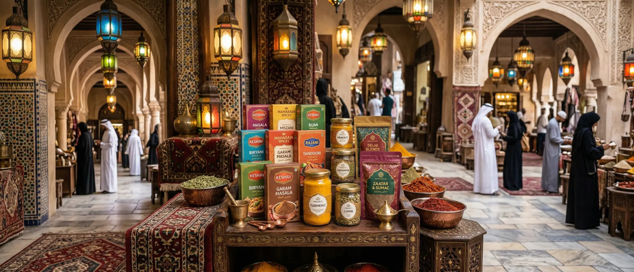
    Saudi Arabia and the UAE are among the most significant markets in the world for Indian spices. The love of Indian cuisine across the Gulf from South Asian expat communities to Arab households who have woven Indian flavours into their everyday cooking creates a demand environment that is both enormous and growing.

    And yet, most Indian spice brands operating in these markets are capturing only a fraction of the available value. They are present in the spice aisles of hypermarkets, in the Indian grocery stores of Riyadh, Jeddah, Dubai, and Abu Dhabi but they are present as commodities, not as brands. Bought because they are available, not because they are chosen.

    The difference between a commodity spice brand and a premium spice brand in Saudi Arabia and the UAE is almost entirely a branding and packaging question. The spices themselves from India’s fertile growing regions are world-class. What is not world-class, in most cases, is the brand that presents them.

    1. Understanding the Middle East Spice Consumer

    The Middle East spice market is not one consumer. It is several distinct consumer groups, each with different relationships to Indian spices and different brand expectations.

    Key consumer segments in Saudi Arabia and UAE:

    • Indian and South Asian diaspora seeking authentic taste with premium presentation
    • Arab households using Indian spices daily brand trust and quality assurance are paramount
    • Premium food enthusiasts interested in single origin, artisanal, and premium spice stories
    • Professional chefs and food businesses bulk quality with consistent specification

    For most Indian spice brands targeting retail in Saudi Arabia and UAE, the primary and secondary segments are the first two diaspora and Arab households. Understanding what each segment values, and ensuring your brand communicates to both, is foundational strategy.

    2. Packaging Design for Spice Retail in Saudi Arabia

    Saudi Arabia’s organised retail sector led by Panda, Carrefour, Tamimi Markets, and the premium specialty chains in Riyadh and Jeddah has elevated its visual and quality standards dramatically in recent years. The Vision 2030 retail modernisation programme has directly raised the bar for what packaging looks like on Saudi supermarket shelves.

    Indian spice brands entering or expanding in Saudi Arabia must design packaging to a standard that respects this elevated retail environment. This means investing in quality printing and materials, integrating Arabic language with genuine typographic care, and building a visual identity that communicates premium and trustworthy above all else.

    Saudi retail packaging non-negotiables:

    • SFDA (Saudi Food and Drug Authority) compliance specific labelling requirements strictly enforced
    • Arabic language  full product information in Arabic, not just a small translation panel
    • Halal certification prominently displayed, from a recognised certifying body
    • Shelf life and storage information clear, compliant, and prominently positioned
    • Country of origin ‘Product of India’ can be a positive signal when combined with premium design

    3. The UAE Premium Spice Opportunity: A Different Market, A Higher Bar

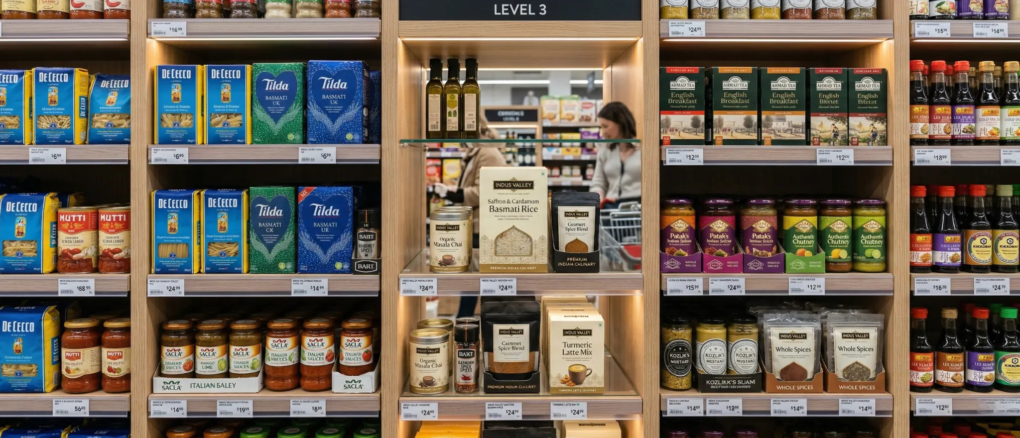
    While Saudi Arabia offers scale, the UAE and Dubai specifically offers premium positioning. The UAE’s cosmopolitan, affluent consumer base, combined with the world’s most competitive retail environment, makes Dubai the global proving ground for premium spice brands.

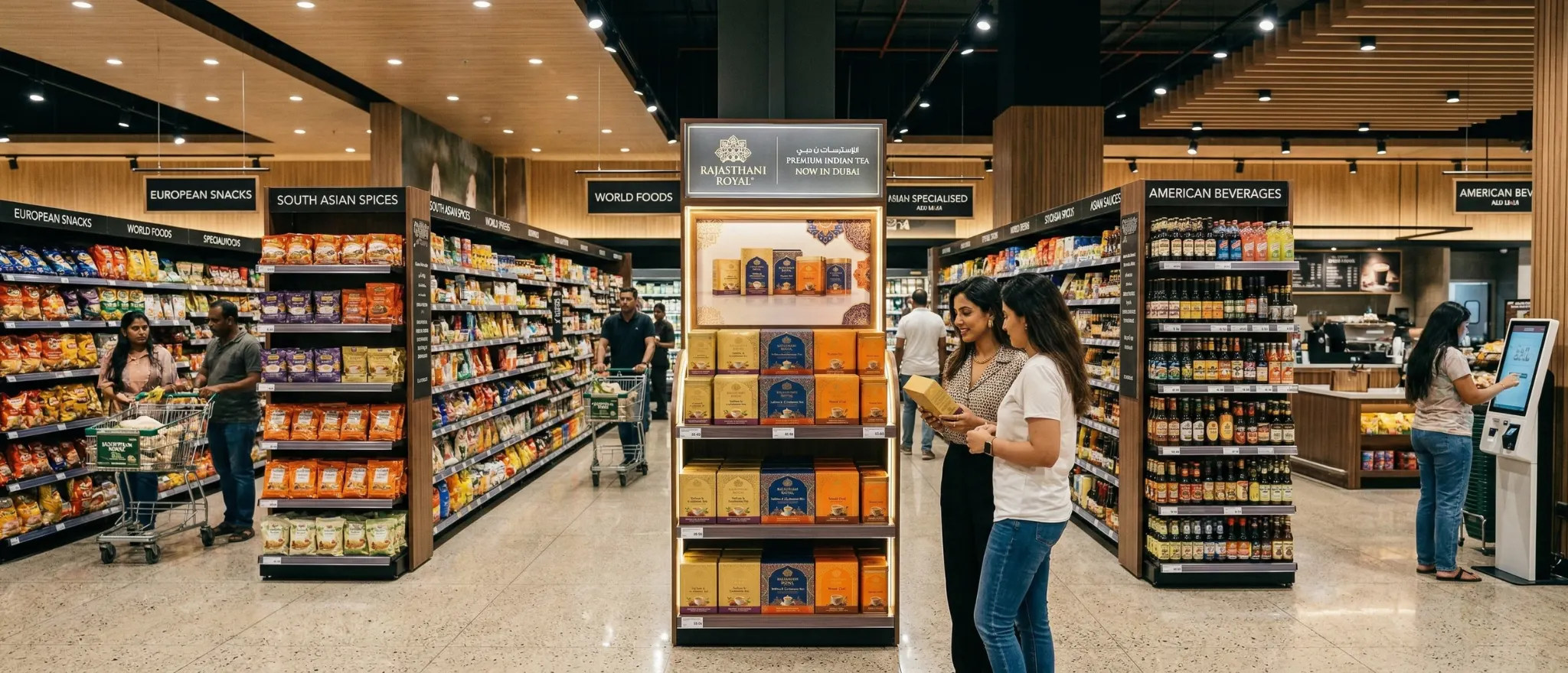
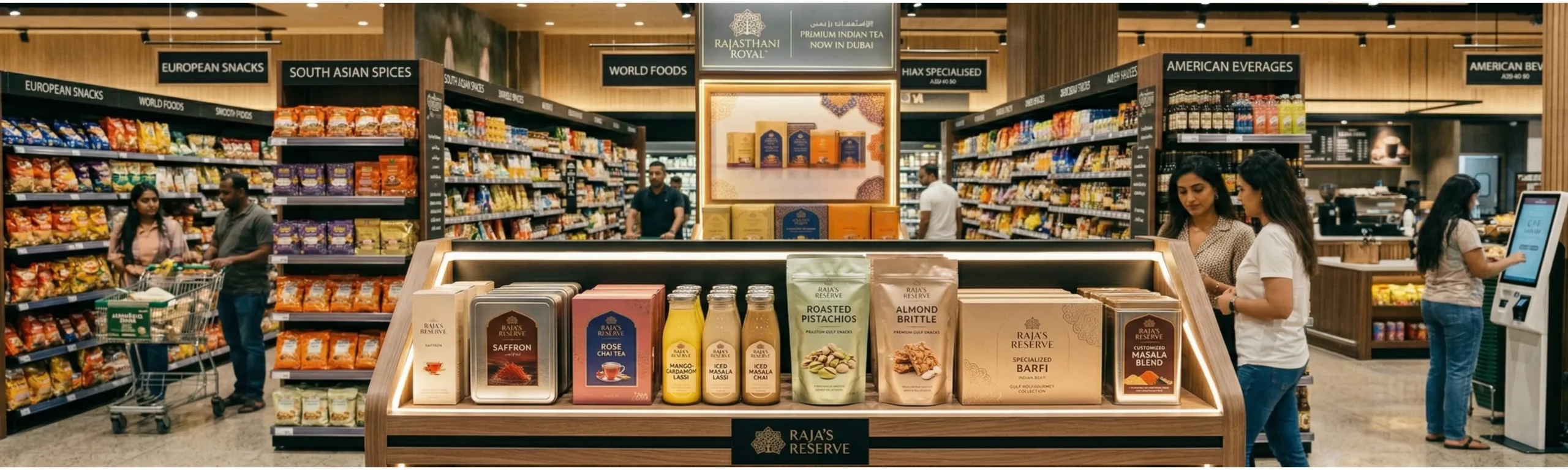
    A spice brand that succeeds in Dubai’s Spinneys, Waitrose UAE, or the specialty food halls of Dubai Mall at a price point that reflects genuine premium positioning has proven something extraordinary: that Indian spice can command the same shelf space, the same price points, and the same consumer respect as the world’s most premium food brands.

    This is achievable. We have seen it happen. But it requires building the brand to that standard from the ground up. Not adapting an existing domestic brand with a sticker, but creating an identity that was always designed for this level.

    4. Single Origin and Artisanal Spice Brands: The Premium Opportunity

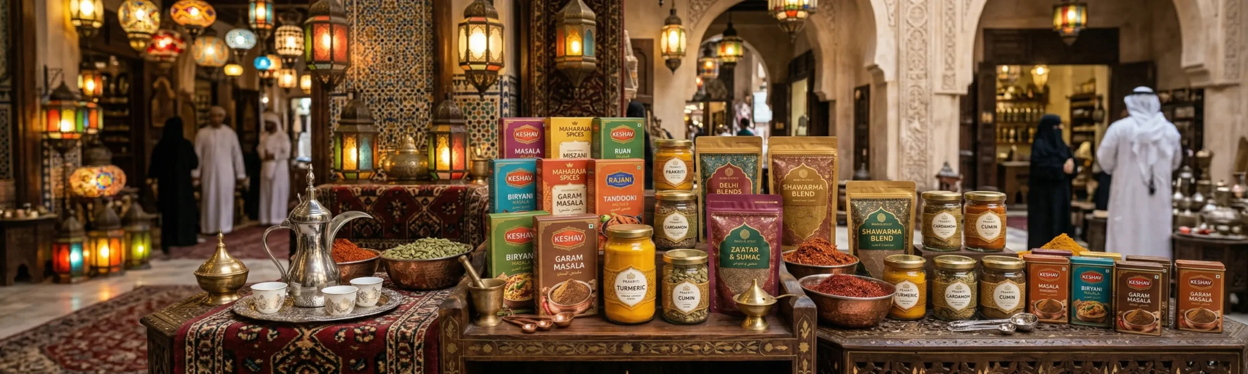
    One of the most exciting brand opportunities in the Gulf spice market right now is the single origin, artisanal spice segment. As consumers globally become more food-literate and more interested in provenance, a spice brand that can tell a specific, authentic story Kashmiri saffron from a specific cooperative, Malabar black pepper from a single estate, Rajasthani coriander from a specific district has a compelling premium proposition.

    In Dubai and Abu Dhabi, this kind of provenance storytelling resonates powerfully with the premium consumer segment. But it requires packaging and brand identity that can carry this story with the visual weight it deserves. A premium single-origin brand in a supermarket bag with generic typography tells no story. The same product in premium packaging with a designed origin story becomes a gift, a conversation, a brand that people share.

    5. Building a Spice Brand Family: From Core to Premium

    The most strategically successful Indian spice brands in the Gulf operate across multiple tiers a mainstream tier for everyday cooking needs, and a premium tier for gift giving, special occasions, and the premium retail channel. This tiered brand architecture allows a single company to maximise both volume and margin.

    Building this kind of tiered architecture requires deliberate brand design decisions from the beginning. The premium tier must look genuinely premium not just a more expensive version of the mainstream tier. It requires its own visual identity system, its own packaging format, its own story. At Richest Branding, we design these brand families as integrated systems, where each tier enhances the credibility of the others.

    6. Your Spice Brand Deserves a Story the World Will Remember

    India gave spices to the world. The maritime spice routes that shaped global history were driven by the extraordinary quality and desirability of Indian spices. That heritage is yours. It is your brand story’s foundation and it is a foundation that is as powerful in Riyadh and Dubai as it is in Mumbai and Ahmedabad.

    The question is not whether your spice brand has a story worth telling. It does. The question is whether your packaging, your brand identity, and your market positioning are telling that story with the confidence and quality that the world’s most valuable spice market demands. At Richest Branding, we build the brands that tell it right.


    Ready to Build a Brand That Builds Empires?

    Strategy • Design • Impact

    richestbranding.com  |  info@richestbranding.com

    Richest Branding — Strategic Branding that Builds Empires

  • The Rebranding Playbook: How Mumbai’s Boldest Companies Reinvented Their Identity

    The Rebranding Playbook: How Mumbai’s Boldest Companies Reinvented Their Identity

    Every Successful Brand Eventually Faces the Same Moment

    There comes a point in every successful business’s life when the brand that served it well in the beginning starts holding it back. The logo that felt exciting at launch now feels dated. The colour palette that once felt fresh now blends into the competition. The brand identity built on a tight startup budget is being asked to represent a company that has grown far beyond its origins.

    This is the rebranding moment. And how a company handles it determines whether it moves to the next level of growth or stalls at the ceiling of what its current brand allows it to achieve.

    In Mumbai’s hypercompetitive business environment, we have seen this pattern play out across every industry from FMCG and food brands in Dharavi’s production corridors to technology companies in Lower Parel’s co working towers, from family businesses in Mulund to export manufacturers in Bhiwandi. The ones who rebrand strategically emerge stronger. The ones who avoid it or rush it pay a heavy price.

    1. What Triggers a Successful Rebranding: The Right Reasons vs the Wrong Ones

    Rebranding is a significant investment of time, money, and organisational energy. It should not be undertaken reactively, impulsively, or for cosmetic reasons alone. The most successful rebrands are triggered by genuine strategic shifts in the business.

    Right reasons to rebrand:

    • The business has fundamentally evolved new category, new audience, new price point
    • A merger, acquisition, or partnership requires identity consolidation
    • The brand is genuinely confused with a competitor or carries negative associations
    • International expansion requires an identity that travels beyond India
    • The current brand is preventing access to premium channels, partners, or investors

    Wrong reasons to rebrand:

    • Boredom with the current logo at the leadership level
    • A competitor rebranded and it created reactive pressure
    • A new marketing manager wants to make their mark

    2. The Risk That Paralyses Business Owners And How to Manage It

    The single biggest fear that stops Mumbai business owners from rebranding when they should is this: will I lose the recognition and loyalty I have spent years building? This is a legitimate concern that deserves a strategic answer not dismissal.

    The answer is brand equity mapping. Before any design work begins, we systematically identify every element of the current brand that carries genuine consumer equity the elements that consumers recognise, associate with, and rely on. These are protected throughout the rebrand. Everything else can evolve freely.

    This approach which we use at Richest Branding on every rebranding project allows the brand to make a dramatic visual leap while maintaining the thread of continuity that existing customers need to follow the journey without losing confidence.

    3. The Rebranding Process: Seven Stages That Must Not Be Skipped

    • Brand Audit document every current brand expression and evaluate equity levels
    • Competitive Landscape Analysis understand where every competitor is positioned visually
    • Strategic Brief define the new positioning, audience, and brand personality precisely
    • Concept Development explore multiple identity directions before committing
    • Stakeholder Validation test concepts with internal teams, key customers, and channel partners
    • Brand Standards Development build the guidelines that govern the new identity
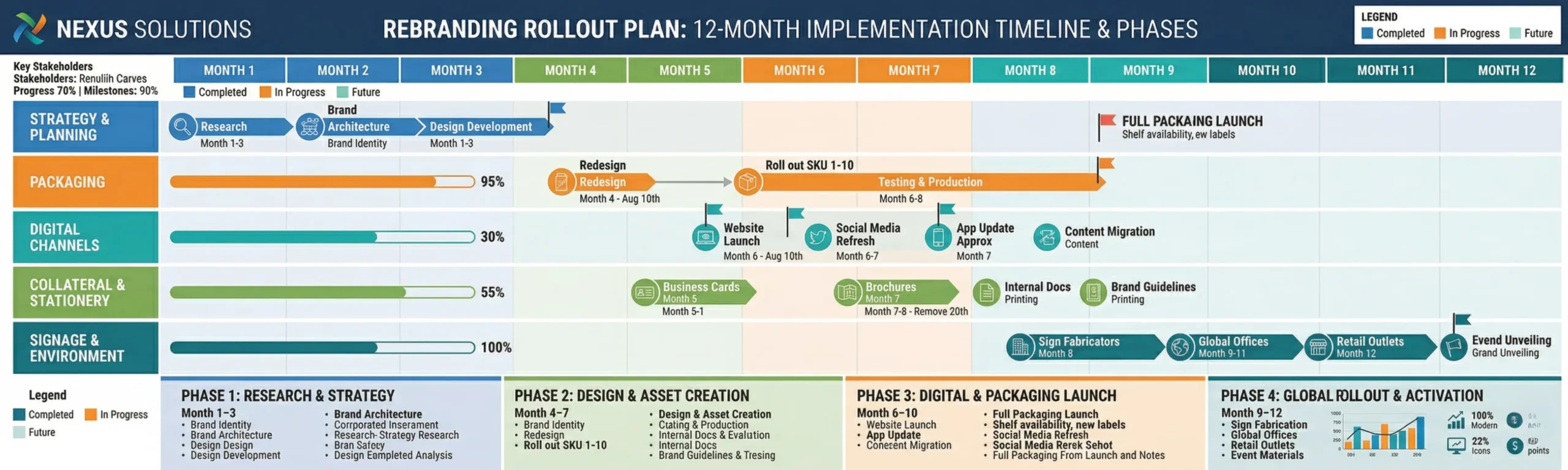
    • Phased Rollout Planning sequence the changeover to minimise disruption and maximise impact

    Skipping any of these stages particularly the audit, the brief, and the rollout planning is how rebranding projects go wrong and expensive. The stage that is most commonly skipped, to devastating effect, is the rollout planning. A brand that is rebranded brilliantly but rolled out inconsistently delivers a fraction of its potential value.

    4. Rebranding Legacy Businesses: The Mumbai Family Business Challenge

    Some of Mumbai’s most interesting rebranding challenges come from family businesses navigating generational transition. A second or third-generation business owner inheriting a well known but visually dated brand faces a unique challenge: honouring the heritage that built the business while repositioning it for contemporary relevance.

    This is a deeply human process, not just a design process. It requires conversations about values, pride, identity, and ambition. At Richest Branding, we bring the sensitivity and strategic rigour that these conversations require. The goal is always a brand that the founding generation is proud of and the new generation is excited to build.

    5. Measuring Rebranding Success: The KPIs That Matter

    • Brand recall lift measured through consumer research before and after rebranding
    • Price point elasticity can the rebranded product command a higher price without resistance
    • Channel access improvement are premium retailers and distributors now more receptive
    • Talent attraction quality are better candidates applying to join the company
    • Stakeholder pride metric the intangible but real measure of how team members feel about representing the brand

    6. Why Richest Branding Leads Mumbai’s Most Important Rebrands

    Rebranding is the most complex and high stakes project in brand design. It requires the strategic depth to understand a business’s full history and future ambitions, the design excellence to create an identity that is both evolved and fresh, and the project management rigour to execute a complex, multi-touchpoint transition without disruption.

    At Richest Branding, rebranding is not a service we offer as an add-on. It is a core discipline one we have honed across industries, company sizes, and market contexts. When a Mumbai company is ready to become what it was always capable of being, we are the partner that makes the transformation visible.


    Ready to Build a Brand That Builds Empires?

    Strategy • Design • Impact

    richestbranding.com  |  info@richestbranding.com

    Richest Branding — Strategic Branding that Builds Empires

  • Export Ready Packaging: What Australian and Singapore Retailers Demand from Indian Brands

    Export Ready Packaging: What Australian and Singapore Retailers Demand from Indian Brands

    Your Product Is World Class. Does Your Packaging Know That?

    India exports billions of dollars worth of food, personal care, and FMCG products every year. A growing share of that export value is going to mature, premium markets Australia, Singapore, the UK, Canada. And the most common barrier that prevents Indian brands from accessing the premium tier of these markets is not the product. It is the packaging.

    In Sydney’s Harris Farm Markets, Singapore’s Cold Storage, or Melbourne’s specialty deli chains, Indian products sit on shelves alongside some of the world’s best branded consumer goods. The consumer in these environments is sophisticated, time pressed, and makes purchase decisions with extraordinary speed. Your packaging has seconds to communicate that your product belongs here that it is not a commodity import, but a premium product worth choosing.

    At Richest Branding, we have built export-ready brand identities and packaging systems for Indian companies targeting exactly these markets. The process is specific, the standards are clear, and the results for brands willing to make the investment are transformational.


    1. The Export Packaging Audit: What Needs to Change

    Most Indian brands that approach us for export packaging work do not need their product changed. They need their packaging rebuilt from a different set of assumptions the assumptions of an international retail buyer and an international consumer, not a domestic Indian one.

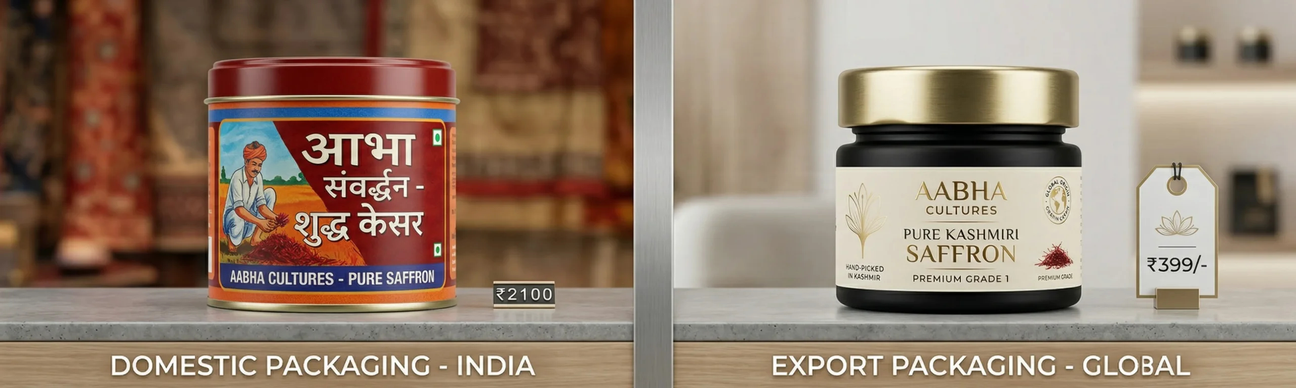
    Key differences between domestic and export packaging requirements:

    • Language and labelling full compliance with destination country food labelling law is mandatory
    • Design register international consumers perceive ‘Indian-looking’ design as lower quality; premium beats ethnic
    • Material quality thinner, lower-quality packaging materials that are acceptable domestically fail inspection
    • Information hierarchy international consumers expect clear, simple front of pack communication
    • Portion sizing and format Australian and Singapore consumers have specific expectations about pack sizes

    2. The Australian Market: What Indian F&B and FMCG Brands Must Know

    Australia is one of the most promising and yet most demanding export markets for Indian brands. The Indian diaspora is substantial and growing particularly in Melbourne, Sydney, and Brisbane. But the premium retail opportunity goes beyond the diaspora to mainstream Australian consumers with strong interest in global cuisines, health-conscious products, and authentic ingredients.

    Australian retail buyers from Coles and Woolworths to Harris Farm, IGA Marketplace, and specialty food chains evaluate incoming F&B brands with rigour. FSANZ compliance, Australian Made considerations, clear allergen labelling, and specific nutritional panel formats are all non-negotiables. Beyond compliance, the design must meet the aesthetic standards of a market that regularly sees the world’s best packaged products.

    What Australian retail buyers respond to in Indian brand packaging:

    • Authenticity genuine story of origin, ingredients, and method. Australian consumers value provenance
    • Clean ingredient lists shorter, recognisable ingredients outperform long lists in Australian consumer research
    • Premium materialism heavier gauge packaging, quality sealing, premium label finish signals quality
    • Clear benefit communication what it is, why it is good, how to use it in plain English, unambiguously

    3. The Singapore Market: Precision Branding for Asia’s Most Demanding Consumers

    Singapore represents the most sophisticated consumer market in Southeast Asia. A multinational, multilingual city state with one of the world’s highest per capita incomes, Singapore is where Indian brands can command premium prices and build international credibility that opens doors across the broader ASEAN market.

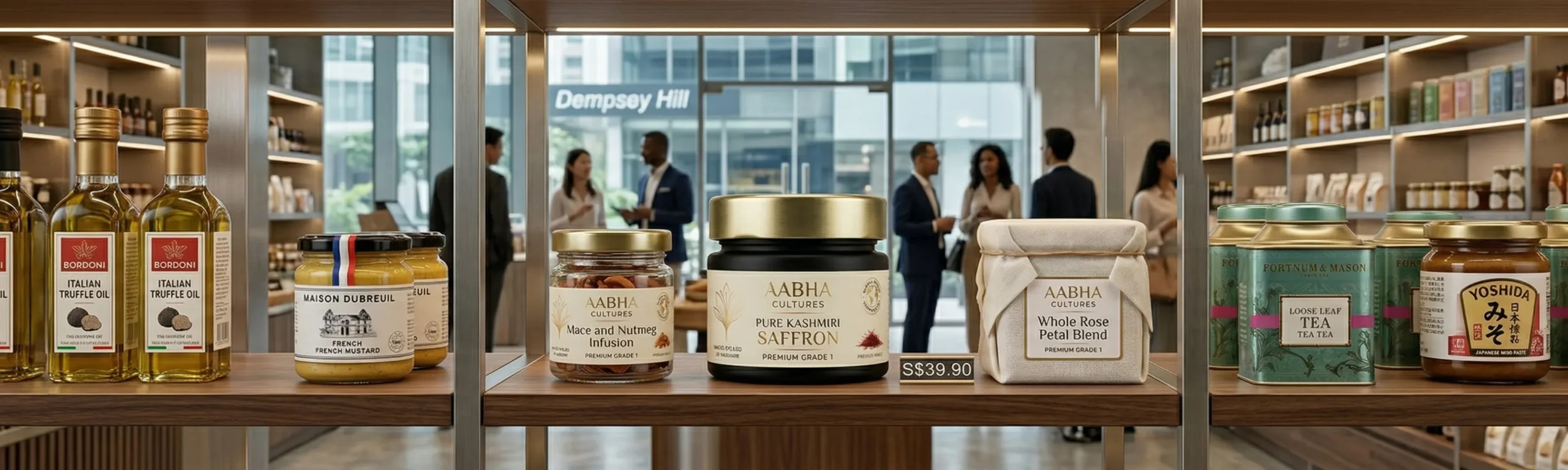
    Singapore’s retail environment from FairPrice Finest to Cold Storage, from Mustafa Centre to Great World City’s specialty stores has extremely high visual standards. The city’s design literacy is among the highest in Asia. Packaging that looks anything less than internationally competitive will simply not be picked up.

    For Indian spice brands, health food brands, and premium snack brands, Singapore is a proving ground. Crack Singapore’s premium retail with the right brand identity and packaging, and you have proven your brand can operate at world-class standards a credential that opens conversations in Japan, South Korea, Hong Kong, and beyond.


    4. Designing for Retail Planogram Compliance

    Something that most Indian brands learn too late when entering export markets is the concept of retail planogram compliance. Retailers in Australia and Singapore organise their shelves with extraordinary precision. Pack dimensions must be consistent. Facing sizes must meet retailer specifications. Label placement must align with shelf-reading conventions.

    This means that export packaging design cannot be done in isolation from retail operations knowledge. At Richest Branding, we design export packaging with retailer requirements built in from the beginning ensuring that your product is not just beautiful but retail-ready from day one.

    5. The India Story: Your Most Powerful Export Brand Asset

    In both Australia and Singapore, ‘Made in India’ when combined with premium presentation is a genuine advantage, not a liability. The global reputation of Indian cuisine, Ayurvedic wellness traditions, and artisanal food production is strong and growing. The key is presenting the India story with pride, confidence, and premium visual craft.

    The biggest mistake Indian export brands make is trying to hide their Indian identity in international markets. The brands that win in Sydney and Singapore are the ones that lead with it authentically, beautifully, and confidently. Because the world wants Indian products. They just need them to arrive in the visual language they can trust.

    6. Start the Export Brand Journey with Richest Branding

    Building an export-ready brand identity and packaging system is a specific discipline that requires expertise in international retail standards, design sensibility calibrated to export market audiences, and deep understanding of the regulatory environments of destination countries.

    It is also one of the most exciting and rewarding projects we work on at Richest Branding because the moment an Indian brand we have built lands on a shelf in Melbourne, Singapore, or Dubai and holds its own next to the world’s best, we know that strategic branding has done exactly what it is supposed to do: build empires, one shelf at a time.


    Ready to Build a Brand That Builds Empires?

    Strategy • Design • Impact

    richestbranding.com  |  info@richestbranding.com

    Richest Branding — Strategic Branding that Builds Empires
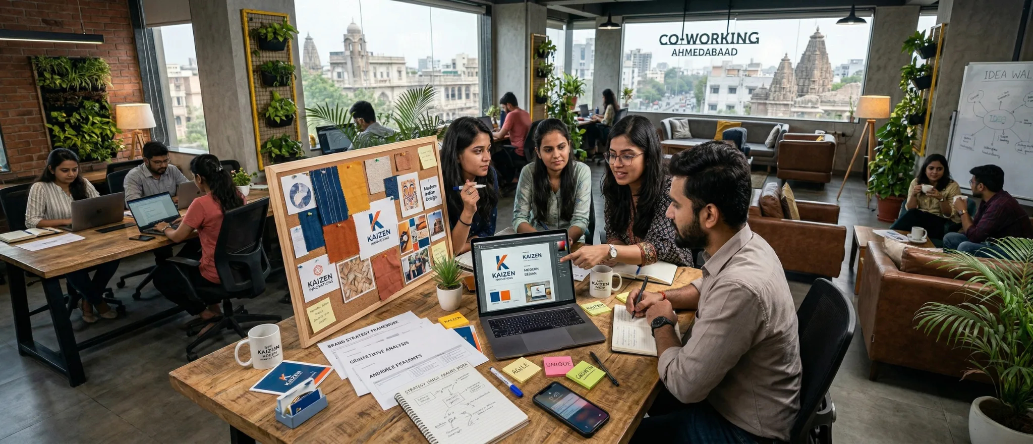
  • Why Ahmedabad’s Smartest Startups Invest in Brand Strategy Before Product Launch

    Why Ahmedabad’s Smartest Startups Invest in Brand Strategy Before Product Launch

    The Ahmedabad Entrepreneur Has Every Advantage Except One

    Gujarat, and Ahmedabad in particular, produces entrepreneurs at a rate that the rest of India watches with genuine admiration. The work ethic, the financial intelligence, the network density, the community support systems the Gujarati startup ecosystem has genuine structural advantages.

    But there is one area where many Gujarat startups consistently underinvest, and it costs them dearly: brand strategy. Not marketing. Not advertising. Brand strategy the foundational work of defining who you are, who you are for, what position you own in the market, and how you communicate all of this with consistency and conviction.

    At Richest Branding, we have seen talented Ahmedabad entrepreneurs build genuinely excellent products that struggle to gain traction not because the product fails, but because the brand fails to communicate the product’s value. And we have seen the transformation that happens when brand strategy precedes launch, not follows it.


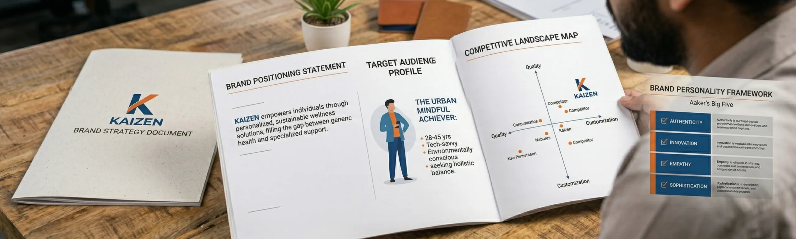
    1. What Is Brand Strategy, and Why Does It Come Before Design?

    Brand strategy is the intellectual framework on which everything visual is built. It answers the questions that, if left unanswered, result in a brand that looks fine but means nothing and sells nothing.

    The core questions brand strategy answers:

    • Who exactly is our target customer not broadly, but specifically and vividly
    • What specific problem do we solve for them that no competitor solves as well
    • What position do we want to own in our category premium, accessible, innovative, trusted
    • What is our brand personality if our brand were a person, how would they speak and behave
    • What is our brand’s story the authentic narrative that gives the brand meaning and memorability
    • What are our brand values the non-negotiable principles that guide every decision

    Without clear answers to these questions, even the most beautiful logo design and the most expensive packaging design will fail to build brand equity. Design without strategy is decoration. Design with strategy is business acceleration.

    2. The Positioning Work: Owning a Category in Gujarat’s Competitive Market

    In Ahmedabad’s increasingly competitive startup landscape, being good is no longer enough to win. You need to be known for something specific — a clear, ownable position in your category that lives in the mind of your target customer.

    Think about the food and beverage brands from Ahmedabad that have broken out nationally. They are not remembered for being ‘good food.’ They are remembered for something specific an authentic regional recipe, an unexpected ingredient, an uncompromising quality stance. That specificity is positioning, and it is built through brand strategy, not marketing spend.

    3. The Brand Name: Your Most Durable Strategic Decision

    For startups preparing to launch, the brand name decision is simultaneously the most important and the most under strategised. Most startup founders spend days agonising over their product formula and minutes on their brand name. The brand name, however, will outlive many product iterations. It will be the anchor of every marketing investment you ever make.

    What makes a powerful startup brand name:

    • Distinctive immediately stands out in category, not generic or descriptive
    • Memorable sticks after one or two exposures, is easy to recall and recommend
    • Scalable works as the business expands beyond its original product or geography
    • Available trademark registrable in key categories and domains available
    • Story able has a narrative or meaning that can be communicated and built upon

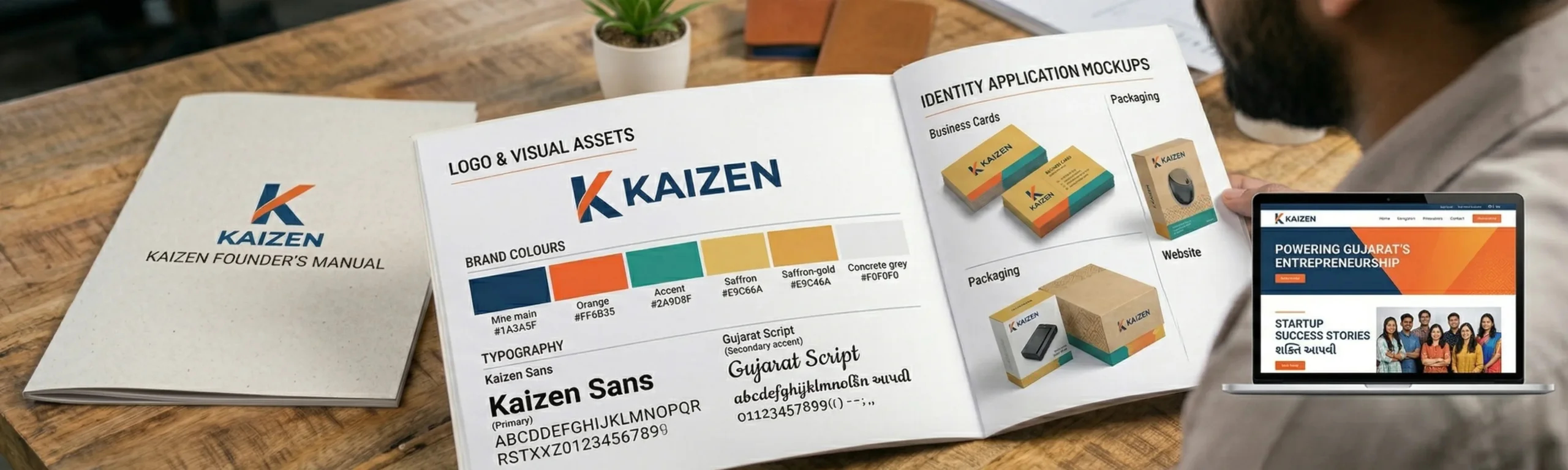
    4. Visual Identity for Startups: Building for Today and for Scale

    A startup’s visual identity must do something that an established company’s identity does not it must work with virtually no brand recognition behind it. Every visual element must carry more communication weight because there is no accumulated brand equity to fall back on.

    This is why startup brand design requires specific strategic sensibility. The identity must be distinctive enough to create immediate recognition, flexible enough to work across a startup’s inevitably wide range of applications, and built with enough quality and longevity to not need a costly redesign eighteen months after launch.

    The temptation for bootstrap startups in Ahmedabad and Surat is to cut costs on brand design early. This is the most expensive economy they can make. A poorly designed early brand costs significantly more to correct later in redesign costs, in lost brand equity, and in the time spent explaining away a brand that does not reflect the business’s actual quality.


    5. Investor Readiness: How Brand Quality Signals Business Quality

    For Ahmedabad’s growing startup ecosystem increasingly plugged into Mumbai’s and Bengaluru’s investor networks brand quality is a direct investor signal. Angels and early stage VCs are evaluating hundreds of decks. The quality of your brand presentation, your pitch deck design, your website, and your packaging communicates something about the quality of your thinking before a word is read.

    We have worked with several Gujarat startups going through fundraising processes. The difference in investor response to a pitch backed by professional brand collateral versus a pitch assembled without brand attention is measurable and significant. Investors invest in teams and businesses they trust. Your brand, at its most fundamental level, is a trust signal.

    6. When to Engage a Brand Strategy Partner and What to Expect

    The ideal moment to engage a brand strategy partner is before your visual identity is designed or, if you have already launched, at the point where you are planning your first significant market expansion.

    At Richest Branding, our brand strategy engagements begin with a deep discovery process understanding the business, the competitive landscape, the target audience, and the founder’s vision. From this foundation, we build a Brand Strategy Document that becomes the creative brief for all design work, the communication guide for all marketing, and the north star for every brand decision the business makes for years to come.

    Because for Ahmedabad’s most ambitious entrepreneurs, building a great business and building a great brand are not two separate tasks. They are the same task, pursued together from the very beginning.


    Ready to Build a Brand That Builds Empires?

    Strategy • Design • Impact

    richestbranding.com  |  info@richestbranding.com

    Richest Branding — Strategic Branding that Builds Empires


  • Corporate Identity Is Not a Logo It Is a Growth Strategy.

    Corporate Identity Is Not a Logo It Is a Growth Strategy.

    The Companies That Win Markets Are Always the Companies That Win Minds First

    Walk into the offices of Mumbai’s most successful companies from financial services firms in BKC to technology companies in Powai and notice something they all share: a brand identity that communicates exactly who they are before a word is spoken. The colour of the walls, the typography on the signage, the quality of the business cards, the website’s visual language every element is deliberate.

    This is corporate branding. Not a logo. Not a tagline. A comprehensive, strategic identity system that makes a company’s positioning and values tangible at every touchpoint. And in today’s hyper competitive business environment where clients, investors, partners, and top talent all form instant judgements corporate branding is one of the most powerful competitive advantages a business can build.

    At Richest Branding, we work with ambitious companies across Mumbai, Pune, and Bengaluru who understand this. They come to us not because they want a new logo, but because they want to reposition, attract better clients, enter new markets, and build something that lasts.

    1. What Corporate Branding Actually Includes

    When business owners hear ‘corporate branding,’ many think logo and website. But a complete corporate brand identity is far more comprehensive and far more valuable than these two elements alone.

    A complete corporate brand system includes:

    • Brand Strategy positioning, purpose, values, voice, and competitive differentiation
    • Visual Identity logo system, colour palette, typography, iconography, photography style
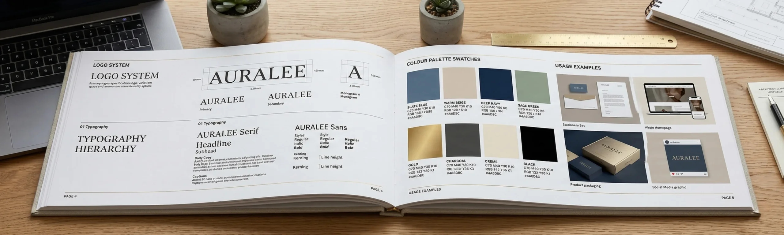
    • Brand Guidelines the rulebook that ensures consistency across all applications
    • Collateral Design business cards, letterheads, presentations, proposals, brochures
    • Environmental Branding office interiors, signage, reception, event spaces
    • Digital Identity website, social media templates, email signatures, digital ads
    • Employer Brand how the company presents itself to potential employees

    2. Brand Consistency: The Compound Interest of Business Identity

    The most powerful thing a strong corporate brand does is compound. Every consistent brand impression every business card, every proposal cover, every LinkedIn post, every email reinforces the same message in the mind of your audience. Over time, this consistency builds something invaluable: brand recognition, brand recall, and brand trust.

    The inverse is equally true. Every inconsistent brand expression a logo used in the wrong colour, a presentation in a different font, a proposal template that looks nothing like the website erodes the brand equity you are trying to build. Mumbai’s and Pune’s most successful companies do not allow this inconsistency. They invest in brand guidelines precisely to prevent it.

    3. How Corporate Branding Directly Impacts Revenue

    If branding feels like an intangible investment, consider these concrete revenue mechanisms that a strong corporate brand drives:

    • Premium pricing a premium looking brand commands premium prices. Clients perceive higher value before the first conversation
    • Faster client acquisition a professional brand reduces the trust-building time in sales cycles significantly
    • Better talent attraction top professionals choose employers with strong, aspirational brand identities
    • Investor confidence investors evaluate brand quality as a proxy for management quality and business seriousness
    • Partnership opportunities premium brands attract premium partners, distributors, and collaborators

    4. The Brand Audit: Where Most Mumbai Companies Discover Their Biggest Problem

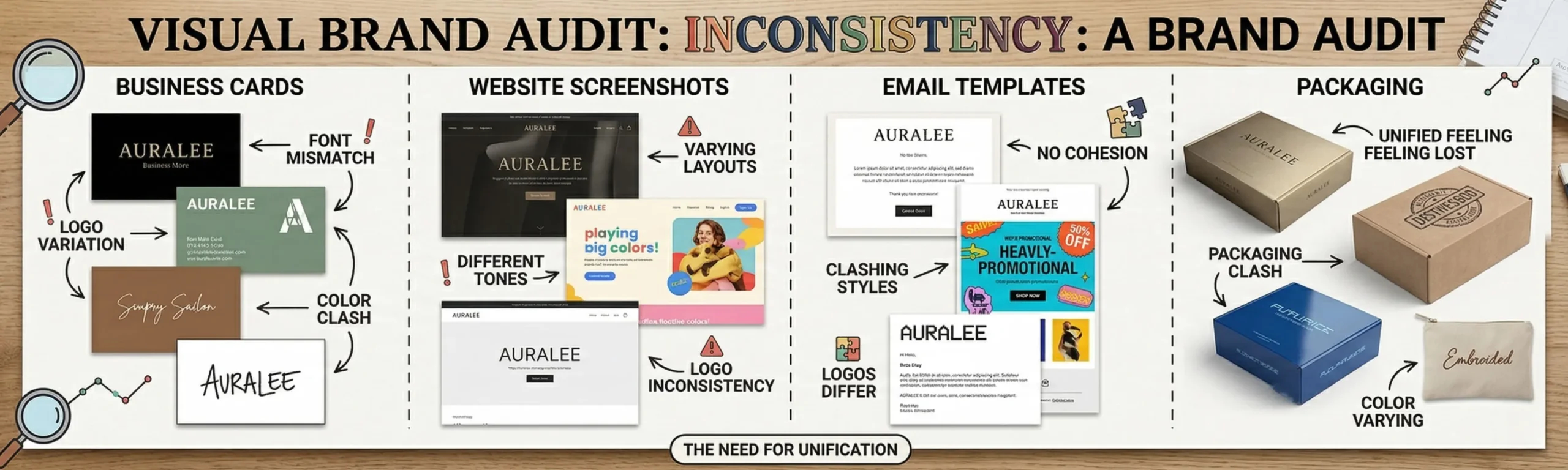
    One of the first things we do at Richest Branding when a company comes to us for corporate branding is a Brand Audit a systematic review of every place the brand currently exists in the world. What we find is almost always surprising to the client.

    In most growing businesses, the brand has been assembled over years through a series of quick decisions a logo done in the early days, a website redesigned by a freelancer in year three, a brochure put together in a rush for an exhibition, a presentation template created by a well-meaning employee. The result is a brand that looks different everywhere and communicates nothing consistent anywhere.

    The brand audit makes this visible and quantifiable. And it almost always reveals that the brand’s current expression is significantly underperforming its actual business quality. This gap between how good the business is and how good the brand looks is the opportunity we build upon.

    5. Rebranding vs Brand Refresh: What Is Right for Your Company

    Not every corporate branding project needs to start from scratch. For established companies with strong market recognition, a Brand Refresh which evolves the existing identity rather than replacing it is often the right approach. This preserves the equity that has been built while modernising and elevating the brand’s expression.

    A full Rebrand is appropriate when the business has fundamentally changed new market, new service category, new target audience, merger or acquisition, or when the current brand is genuinely holding the business back. The key is to make this decision strategically, not reactively.

    6. Building a Brand That Attracts Dubai and Singapore Business

    For Mumbai and Pune companies with international ambitions and many of the most ambitious ones are targeting the Gulf and Southeast Asian markets the corporate brand must be built to international standards. Business development in Dubai, Abu Dhabi, Singapore, and Australia requires a brand identity that does not look out of place next to global competitors.

    This does not mean losing your Indian identity. It means presenting that identity with the visual confidence and professional quality that international markets expect. At Richest Branding, we have helped multiple B2B companies achieve exactly this walking into international markets with a brand presence that commanded immediate respect and opened doors that had previously been closed.


    Ready to Build a Brand That Builds Empires?

    Strategy • Design • Impact

    richestbranding.com  |  info@richestbranding.com

    Richest Branding — Strategic Branding that Builds Empires


  • Cracking the Gulf: How Indian F&B Brands Build Winning Identities in Dubai and Oman.

    Cracking the Gulf: How Indian F&B Brands Build Winning Identities in Dubai and Oman.

    The Gulf Is the Most Valuable Export Market Indian F&B Brands Are Underestimating

    The Gulf Cooperation Council UAE, Oman, Saudi Arabia, Kuwait, Bahrain, Qatar represents one of the most commercially valuable markets for Indian food and beverage brands in the world. A large and affluent Indian diaspora, combined with growing local consumer interest in Indian cuisine, creates a demand environment that Indian F&B entrepreneurs often know exists but rarely exploit to its full potential.

    The reason most Indian brands fail to crack the Gulf is not product quality. India produces some of the finest food products in the world from premium spices to artisanal snacks, from traditional beverages to innovative health products. The reason for failure, almost universally, is brand identity and packaging that does not meet the visual and regulatory standards that Gulf retail demands.

    At Richest Branding, we have worked with Indian F&B brands specifically targeting the Gulf market, and we have learned precisely what it takes to succeed. It begins, always, with building the brand right.


    1. Understanding the Gulf Consumer for Indian F&B

    The Gulf market for Indian food is not a monolith. It contains at least three distinct consumer groups, each with different expectations from Indian F&B brands.

    The Three Gulf Consumer Segments:

    • Indian diaspora seeking authentic taste memories they want the real thing, beautifully presented
    • Expatriate community open to Indian flavours they need accessible, clearly communicated products
    • Local GCC consumers exploring world cuisines they judge by visual quality and premium cues first

    Your branding and packaging strategy must be clear about which segment you are primarily targeting because the design language, the price point signals, and the retail channel strategy are different for each.

    2. What Gulf Retail Buyers Look for in Indian F&B Brands

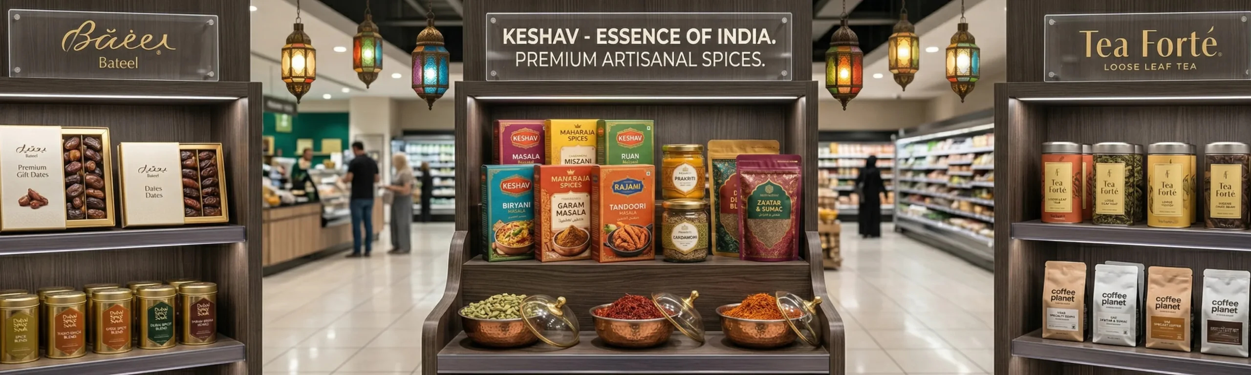
    Getting into Lulu Hypermarket, Carrefour UAE, Spinneys, or the premium specialty food stores in Dubai and Oman is not just a distribution challenge. It is a branding challenge. Retail buyers in the Gulf evaluate incoming products with a sophisticated eye, and their first question before they look at price, before they evaluate distribution reach is always: does this brand look right for our shelves?

    Gulf retail buyer checklist for F&B brands:

    • Packaging finish quality premium materials, professional printing, clean design
    • Regulatory compliance Arabic language requirements, halal certification visibility, nutritional labelling
    • International visual standards does it look like it belongs next to European and international brands
    • Brand coherence does the range look unified and professionally managed
    • Shelf-ready presentation consistent pack sizes, clear retailer-friendly front of pack hierarchy

    3. Arabic Label Integration Strategy, Not Just Translation

    One of the most technically and creatively challenging aspects of designing for Gulf markets is the integration of Arabic text into your packaging. This is not simply a translation exercise. Arabic script reads right to left, has its own typographic traditions, and must be handled with cultural sensitivity and design skill to avoid looking like an afterthought.

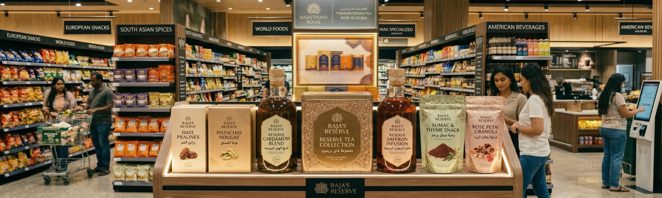
    The worst packaging approach we see from Indian brands entering the Gulf is a sticker approach English design primary, Arabic sticker applied on the back or side. This immediately signals to Gulf retail buyers that the brand has not invested seriously in the market. The right approach is designing bilingual packaging from the ground up, with Arabic and English integrated as equals in a beautiful, cohesive design.

    At Richest Branding, we design Gulf-ready packaging with Arabic integration as a first principle, not an afterthought. The result is packaging that feels genuinely at home in Dubai’s retail environment not an Indian product visiting the Gulf, but a brand that belongs there.


    4. The Halal Brand Opportunity: More Than a Certification

    For Indian F&B brands targeting the Gulf, halal certification is the baseline. But the most strategic Indian brands are going beyond certification to build halal as a brand value communicating it visually, narratively, and through every aspect of the brand identity.

    In the Gulf, a halal brand is not just about what the product does not contain. It is about trust, transparency, and a commitment to quality standards that resonates deeply with Muslim consumers across the Gulf and Southeast Asia. Brands that communicate this authentically not just with a small stamp on the back panel but through the entire brand voice and identity are building something far more durable than a product listing.

    5. Indian Beverage Brands in the Gulf: The Premium Opportunity

    The premium non alcoholic beverage space in the Gulf is exceptionally fertile for Indian brands. From traditional sharbats and rose drinks to modern functional health beverages rooted in Indian botanical tradition ashwagandha tonics, turmeric lattes, chilled chaas the opportunity is enormous and the competition, at the premium end, is sparse.

    What unlocks this opportunity is not the formulation Indian manufacturers are world-class. What unlocks it is a brand identity that communicates premium, natural, and authentic in the visual language of a world class beverage brand. The packaging architecture, the bottle shape, the label design, the brand name, the brand story all of these must be built to international standards.

    6. Building Gulf Market Brand Strategy Before You Launch

    The biggest and most costly mistake Indian F&B brands make when entering Gulf markets is treating branding as something to sort out after they have secured distribution. In reality, the sequence must be reversed. Your brand identity and packaging must be Gulf ready before you approach a single distributor or retail buyer.

    This is because your brand is your sales pitch. In the Gulf, the first meeting with a retail buyer is almost always a visual presentation they are evaluating your brand at first sight. Arriving with substandard packaging and a vague brand identity wastes the relationship. Arriving with a premium, retail-ready brand opens the conversation at an entirely different level.

    At Richest Branding, we build these Gulf ready brand identities from Mumbai, working with Indian F&B brands to give them the global face they need to win in the world’s most commercially exciting market. Because your product deserves a brand that is as good as the recipe.


    Ready to Build a Brand That Builds Empires?

    Strategy • Design • Impact

    richestbranding.com  |  info@richestbranding.com

    Richest Branding — Strategic Branding that Builds Empires
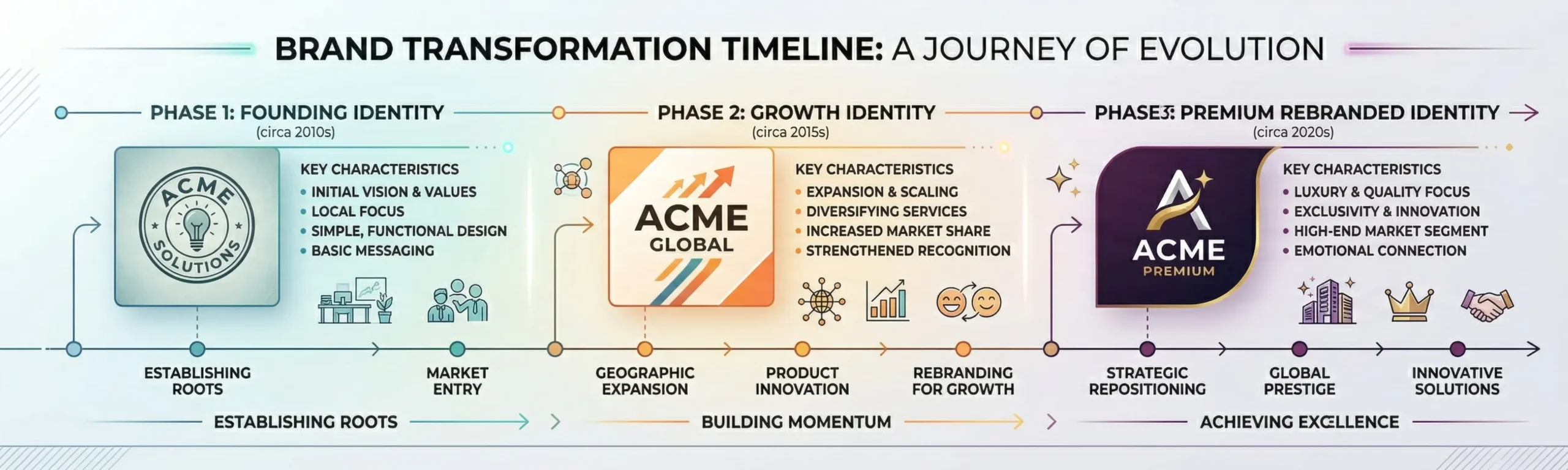


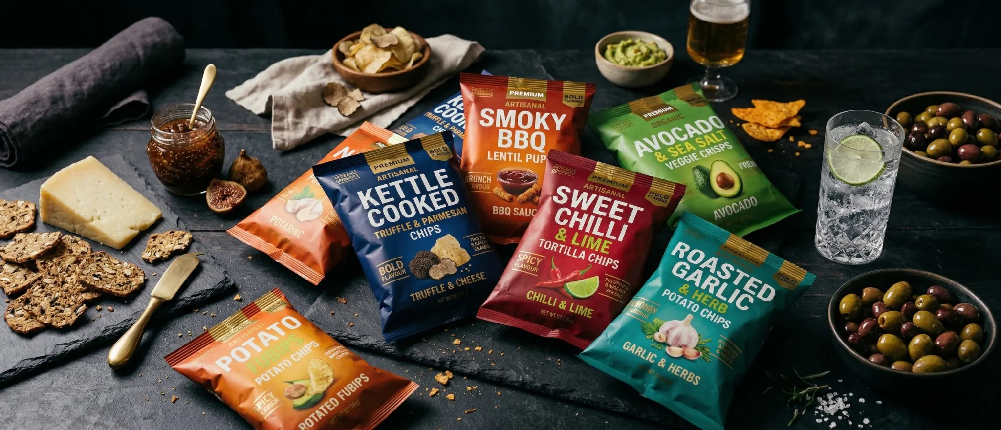
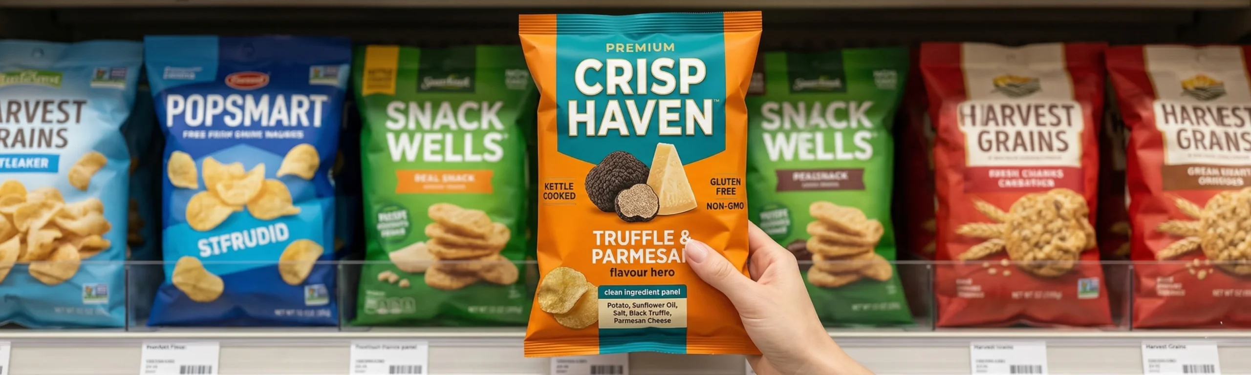
  • Crunch the Competition: How Strategic Packaging Wins the Chips and Snack War

    Crunch the Competition: How Strategic Packaging Wins the Chips and Snack War

    India’s Snack Market Is Exploding. Only Branded Players Will Survive.

    India’s packaged snack market is one of the fastest growing FMCG segments in the world. From Bengaluru’s health conscious tech crowd to Pune’s college driven snack culture, from Hyderabad’s bold flavour preferences to Karnataka’s growing premium retail infrastructure the appetite for packaged chips and snacks has never been greater.

    Yet for every successful snack brand, there are dozens that launch with great recipes and die with poor packaging. Because in the snack category, the purchase decision is almost entirely impulsive. Nobody walks into a store with a specific plan to buy your brand of chips. They walk in, scan the shelf, and something grabs them. That ‘something’ is packaging, and it is entirely within your control.

    At Richest Branding, we have built and rebranded snack products across India and for export markets. The difference between a brand that survives and one that dominates comes down to how deliberately and strategically the packaging is designed.

    1. The Impulse Purchase Psychology Engineering the ‘Grab’

    Snack purchases are driven by one of four triggers: hunger, boredom, habit, or social sharing. Each of these triggers has a visual language that packaging must speak. A packaging design that does not trigger any of these responses is invisible even if it is sitting at eye level on the shelf.

    What makes a snack pack irresistible:

    • Flavour visibility the consumer must almost taste it just by looking at the pack
    • Colour energy snack packaging must pop, not whisper. High contrast, bold, immediate
    • Brand recognition a consistent mark and design system that builds recall over time
    • Size signalling the pack must clearly communicate quantity and value
    • Texture appeal photography or illustration that conveys the crunch and taste experience

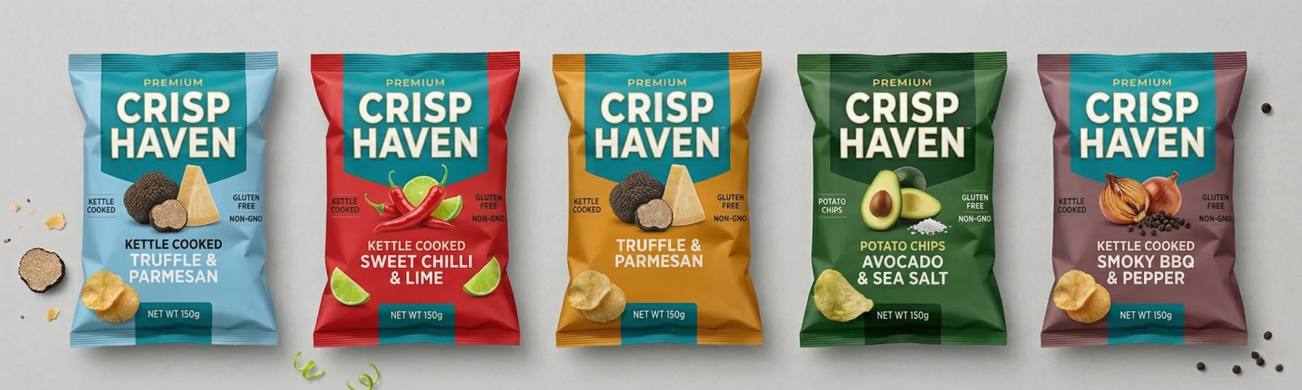
    2. Flavour Architecture: Designing a Range That Looks Like a Family

    One of the most overlooked aspects of snack brand packaging is range coherence. A brand with ten flavours needs a design system not ten separate designs. The range must look like a family, where each flavour variant is immediately identifiable as part of the same brand, yet clearly differentiated from its siblings.

    This is where many homegrown Bengaluru and Pune snack brands struggle. The plain salted variant was designed at launch. The masala variant was added six months later with a slightly different designer. The tangy tomato variant came a year after that. The result is a range that looks like it belongs to three different companies and that incoherence destroys brand equity.

    At Richest Branding, we build snack packaging systems from the ground up a master design architecture that accommodates current and future variants while maintaining iron clad brand consistency.

    3. Typography and Hierarchy in Snack Packaging

    In the snack category, typography must be bold, confident, and readable from across the aisle. This is not the place for delicate serif fonts or subtle pastel lettering. Brand name must be the dominant element, followed immediately by the flavour descriptor because flavour is the primary purchase decision driver in snacks.

    Claims like ‘Baked, Not Fried’ or ‘No Artificial Colours’ must be present but should not compete with the primary hierarchy. These are trust builders, not the hook. Getting this hierarchy wrong is one of the most common and costly packaging mistakes in the snack category.

    4. Packaging for Karnataka’s Premium Retail Boom

    Bengaluru’s retail landscape has transformed dramatically. The city now has some of India’s most sophisticated specialty food retail, health food stores, and modern trade chains. Brands positioned correctly for this retail environment command dramatically better shelf placement, better margins, and access to consumers willing to pay premium prices.

    A local Bengaluru namkeen and snack brand entering Foodhall or a premium format Reliance Smart with packaging that competes visually with the best national brands changes its entire business trajectory. It is not just about looking good. It is about accessing better channels, better buyers, and better pricing.

    5. Digital-First Snack Brands: Designing for Screens and Shelves Simultaneously

    An increasingly important dimension of snack packaging design is digital performance. Your pack will be photographed by consumers, featured on Swiggy Instamart and Zepto, listed on Amazon and Blinkit, and shared on Instagram. Packaging that works brilliantly in physical retail but looks flat and undifferentiated on a white e-commerce background is leaving money on the table.

    • High contrast between pack and white digital background is essential for Ecommerce
    • The brand name must be readable as a thumbnail test at 150px width
    • Flavour photography must be vibrant and food styled, not generic stock imagery
    • Front-of-pack claims drive click-through on Ecommerce brief, bold, benefit led

    6. When to Rebrand Your Snack Packaging

    If your snack brand is growing but your packaging has not been updated in three or more years, you are likely leaving significant revenue on the table. The snack category moves fast. Consumer expectations evolve quickly. Competitor design standards keep rising. What felt fresh in 2021 can feel dated by 2024.

    The best time to invest in a packaging rebrand is when you are expanding new city, new retail channel, new export market, new product line. Use that expansion momentum to enter at the premium positioning your product quality deserves. Because in the snack aisle, you do not get a second chance to make a first impression.


    Ready to Build a Brand That Builds Empires?

    Strategy • Design • Impact

    richestbranding.com  |  info@richestbranding.com

    Richest Branding — Strategic Branding that Builds Empires
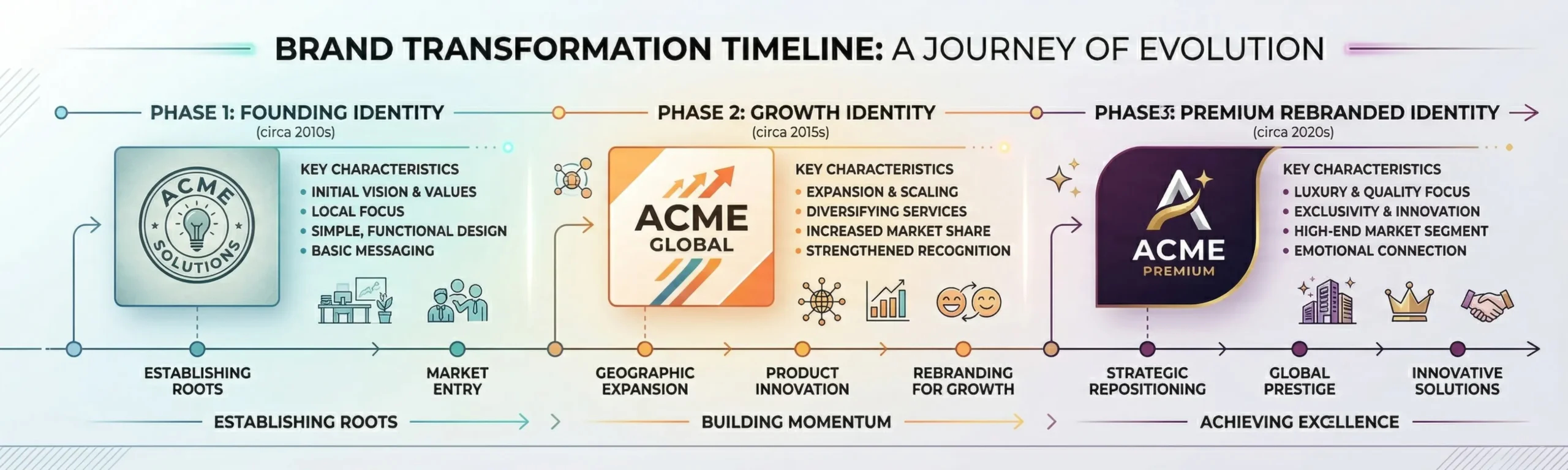


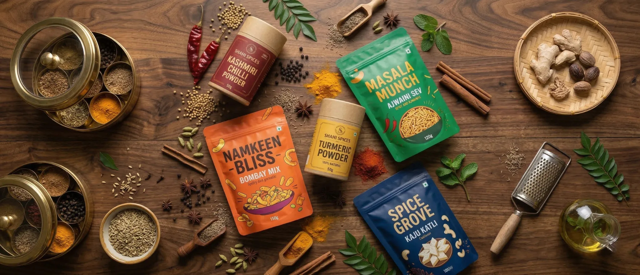
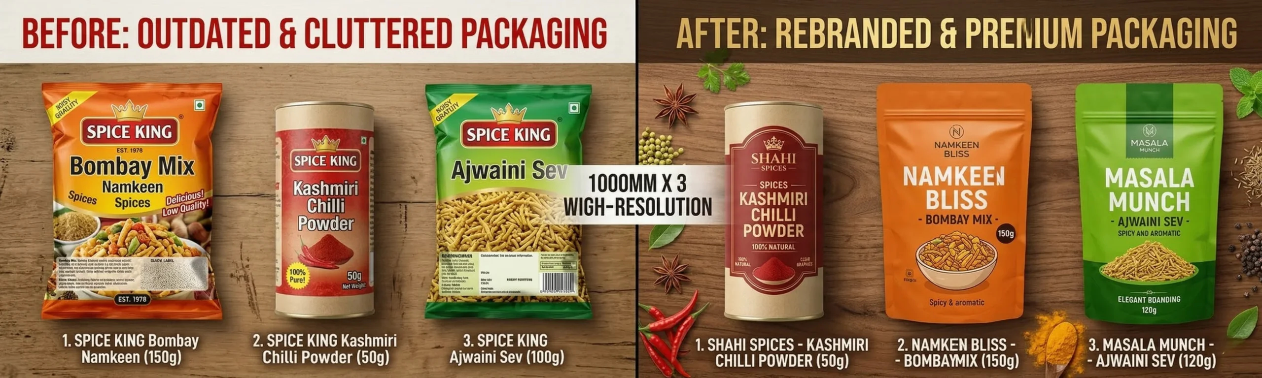
  • Rebranding Your Spice or Namkeen Business: The Strategy That Doubles Shelf Value

    Rebranding Your Spice or Namkeen Business: The Strategy That Doubles Shelf Value

    India’s Spice and Namkeen Industry Is Sitting on a Branding Gold Mine

    India is the world’s largest producer and consumer of spices. Gujarat and Maharashtra alone account for a massive share of the country’s namkeen and snack production. These are industries built on centuries of tradition, incredible product quality, and family recipes that have passed down through generations.

    And yet, walk into any modern grocery chain in Ahmedabad, Mumbai, or Bengaluru  or browse the Indian grocery shelves in Dubai, Oman, or Singapore  and you will find most of these products packaged exactly as they were twenty years ago. While the product inside is world class, the packaging says: we have not changed. We are not premium. We are just another option on the shelf.

    This is the branding gold mine that most spice and namkeen businesses are sitting on  and almost none are extracting. The ones that do rebrand strategically are transforming their revenue, their market reach, and their ability to command significantly higher prices.

    1. Why Rebranding a Traditional Food Brand Feels Risky and Why It Is Not

    The number one fear that business owners in the spice and namkeen space have about rebranding is: will my existing customers still recognize me? Will I lose the trust I have built over years?

    This fear is understandable but, in most cases, unfounded. Strategic rebranding is not about erasing your identity. It is about evolving it  retaining your core brand equity while elevating the presentation to meet the expectations of today’s consumer.

    Well-executed food brand rebrandings retain and often grow their existing customer base, because the customers see the brand they trust now presented in a way that makes them feel proud to buy it. They perceive the quality they already knew was there, now confirmed visually.

    2. The Spice Brand Rebrand Framework: Five Non Negotiables

    a) Retain the Core Evolve the Expression

    If your brand has a name, color, or element with strong consumer recognition, that is your equity. It must be preserved and refined, not discarded. The rebrand evolves around this equity, elevating everything else while the core remains recognizable.

    b) Category Credibility First

    Spice and namkeen packaging must first pass the category test  it must be instantly recognizable as a food product in its category. This means using category appropriate color signals (warm reds, oranges, and golds for namkeen; vibrant earthy tones for spices) while still standing out within those norms.

    c) Appetite Appeal Is Non Negotiable

    For food brands, the packaging must make you hungry. Photography, illustration, or color  whichever route you choose  must trigger appetite before any other response. This is a science, not a preference, and it requires working with brand designers who specialize in food category design.

    d) Build a Cohesive Product Family

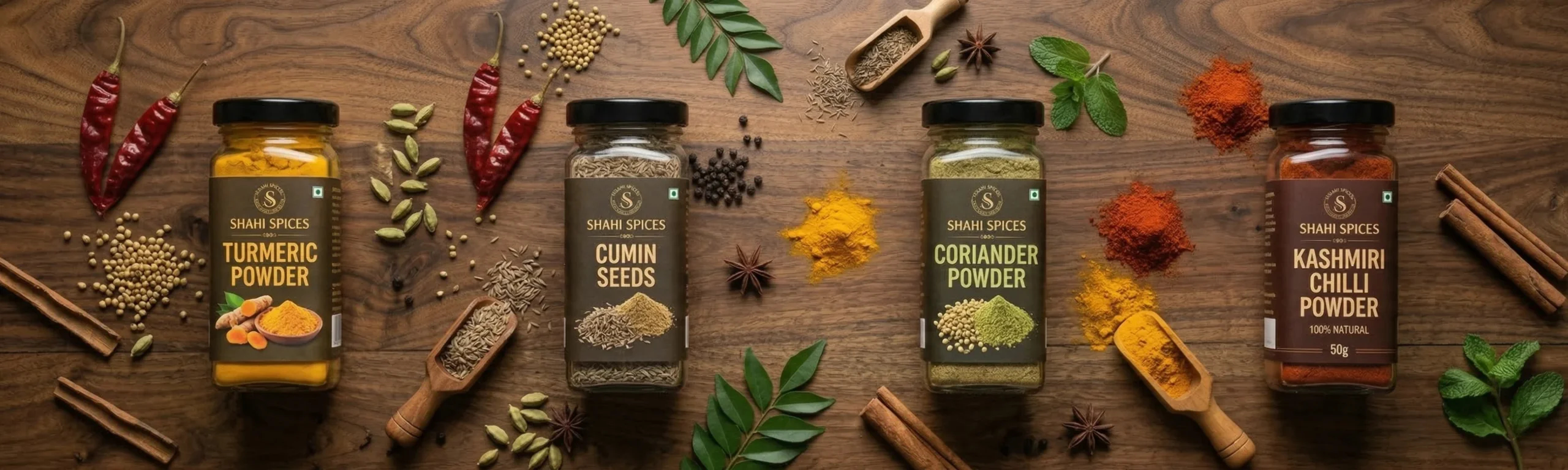
    One of the biggest visual weaknesses of traditional Indian spice and namkeen brands is inconsistency across variants. The chilli powder pack looks nothing like the coriander pack. The plain namkeen looks nothing like the masala variant. Premium brands have strong visual architecture  a design system where every variant is instantly part of the same family.

    e) Design for Modern Retail AND Traditional Trade

    Your rebrand must work in the modern trade context  organized retail, premium supermarkets, Ecommerce  while also working in the traditional trade channels  kirana stores, wholesale distributors, local mandis. These are very different visual environments, and a strong packaging design must succeed in both.

    3. Case for Premium Pricing: How Packaging Justifies Higher Price Points

    One of the most direct and measurable benefits of a strategic spice or namkeen rebrand is the ability to reprice upward. When your product looks premium, you can charge a premium price  and consumers will pay it because their perception of quality has shifted to match the visual signals.

    This is not manipulation. This is alignment. If your product quality is genuinely strong  and in most cases it is  your packaging should communicate that quality. When the packaging matches the product quality, charging the right price becomes a conversation between equals.

    • Modern trade retailers accept higher MRP products more readily when packaging is premium
    • E-commerce listings with high quality packaging photography convert at significantly higher rates
    • Export markets UAE, Singapore, Australia require premium packaging as a baseline expectation
    • Premium packaging enables brand-building at the consumer level, not just distribution level sell in

    4. Exporting Your Spice Brand: What Dubai and Singapore Demand

    For Gujarat and Maharashtra-based spice and namkeen businesses eyeing the Gulf and Southeast Asian export markets, packaging is the single biggest barrier to entry in premium retail. The UAE’s Spinneys, Carrefour, and Lulu group have high packaging standards. Singapore’s NTUC FairPrice and Cold Storage have specific requirements.

    The Indian diaspora in these markets wants authentic Indian products  they are not looking for Indianness to be toned down. But they do expect the packaging to meet the visual standards of the international retail environment around them. This is the gap that a strategic rebrand fills.

    5. The Richest Branding Approach to Food Brand Rebranding

    When we rebrand a spice or namkeen business at Richest Branding, we start by understanding the business deeply  the founder’s story, the product’s heritage, the regional roots, the consumer’s relationship with the brand. These are not just background details. They are the brand’s most valuable raw material.

    From there, we build a brand strategy document that defines positioning, tone of voice, and visual direction. Only then does design begin. The result is not just beautiful packaging  it is a complete brand system that can grow with the business, enter new markets, launch new product lines, and build consumer loyalty that no competitor can easily replicate.

    Because a namkeen brand is not just selling snacks. A spice brand is not just selling powder. They are selling taste memories, cultural connection, and the reassurance of something real and trusted in a world of choices. When that story is told through world-class branding and packaging, it does not just sell  it builds an empire.


    Ready to Build a Brand That Builds Empires?

    Strategy • Design • Impact

    richestbranding.com  |  info@richestbranding.com

    Richest Branding — Strategic Branding that Builds Empires